This is my first ever blog that I will be using to explore and record my creative thinking and drawings for my Practice of Painting – Drawing 1 coursework. Lets see where we go….
This is my first ever blog that I will be using to explore and record my creative thinking and drawings for my Practice of Painting – Drawing 1 coursework. Lets see where we go….
I went to Hornsey Road Fire Station to photograph the Fire Fighters following getting permission from the Station Chief. I did not really know what to expect, whether I would just get some portraits of crew members and shots of the Fire Station or something more. As it turned out the crew were really accommodating and allowed me to photograph them as they went about their regular and daily testing procedures. I could not really draw there as they had no time to pose for me, and would tend to get called out at a moment’s notice, so it was better to do my research photographically and sketch from that reference later.
From a wide selection of photographs I selected some of the ones that I felt made good story telling compositions as well as the ones that I felt would make good portraits.
It was the process of selecting the storytelling images and sketching them out that I decided to divide my project into two paths, one series of portraits that I would do in oil pastels, another that I would do in a more sketchy style that represented daily life.
The conditions that I had agreed to with my contact at the Fire Station stipulated that I would represent the crew fairly and in correct uniform in my artwork, so although I was not after a photo-real look I wanted to have some level of accuracy about my drawings. I felt that if I was to have accurate sketches, I could introduce an element of looseness and energy into my drawings with the colour element. I drew on some of the research I had done on the recommendation of my tutor and looked at a few suggested artists:
I really liked the simple use of limited colour, loose organic painterly brush work and slight translucency of the colour whilst still retaining an element or realism and accuracy.
With Joan Eardley’s work I liked the sketchy line work over the rough colour base. The characters are maybe more stylized than I wanted to go for, but there is an energy in her work that I wanted to draw from.
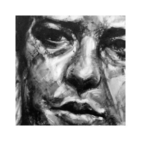
This close up by Jenny Saville was inspiring for the painterly brushwork. I like the powerful composition, but did not want to create cropped portraits for my work as I wanted to show the Fire Fighters in their official kit, but I did want to take from her work the layering and painterly effect in the tonal aspect of her work and apply some of this to my oil pastels in the colours and mark making that I used.
With Nick Lepard’s work I wanted to draw from the energetic mark making with colour to bring out the light and dark areas and loose abstract background.
Looking at Yan Pei-Ming I was inspired by the monochrome and drippy nature of the overlaid mark making, an aspect that really wanted to utilize.
This image by Jerome Lagarrigue I also found very inspiring, His work was being exhibited by Galerie Oliver Whitman in Paris. The focus on the face with the additional smaller background focus, as well as the markmaking were aspects that I wanted to draw upon for my portraits in Oil Pastel. I did decide to do the backgrounds of my portraits in Conte Pastel and very minimal as this would knock the background back while still showing enough to give the image context and hopefully bring more focus to the portrait.
The final image that I wanted to draw from as inspiration was one that I did with spot colour in Part 4 of Drawing 1:
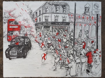
I had really enjoyed using pen to draw with and the way the red brought the image to life and represented the England Colours. In my Fire Fighter sketches I wanted to pull the main colours that stick in your mind when you think of Fire Fighters which is Red and Yellow. I wanted the colours to sit on top of the paper rather than sink into it as felt that that would help accentuate the detail.
I put the base down of Quink Ink to create the monochrome look over the drawing, from the sketches I found that it was better to draw the image first with permanent pens, I preferred the Faber Castelle PITT pens after buying and testing a number of brands to ensure that they did not bleed when I went over then with a wash. My tests explores mixing the colours with water to thin the colour and mixing them together to get an orange. I realised that I had to be careful as acrylic inks are very unforgiving, no mistakes allowed!
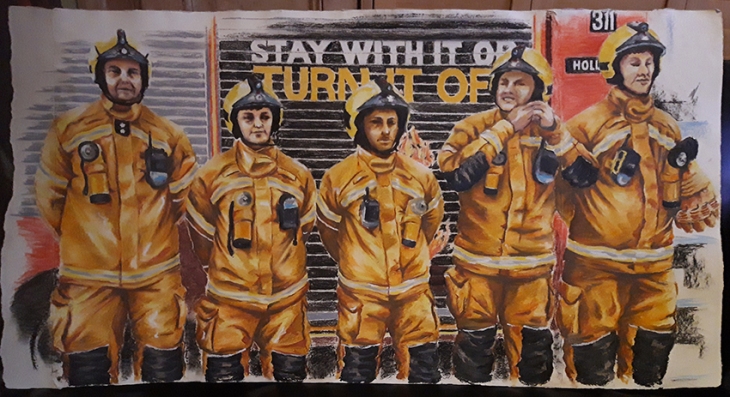
After one visit to the Fire Station when I was asked to do a drawing of the whole watch I did some experimentation with how I might represent them. I tried doing a mixed size compilation composition, however I moved away from this idea in the end in favour of depicting the crew in official line up for my oil pastel series as I felt this gave the individuals more authority and respect.
Having drawn Green Watch and then red Watch in a line up, I decided that as a series it would be more interesting to draw the watch getting into uniform, so when I came to draw White watch I took lots of pictures of the individuals getting ready and put the chosen images together into the composition.
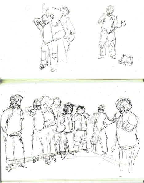
I felt that having the figures in action made for a much more interesting image, and as a series it would tell the story of the sequence of dressing that they had to go through in order to wear their full kit.
I found that I was more confident in bringing a compilation of images together to make up my composition as I had completed more of my drawings. The fact that I had not captured the image that I wanted in my research photographs no longer mattered so much as I could tell the story in my image by bringing together material from different photos.
All accessed January 2019
marlene dumas portraits
Jenny Saville portraits
https://www.google.com/search?biw=1366&bih=632&tbm=isch&sa=1&ei=yRjGW-OHCIKugQb55774BA&q=jenny+saville+portraits&oq=Jenny+Saville&gs_l=img.1.1.0j0i67k1j0l8.18724.20763.0.22583.2.2.0.0.0.0.203.345.0j1j1.2.0….0…1c.1.64.img..0.2.343…0i30k1.0.MYLOE_aaKZI#imgrc=Jpgj5rHQuo8PIM:
Nick Lepard’s paintings
http://koikoikoi.com/2010/05/nick-lepards-paintings/
Yan Pei Ming
Joan Eardley

For this series I decided to work in a limited palette; I guided my composition in blue Col-erase pencil first, sometimes I had to make alterations to my drawing or combine two photographs from the photographic reference to tell the story that I wanted in my composition.
I then drew up the work in Faber Castelle PITT pens mainly the (S)small, (M)medium, (C)Calligraphy and (B)Brush nibs, often drawing up a number at a time and working through the set many times to work them up to their finished state. Having completed my pen work I next wet the whole page with a sponge and clean water to dampen the paper in order to add the ink top layer. To keep the feeling of the composition as sketch-like as possible I wanted to apply the ink quickly so that it ran and blended over the image and only had a hard line when I wanted it to. The Black Quink Ink I chose to use has hints of blues in it and id bleachable, turning the black area that has had a dilute solution of bleach an ochre/sandy shade of varying strengths.
Having applied the Black Quink Ink in varying strengths of shade across the whole image to define the environment I built up tonal ranges in the figures and foregrounds. The main colours that the Fire Fighters wear are Dark Blue and Red, with yellow present on their official call-out uniforms and truck. So to give the compositions I used some spot colours of mainly red and yellow to bring out some focal points to the image. I chose to use an Acrylic ink as the colour sits more physically on the surface of the paper which I felt appropriate and for the look that I wanted. Occasionally I needed to use a mix of the red and yellow to give me an orange, and the blue and yellow for a green. When the red or yellow spot colour was limited the image had less impact, another colour would bring the scene to life, so by adding inks more soaked into the paper and subtler (which was better to use a bleachable D PH Martins ink or really watered down acrylic); blue was used more to depict light and reflection, green was laid down more flat a solid colour depicting a solid object.
I think the limited use of colours really ties all the series together to show the depiction of daily life, the monochrome feel and spot colour leaves a lot of the image to the imagination so you want to look more into the picture. There is also an element of seeing things in black and white or monochrome (ie; sepia) that has a sense of nostalgia and a record of the past that suits this medium of storytelling.
On Parade in official uniform
For this series I felt it important to present the individual as well as the drawing, a more solid medium in bold colours would give the individual a presence and officidum. I had been working with oil pastels quite a lot in my life drawing classes and considered that this felt like a good medium to convey the look that was in my head; solid, correct but not photo-real, conscious and sometimes bold in the colour palette and strong and proud in front of a hint of a background which I would complement the oil pastel with a chalk pastel or Conte stick to add suggestions to aspects of the background.
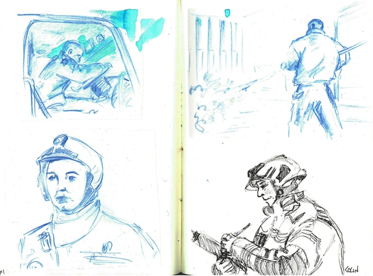
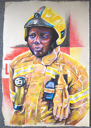
The first Fire Fighters that I chose to draw were the only two female crew; 2018 being the year of the women and all that! Having completed these two portraits I went on to draw some other of the crew members. I couldn’t do all of them, so I just decided to take a select a few photographs that I felt would be suitable for a series. I had a few that showed the Fire Fighter in the act of doing something, putting on a helmet and taking the register, I felt that a mix of these different poses would make the viewer more engaged with the subject if they could relate to them as people, not just to attention.
The paper that I decided to work on is a rag paper which is approximately 78 x 57cm, the brown flecks in the paper are bagasse (Sugar cane) or other fibers and the paper feels like it has a sort of gum in it, it has a good surface for the oil pastes, a tooth, but not too much, an organic surface with natural edges. I used a half sheet for the portraits and 3 quarters of a sheet for one work. When I went back to get some more paper I discovered that they were out of stock and then later that they are discontinuing the line! I found a white rag paper with a similar feel to the surface, but not the flecks colour of the original choice, typical! I will just have to do the remaining ones on white!
I then got asked if I would do a group drawing of Green Watch, which would fit nicely on a full sheet of paper. Then slowly as I was doing it I realised that I would have to do one of each of the Watches now, the project would not be complete if any watch was missing and I didn’t want to appear bias in any way!! Then when I returned to each watch to photograph them in uniform in a line-up the other Watches have 5-7 members, I would have to get more white rag paper and stick two pieces together.
All the Daily Life images are done on 200gsm A2 Cartridge with Quink Ink, Diluted Bleach, FW Daler Rowney Acrylic Inks and Dr PH Martin inks.
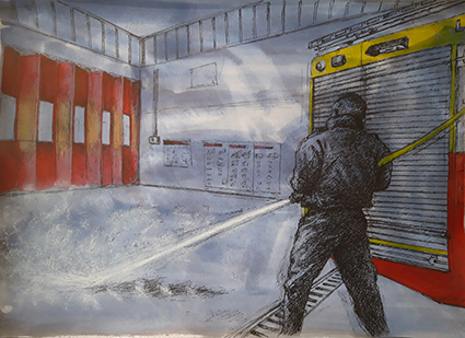
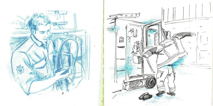
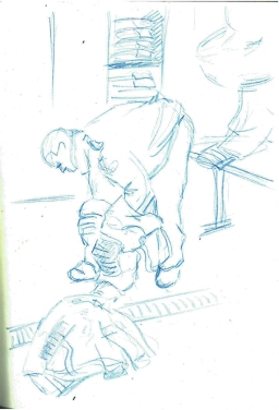
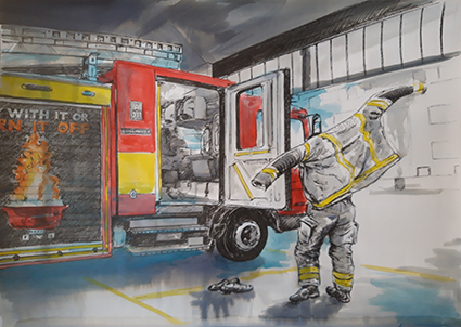
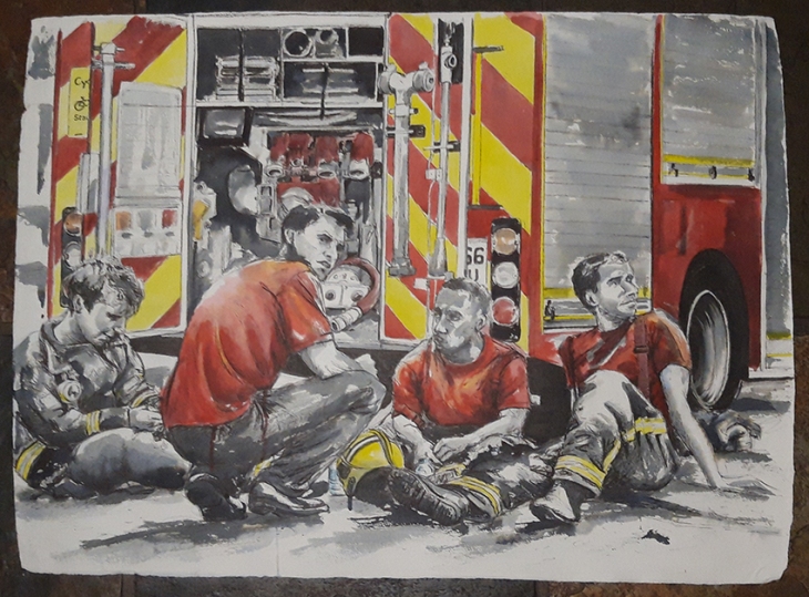
Testing the hose (Red Watch)
This was the first sketch that I did for this series. I was getting to grips with my subject and my drawing methods. I made some mistakes with the size of the Truck, but succeeded to leave them in as I think that not only do they tell the story of my drawing, but add to the sketchy look. The spot colour helps keep the eye away from the mistakes. The red was also applied very selectively on the doors to help create areas of light and shade, and the water spray is done in a soft white pastel that sits on top pf the background wash to depict the spray.
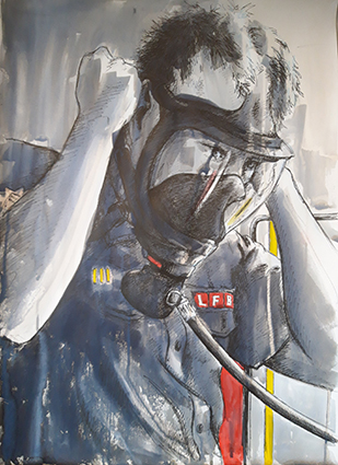
Testing the Mask (White Watch)
It took me two attempts to get the proportions right on this sketch, the mask was really dark in my reference and I struggled to make out its form. There is not much colour in this drawing, however I think it is one of the stronger compositions. The soft reflections in the glass on the mask really help , and there is a focus about subject testing the equipment.
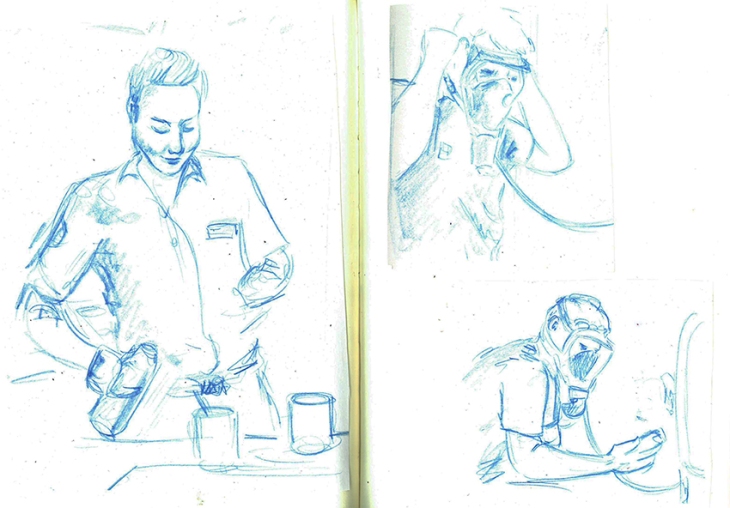
Testing the Pressure (Red Watch)
I like he intensity of the focus here, the equipment being functioning properly can be a matter of life and death. This has to be done every change of shift. There is just enough a hint of the background to imply that it is the truck. I used a little bleach in this one to draw some highlight to the arm, and a little on the face to imply the skin.
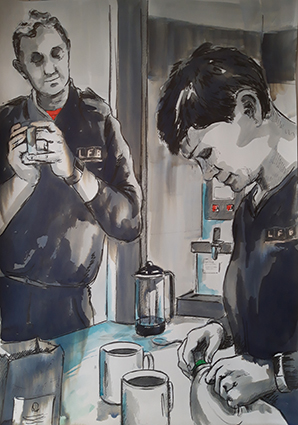
Making Tea (Red Watch)
Fire Fighters make a lot of tea, a lot more than they get to drink tho! I wanted to capture that ordinary function of making some tea and just having a chat whilst doing it. I am happy with the composition, however there is not much spot colour, just a bit of T-shirt and some buttons on the coffee machine. It is here that I realised that I would need to introduce some additional colour. A pale wash of blue would indicate shine on the stainless steel surface and the blue and yellow ink made a nice green for the milk lid, this also gives an importance to the humble milk bottle that is so integral to the ritual of tea making.
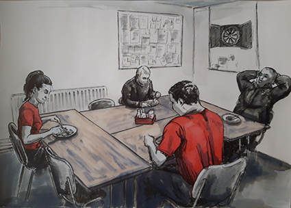
The Mess Table (White Watch)
Having made food for the whole crew Lexi sits down to eat with her Watch, I go and literally 2 minutes later when I was up the road, the truck drove past sirens blaring. I wanted to capture a rare moment when they actually all got to sit down and eat together. I wanted to capture the starkness of the Mess room. The wooden tables were emphasised better with some bleaching turning the black ink sandy colour to represent the wood, it also softened the image and drew you into the table more. The head of the female Fire Fighter seems a bit big to me, but I live with my mistakes!!
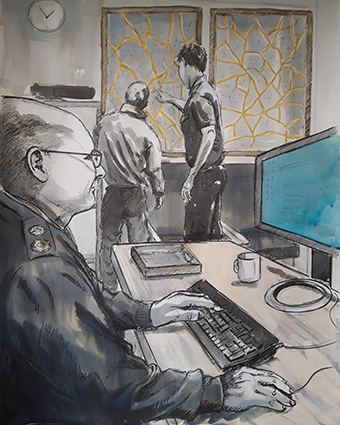
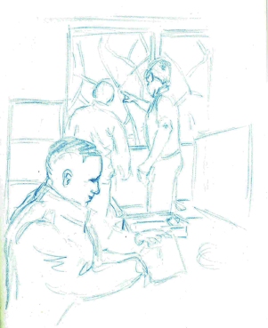
Checking the Map (Red Watch)
This is a compiled composition; I wanted to capture the Sargent doing his work on the computer while the Fire Fighters work out where they are headed by studying the large map of the area. This composition has some depth as the scale helps draw the viewer through to the map, the yellow on the roads was not enough to pull the picture together, then as I looked at the computer screen I realised that the Microsoft Blue light coming from the screen held the answer. You don’t really see it, it just draws you past it, but the figure is intently looking into it!
The Call Out (White Watch)
This was the sketch the made me realise that I would need to use other colours other than just red and yellow! I needed a blue to show the siren lights and to mix the red and yellow to show the flames on the graphics on the side of the truck. I felt important to show this composition into the story, introducing the truck, the act of quickly putting on the kit, leaving the day shoes ready to get into the open door and drive off into the light outside. By putting the coloured ink over the top of the tonal Quink Ink I can give some idea of texture and shade.
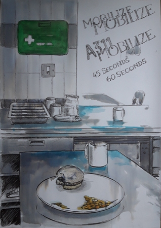
Mobilize Mobilize (Red Watch)
I now wanted to show what the station looked like once the crew had gone out on call, any food was left half eaten, I was warned that every time they cooked together the meal was interrupted by a call-out! This was the only sketch that I felt warranted text, I wanted to convey what was said over the tannoy. It is surprisingly quiet as an alert, not a loud siren that would make you jump out of your skin! For this reason I have done the lettering sketchy and not solid. A bit of bleach on the bun gives a feel for the bread while the beans required some orange mix. The sketch came to life when I added the blue on the stainless steel and then the secondary focus on the First Aid Kit, the green object giving another point of interest.
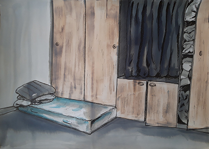
Night Watch
I was shown around and delighted to see the sleeping quarters used by the Night Watch. The mattresses were supposed to be put away, however fortunately for me this one was still out. It felt very basic and 1950’s in the feel of the built-in wardrobes that stored the sleeping bags and mattresses. The only real colour was a bit of blue in the pattern on the mattress, so I added colour in this sketch by bleaching back the doors to represent the wood. The lone small mattress looked quite bleak in the corner, so I wanted to keep an element of bleakness to this drawing.
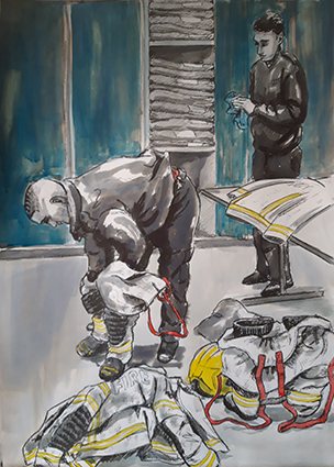
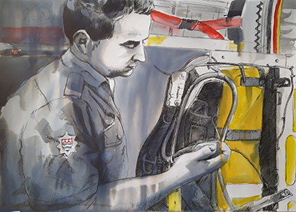
Sorting Kit (White Watch)
Having come back from a Call-Out the Fire Fighter has to change his soiled uniform for a new one. New uniforms were introduces a few months ago, now every time they get a bit dirty or contaminated they are sent off for either cleaning or disposal. New kit is stored in plastic bags in the lockers behind. When I painted these blue it was too dark and I forgot that it did not bleach, the Quink Ink behind it did bleach a bit and it left the doors looking quite streaky and a little busy, but I have to live with my mistakes! I really like the way they have to put their trousers over their boots to enable quick dressing and get away. In this sketch I wanted to show the way that they do this, the way that the clean their kit, and record and unwrap the stiff pristine new uniform.
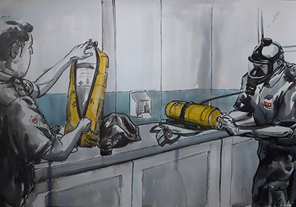
No Pressure, Changing the air tanks (Blue Watch)
This is what the daily checks are for. The tank was not up to pressure and had to be changed for a new one. There is a side room where all the spare tanks are kept, it was stark and lacking any colour except for a pale blue/grey stripe around the wall which I had to use a very dilute wash over the dilute Quink Ink, the yellow covers for the tanks and the embalms on their uniforms being the only other spot colour.
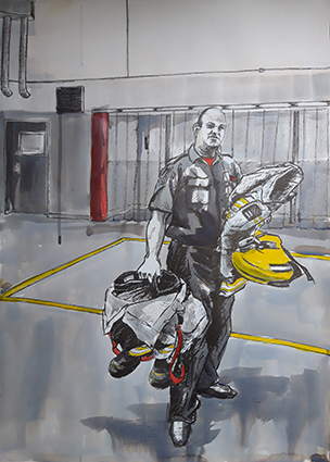
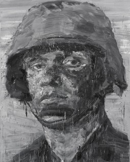
Sargent Carrying Kit (Blue Watch)
I wanted to show just how bulky the kit is that they have to carry, this shot of the Sargent, denoted by the black and white stripe on his helmet. This view, which I used a bit of artistic licence in the background, also shows the Fire Poles behind the clear plastic blinds, I don’t think they are used that much, but they are an integral part of our stereo typical idea of a Fire Station. I really like the minimal spot colour in this sketch, and the deliberate drips add to the textural interest.
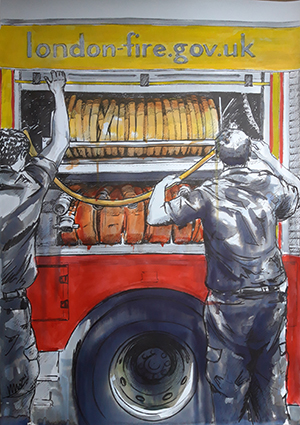
Checking the Hose (Blue Watch)
The hose is obviously an integural part of the truck; the automatic rotation to coil the hose needs to be checked, sometimes if not returned correctly the hose can become jammed. There are two sorts of hoses, ridged yellow ones and more flexible red ones. When the wound hose is correctly coiled, the shutter door is pulled down. This sketch is the one that I have used the most colour in so far, varying shades of orange are used for the hoses flanked by the red and yellow of the Truck. I kept it qiute rough, drippy and sketchy to keep some textural interest, I didn’t want the colour to be too neat and become to tight and dead visually.
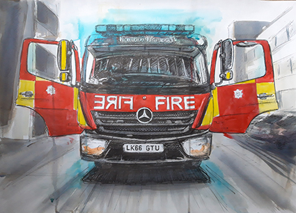
The Truck (Blue Watch)
Had to draw the Truck, it is a part of the Family! I wanted the background visible, but a bit softer as if bleached out by the bright sun. The Truck, ready and waiting for a Call-Out sits waiting like a butterfly ready to take off and fly. The crew run regular checks on the siren lights to ensure that they are working, giving the Truck a sort of blue halo! I like that the background looking as if it is whizzing past even though the Truck is stationary, it gives it a sense of life.
For a culmulation of this series of daily life, testing and training I was given a photograph taken by one of the Fire fighters of Red Watch when they had attended the fire at Grenfell Tower in North Kensington, it was such an emotive image that I felt it would make a fantastic final image for this series, this is what all the work, training and preparation is for.
Once I had added the spot colour on the truck and clothing this artwork really came to life. Tammy, on the left hand side of the picture is still in full uniform, the old dark blue wear that was replaced towards the end of 2018. Getting the expressions right was critical to this image, the viewer questions what they are looking at which is only given away by their demeana and the title. The loose almost abstract ink work conveys the exhaustion and soot, the colour gives the Fire Truck context.
These portraits are a celebration of the men and Women who serve at Hornsey Road Fire Station
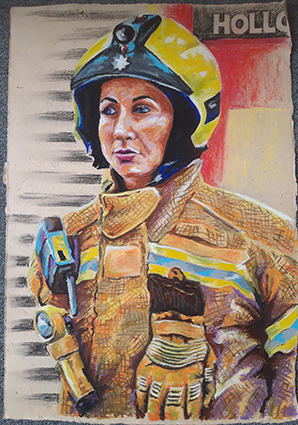
Lexi
I wanted to start my oil pastel drawings by drawing the female Fire Fighters first as 2018 was the year of the women. Lexi was so hospitable and helpful showing me around I wanted to do her first. This is the first time I would work out how to represent the uniforms and tones. This part of my project enables me to explore tone and colour while trying to keep a freshness about my mark making, I had to work out some mark making and methods of application that I could apply to this and future portraits.
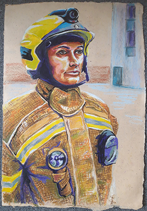
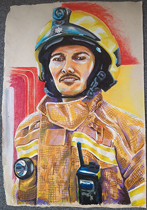
Tammy
I got some new oil pastels so that I had some differing colours and density of oil pastels, some harder (the Daler Rowney ones) some medium hardness (Neopastels) and softer ones (Selinner) I also got some cheap ones (Giotto) to add to my tonal selection. This portrait is quite official in Parade pose, but it does emanate a strength and defiance of character.
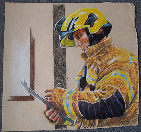
Colin
I wanted to illustrate another aspect of Parade, so I drew Colin checking his crew with a clipboard. Compositionally this needed to be larger than half a sheet so I used about three quarters of a sheet which looked most comfortable. The minimum use of colour done in Conte pastel just indicates his surroundings rather than drawing too much in.
Brian
Here I wanted to try rendering a different colour skin tone, I had seen Brian standing in on an extra Watch and felt his dedication needed to be recognised! This was a good exercise to see how far I could push the colour tones to bring out his character.
Reece
When I went in to photograph Green Watch Reece was particularly helpful and had a really outgoing character, so I felt he would be a good subject for a portrait, slightly cheeky and always smiling! It was also this Watches’ idea that they would like a group drawing, what had I got myself into?
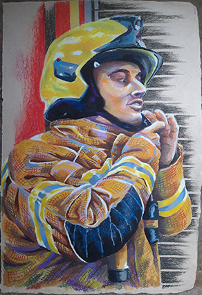
Dan
I wanted to capture this portrait in the act of dressing in uniform putting on the helmet as drawing someone in mid movement can create an interesting composition. As with the other portraits, I laid out my composition in blue Col-erase pencil which I then rubbed out lighter with a putty rubber before building up firstly the uniform, secondly the face, then finally the dark areas on the helmet and clothing and the cross hatching over the top of the uniform.
A single comment from one of the crew inspired this drawing, he wanted one of the whole watch so that he could put on the inside of his locker. Drawing the crew smaller was more difficult as representing detail in oil pastel at this size is not as easy as it is on a bigger scale. I had to add uniform trousers to this drawing as they had posed only in jackets, I got this reference from pictures of White Watch. I wanted to capture them official, but a bit relaxed as I felt that this would give each one an identity and personality easier than if they were stood fully to attention. All these group drawings are done on A1 sheets stuck together to make the appropriate landscape length.
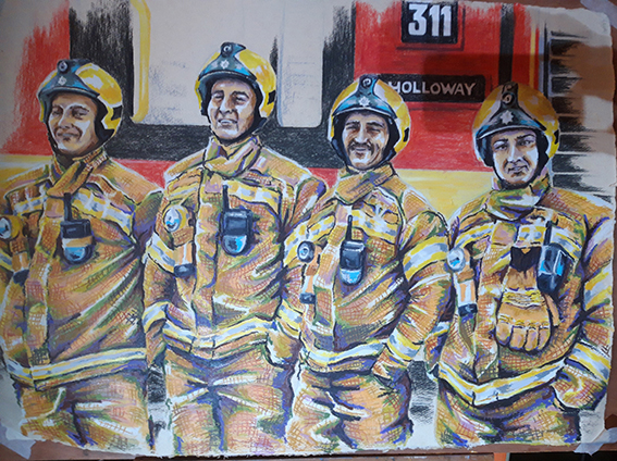
Once I had done Green Watch I realised that I had to do all the Watches, it would not be fair to just do one, I had to do all four watches. When depicting Red Watch I felt it added an extra level of interest to the scene if one of the crew was doing up his helmet. By the time I started this drawing I had shown some of the drawings to the Curator of Islington Museum who indicated that they would be interested in having a future exhibition around the Fire Fighters to celebrate their work, this also made me realise that I could work on a slightly bigger scale by sticking sheets of paper together to make a landscape and fit all the crew on rather than making the figures even smaller. I intend to show them clipped and unframed as they are on 350gsm cotton rag paper which is fairly rigid. The bagassee and Gunny paper that I had been working on had been discontinued, so I had to find an alternative. I did prefer the brown off white background, but I could not find suitable alternative paper in brown, so I had to suffice with a white background.
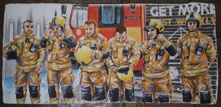
For green watch I had used a green base to the uniforms, for Red Watch an orange tone, then for Blue watch I added a blue highlight and a white highlight for White Watch. I had liked the crew member putting on the helmet in the previous drawing, so in this group image I wanted to show the process of putting on the helmet. I had to compile this image from a collection of photographic reference, I like the wave line that is created through the image of the different stages of putting on their helmets. I am not 100% satisfied with my depiction of the faces, maybe sometimes the heads are a bit big, but the proportions were challenging when you place a human figure in an over size uniform! I could not change it, so I had to go with the result that I created, they do all have individual characters, and I think that the aspect that I have depicted the truck in does add an additional interest as it also includes the station doors implying the way out when opened. With 6 characters in the crew, the paper had to be a bit linger. I wanted to keep the heads not on a paper join seam, so I had to add additional paper to each side to accommodate the composition.
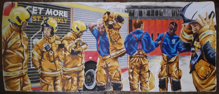
Finally I had White watch to draw. Some of the crew were a bit drawing shy, but they did all dress in uniform for me as I photographed them. I had in mind that I wanted to depict them getting dressed in uniform to show the layers and sequence of dressing. This image is the longest as a full maximum crew of seven were to be depicted. This is a complete compilation from many different photo’s and was the most difficult of all of them to complete. I chose to show a different view of the truck and the station so that I had a full gamut of scenes. this is my favourite of all the group portraits, I think it has the most movement and storytelling in it and is therefore the most interesting, especially as it includes a different aspect of the station back doors as well.
In all the portraits I have used Conte sticks to depict the backgrounds. I had to use the edge of a sheet of paper to get the straight lines, and although I was depicting the truck and the environment I was careful not to do so fully so as to leave something to the imagination. I like the contrast in technique as it gives the eye two aspects to look at that do not fight each other.
I may have done more images than is strictly required for this part of the course, but I felt that I had a story to tell, and that story could not have to be told in few images. I needed a bit of extra time to finish all the drawings as the big ones took a couple of days to do in total at least as it could take some time to get the composition right to start with and I have been working full time throughout December and January, although I did have some well needed time off over Christmas that I put to good use with my drawings.
I have really enjoyed this project and have relished getting into producing a series of works that have evolved and developed over the period of time that I was executing them. Working in two styles gave me scope to tell two parallel stories that depicted the sides that you see and don’t see publically. I hope that I have achieved my goal of celebrating the work of Hornsey Road Fire Fighters, and I have to thank them for their generosity in accommodating me doing this project.
I wanted to take the opportunity to explore further drawing the figure and portrait. I had enjoyed part 4 the most out of the whole of Drawing 1, this was where I had explored new styles and materials the most and been the most expressive in my work.
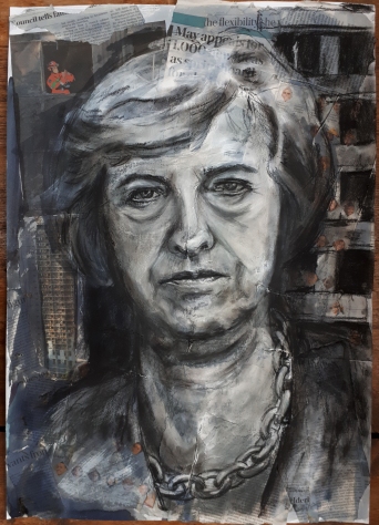
With this in mind I struggled at first to settle on a subject matter and theme. Looking through my previous works I was drawn to the monochrome portrait that I did of Threasa May in front of Grenfell Tower, and to a figure of a fire fighter or inspector that was a part of the collage that I had made the background up out of. This small aspect of the image was to become the inspiration for my final project. I contacted my tutor to put forward my idea, she approved and I visited the local Fire Station in Hornsey Road in London and found out who I should write to to ask permission to photograph the firefighters and draw them for this my final project for this module. Unfortunately my contact was on leave and it took a few weeks for him to get back to me. He gave me permission to photograph the crew and the fire station with the caveat that I must represent them in their official uniforms and not demonstrate any political statements as the drawing of Threasa May does.
My motivation for this project is to look at the life of the Fire Fighter when they are on duty and to celebrate their work. I knew that I would have to work from photographs for this project as the crew would not have time to sit for me and could be called out at a moment’s notice. So I talked to the crew as they went about testing the equipment and was kindly shown around the station so I could get a feel of what daily life is like.
There are 4 crews; Red Watch, Green Watch, Blue Watch and White Watch. They work two days on, followed by two nights on, followed by 4 days off, although often there are stand-ins from other stations and the individuals may work a different Watch shift at times. At each change of watch the crew has to run their equipment checks to ensure that it is all working and stored properly, then there might be a round of Tea. Fire Fighters seem to drink a lot of tea, although they don’t always get a chance to finish tea or meals as a call out could come at any time. They only have one truck and are scheduled to go out on a daily basis to check and fit smoke alarms at various locations. So for me to photograph each Watch, in uniform and performing daily tasks, I had to visit fairly frequently and keep going back to see if they were in or not, often I would go by and the station was unmanned as all the crew would be out on a call. Each Watch is made up of a minimum of 5 and a maximum of 7 members, I made a lot of Banana Bread to give one to each Watch as I first met them, the bribery/ thank you gift went down well and all the Watches were really accommodating and helpful.
It was really important for me to spend time photographing and talking with the Fire Fighters as I experienced Station life and the individuals themselves to get a feel of my subject matter before I put pen to paper. This helped me form an idea of how I wanted to approach the project as a whole.
I decided to approach the project from two angles; the first would be a series of looser limited palette sketches that depicted daily life behind the scenes at the Fire Station that culmulates in a working image of Red Watch after Grenfell. The second would be a series of more formal portraits, firstly depicting the two women Fire Fighters at the station and some of the other crew members then a series of larger images that depict each watch as a group.
The project definitely evolved as I progressed through the work, I worked on both paths of my approach at the same time rather than one at a time as it helped me to be more considerate and reflective to each style as I had time to step back and look and consider it as I worked on the other style series. It also gave me the opportunity to go back to the Fire Station and take additional reference photographs in order to get images that would help me tell a more complete story.
Assignment 1
My first assignment, Still Life, was described by my tutor as although being technically competent was too illustrative. I set up the still life with some of my more obscure ornamental objects that I had around my house to create a sort of scene, I think this arrangement was the core reason for the illustrative nature, however, having chosen to work in dip pen the detail and relatively tight drawing style this exaggerated the outcome. When I produced the drawing I was quite happy with it, but I came to appreciate my tutor’s comments more as I worked my way through part 2 and worked in a far more experimental style.
Assignment 2
I had taken on board my tutor’s comments during this section of the course and really tried to free up my work and experiment with different media. This assignment I feel was much more successful, the combination of different media makes for a far more interesting piece of work. The final piece is in some ways I feel is a bit too busy and does not leave too much to the imagination, but the textures and colours create an interest in the overall feel of the image. My favourite part of this part was actually drawing around my house in my sketchbook, this I found experimental and liberating, I enjoyed making this record of my home.
Assignment 3
This part of the course was concentrating on buildings. I think that I got wrapped up in being accurate with the detail of the structure and of recreating the building faithfully and accurately. This resulted in some very accurate renditions that I ended up taking far too long over and resulted in a rather twee outcome. I did try a quicker version; however this lacked any emotion and was pretty dead as a drawing. I think that the very nature of buildings being static contributed in my rather static interpretation of the subject matter.
I also consider that whilst freely working in my sketchbook and being experimental, I got what I can only describe as Assignment tension and suddenly reverted back to being detailed and intricate in my interpretation of the subject matter. I also seemed to have misunderstood the brief, even though I did read it a number of times, ‘Take up to 2 hours’ turned into ‘Take at least 2 hours’ in my head. Taking longer over a drawing just allows the opportunity over work and add too much detail.
Assignment 4
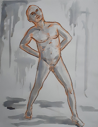
I took advice from the handbook for this part of the course and too up going to life drawing classes. This really helped me to loosen up really practice drawing the figure in a number of different styles. Of all the Assignments I feel that this was my most successful. I think that I managed to apply some of the techniques that I had been developing and actually put them to good effect in the actual assignment. I also made sure that I did not spend too long on each piece so as not to run into the danger of overworking it.
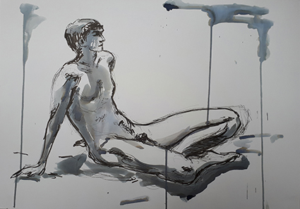
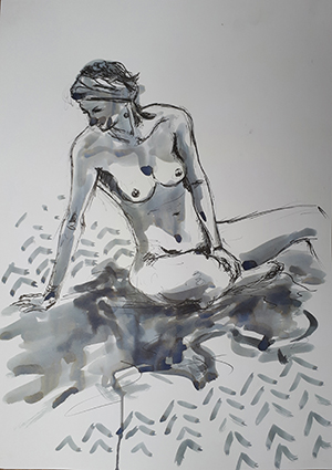
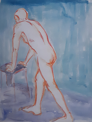
In my first portrait Seated figure working in line I wanted to get across that feeling of someone working. I was pleased with the outcome. The fact that I indicated the background rather than detailing it really helped with the impression of someone busy at work and focussing on the figure rather than whole image.
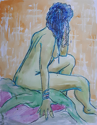
The second portrait of a reclining figure in tone was not so successful. I think that there is too much detail and distraction from the figure. Focussing on a small part of the composition and working on a closer more magnified section would have created a more interesting composition. Even my second version in monochrome, which works better as it is slightly looser, does not really compel as a really strong drawing.
The final work was the portrait in line and tone which I feel is my most successful. The line and tone are free enough that still leave much to the imagination which makes it an interesting image to view.
After feeling that I had sort of stepped back during part 3, I felt that Part 4 of this course was really the section that I freed up started to find some styles that I enjoyed working in. The process of life drawing really helped me loosen up and experiment, as did the fact that I was drawing a more natural and textural forms.
Complete two large figure studies (A1) size and a portrait/self portrait (any size) – three drawings total together with supporting studies, experiments etc.

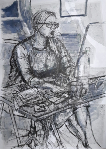
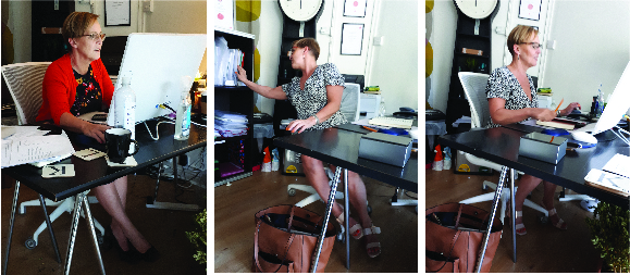
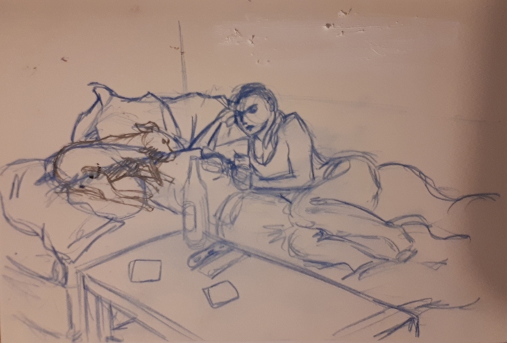
For this portrait I wanted to try and create an impression of my model at work at her desk, the sketchy lines creating an impression of movement. I knew that she would not be able to sit exactly still for two or more hours so I felt that some ghosting of other positions would help create a busy feel to the drawing. This technique is quite unforgiving as you can not rub pen out and any mistakes remain visible, but I do like the effect that that much drawing creates.
The office is quite small, I had little option as where to sit comfortably with my A1 board, but I did manage t o get an angle that suited the composition that I was after where I could see her legs and base of the chair as well as enough of the desk to show what is going on, yet not concealing too much of the body.
I found the whole process quite interesting, building up the figure with a very sketchy line. I did go wrong a few times, focusing in on a hand and a corner of the table before I had established that it was in the correct position and to the correct proportion on the page. This did end up creating some dark details in the wrong place , but also helped create a sense of movement as she went about her tasks at the computer.
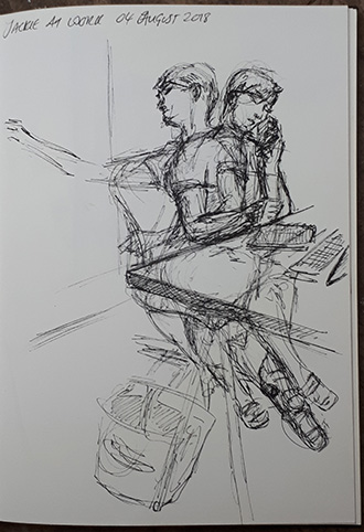
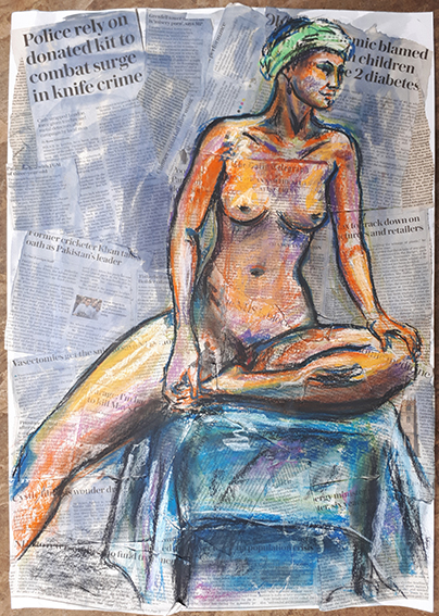
I had found a map of bookshops in London that I tore up an collaged to a sheet of A1 cartridge. I liked the light tones of the map that meant that there was a light random texture across the background. Jackie is an Accountant, so book had a fairly loose connection.
I think I was a bit nervous going into the drawing as I knew that she wouldn’t be happy if I asked to sit in the office again, so I had to get it right first time. At first I struggled to get my positions and proportions in the right place, and had to keep reminding myself to relax, move on and look at it as a whole and not be afraid to move on and re-draw a more correct version. It’s amazing how much even the stuff moves around the desk over a few hours. Getting the feet in a position that felt comfortable with the position of the torso was difficult as she kept changing foot positions and crossing her legs in a variety of ways.
There was one point where I felt like giving up and starting again, but I only had one pre-collaged piece of A1 paper, so I persevered and the end result is growing on me as it sits on the floor uncurling as I had to carry it rolled. I think adding the Quink ink to help define some areas helped pull it together, especially the background which works better with a softer line, it puts it on a different plane. The middle of the torso is a bit dark and jumps at you as the darkest area, which was not my intention!
I took some photographs and produced these initial sketches. It gave me a fairly good idea of what I was aiming at, and made me realise that I would need some additional interest in the background.
Looking back at the artists that I have studied throughout this course, there were a couple that I think influenced me for this sketch, I like the overworking of the lines and the sketchy style. These are both way more refined that the drawing that I have produced, but I think I have tried to capture some of the energy in these works.
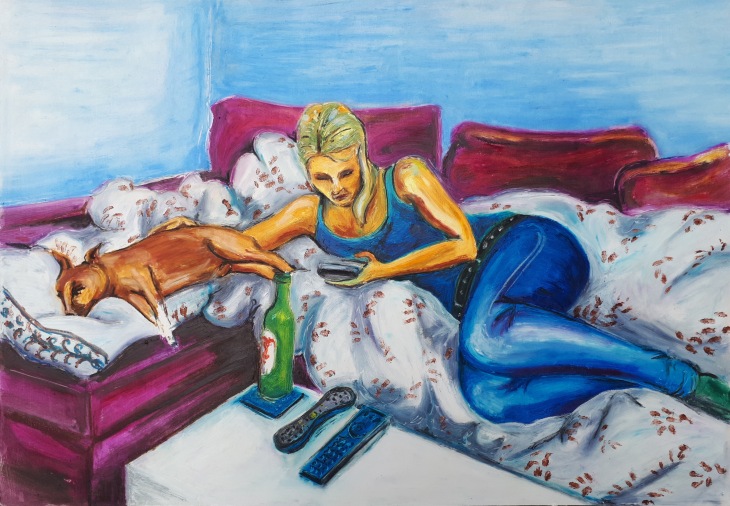
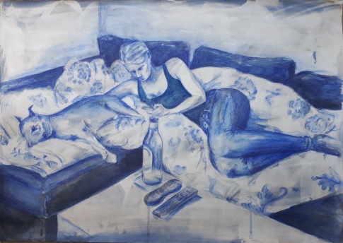
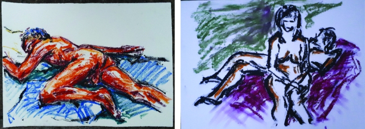
For this assignment I used Oil sticks, oil pastels and spirit on a prepared piece of A1 mount board that I coated with gesso first. I sketched out the composition in my sketchbook then lightly in Conte stick on my A1 board, before drawing the figure and sofa in oil pastels. I spent about 4 hours in total, building all my areas up in tonal value, then using a cloth blending the oil pastels.
I noticed having got nearly to the end that I had somehow got her bum too big, so I had to wait until the oil pastel had dried a bit before I could make amendments and build the white of the duvet back on top of the dark blue of the jeans.
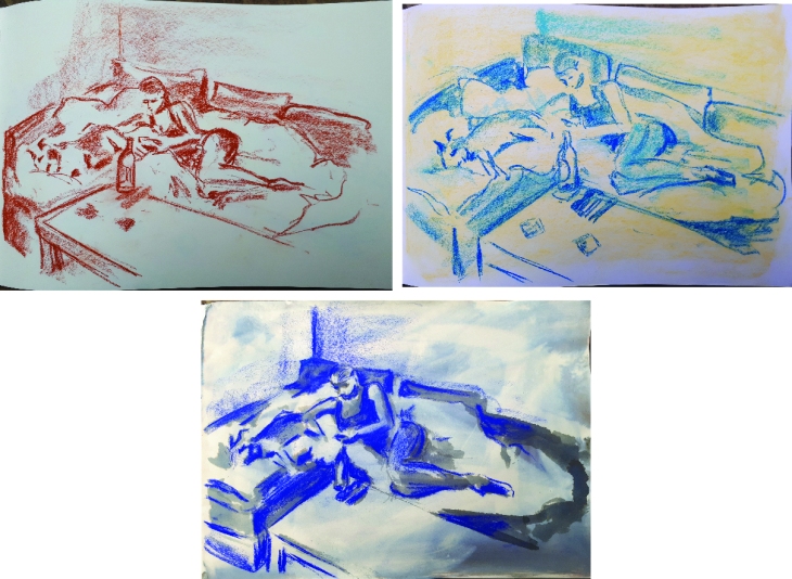
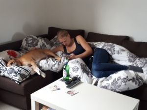
For this reclining pose I wanted my model on the phone to continue this modern social trait in my work. I also really felt it important to include her rescue dog Leon that having suffered cancer has had Chemotherapy treatment and is in recovery. They are very close so a portrait of her would not have been complete without Leon in it,
I still feel that I am experimenting with the Oil sticks, so this was an opportunity to have another go at them and see how they worked when producing a piece of work based on tone. I liked the contrast of the light walls, dark sofa, light cloud duvet an dark model. I have interpreted the pattern on the duvet and simplified it, I think it adds a dimension to the cloud that gives it much more interest.
I also used a rubber tipped tool to scratch in a few highlights and give some textural interest to the drawing. Before I have made some alterations to the picture I am not that happy with it as a finished piece, I think stepping back for a day or so is necessary to see the erky bits and know confidently howto fix them.
I thought that I had got the composition that I was happy with fairly quickly having done it in my sketchbook first, however I think the sofa and figure could have been placed higher in the frame on reflection having see the finished piece.
Working with the oils has evolved for me. The first times I used them I was really just drawing with them.
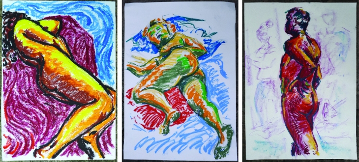
But then I began to smudge them and realised that this gave a whole new dimension to the drawings, and creating a gradated tonal value was achievable with a cloth and sometimes a bit of white spirit. It is from these drawings that I have chosen to draw from for this final assignment piece. The last example was the first time I had used this medium without enclosing the figure in a black line.
Then having got home and re-read the brief I wondered if I should not have used colour for my tone, maybe I should have done it in monochrome as this would have accentuated the use of tone. I had to work from the photographic reference to complete this second version.

This version was built up in a much more blocky fashion, looking harder at the tonal values. I used Quink ink, Lagoon Blue Inktense pencil with wash and a bit of blue Conte stick. I think the pattern on the duvet really helped the cloud like effect that I wanted to convey. I had prepared the background with a Qunk ink wash that I then bleached back with a watered down bleach solution to give a sandy yellow textured ground which gives the finished image a slightly muted feel. I like the building up of layers in the different mediums. This method is far less forgiving as mistakes are not as easily rectified as with Oil Sticks that you can just go over once dry!
I used a brown conte for the first sketch, but felt it too stark, so for the second sketch I gave the background a pale yellow which warmed it up. The final test sketch was done on top of a Quink ink bleached background, this was the one that I decided to take forward.
I wanted to have a fairly soft look to my drawing and took from these examples the need to ensure I had enough really dark areas that would help bring the light areas forward.
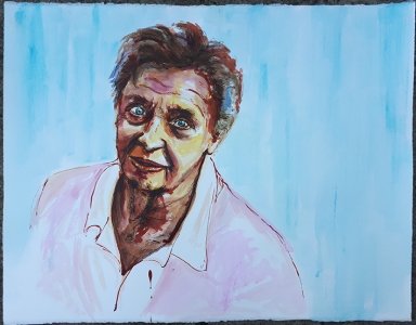
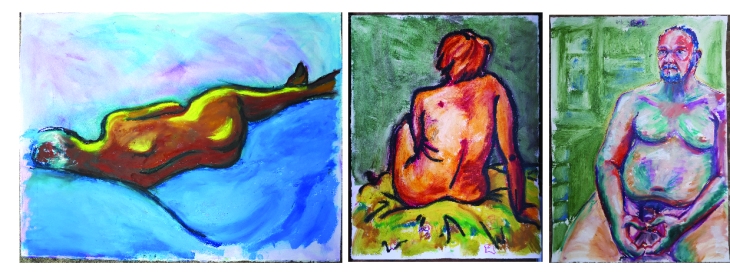
For this part of the assignment I decided to draw Lady Jill Freud who I had met at my life drawing classes. I had to do the portraits from photographs as it was not possible to arrange a time for a sitting. I had drawn myself 5 times in the previous exercise so fancied a change. From the selection of the few photographs that I took I chose one where I was slightly looking down at my model. She often wears pastel colours, so I wanted to keep my palette in that tone.
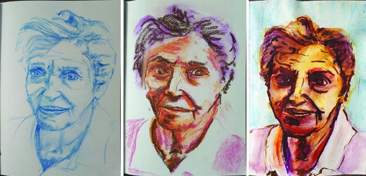
First of all I wanted to get used to drawing her face so I sketched it in blue Col-erase. I then wanted to experiment with what medium I would do the portrait in so I had a go at soft pastels, but I wasn’t convinced that I would incorporate the ‘line and tone’ aspect of the brief. So the next sketch I did in acrylic and ink line.
The first drawing I did took about 2 hours and is done in wax crayons and acrylic paint with some candle resist in the background on Royal watercolour society 300gsm Hp paper (52x65cm). I incorporated the abstract spotlight as my model is an actress and the pale blue background compliments the pink jumper. I off set the position of the model to the left as it looked a bit boring set in the centre, I think that the background and the figure fight a little, the wax crayons are also a little clumsy, but I am glad that I had a go and experimented and so I decided to have another go.

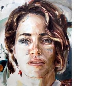
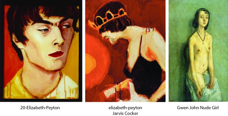
For this second drawing I used acrylic paint, Ecoline and calligraphy ink on Royal watercolour society 300gsm NOT paper (52x65cm). I find the space around a little awkward, but engaging at the same time. The ink went a bit off course, but that grew on me too. I think this is the better of the two portraits, although maybe the chin and mouth are not 100% accurate. I drew on the research that I had done for the previous two A1 drawings, particularly that of Elizabeth Peyton, at the Royal Drawing School classes the tutor had alluded to my work having a resonance with her work, so I wanted to expand on that. I like the looseness of the line that describes the body and the colours suit my subject as these are the colours that she wears.
As a final reflection I can say that with the addition of my attending life drawing classes throughout this part 4 of the course, I have really enjoyed drawing the figure, and feel that I can see development and progression of my work as I have experimented with different mediums. Drawing the figure I feel that I have loosened up from my tight drawings of buildings, and working at an easel has enabled me to work more with my whole body and stand back to observe what I am drawing in a more productive manner.
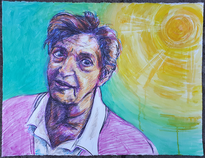
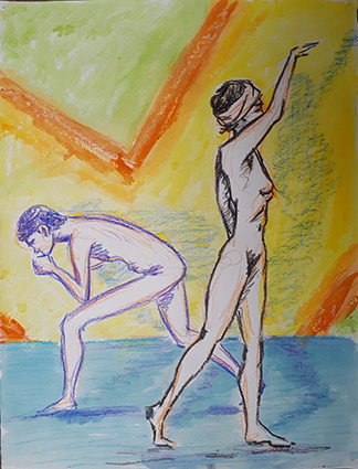
In the spirit of trying out new classes, I met a friend at the class that she had been attending in Covent Garden. I was fortunate enough to get an easel as I like to work standing up and with various materials that would be difficult if I had a board on my lap.
This final pose is on A2 pre-prepared collaged cartridge with news articles from the Saturday Telegraph 18th August 2018, It is drawn in Quin ink, conte stick and Rembrandt pastel. This is a style that I have been working on for a while and it is beginning to grow as a method, I am quite pleased with this sketch.
This 20 min pose is on A2 cartridge done in Quink ink and Faber Castelle PITT Pens. This style suits this length of pose, roughing outn a thin M pen then adding a thicker line with either a C or B head.
This 20 min pose is on A2 cartridge done in Quink ink and Faber Castelle PITT Pens. adding the pattern of the parquet floor gives the sketch a new level of interest as do the drip lines that I quite like to add.
I decided to do all my warm up poses on the 22×17″ wallpaper, thisway I can rough the pose out quickly in a light wax crayon, I favour light orange, then I can define the line later at home with a darker colour or black and add some colour with poster paints and texture with wax crayons or wax candle. I probably spent about 10-15 mins on each sketch at home to finish them
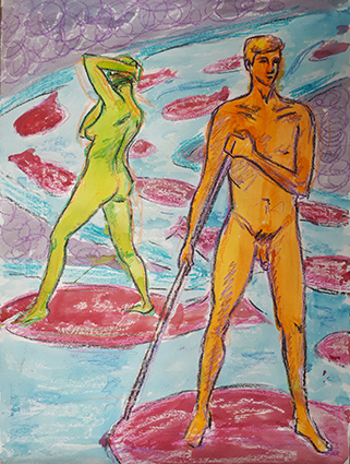
I have begun to realise that it is quite fun to put the poses into a different environment when I work them up at home, the pole made me think of punting that they could be riding on floats like blood cells down a river/vein.
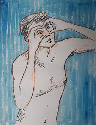
The close-up bold sketches work well with a simple background, it reminds me of pyjamas!
And adding colour to the figure makes the drawing look more complete, especially set against a textured background.
I think it also works well putting the figures into a three dimensional space, especially including shadows.
This pose reminded me of a James Bond Poster, the circles are formed by with the wax candle.
It was interesting going to another class, and the models were very good. I am quite enjoying developing the drawings further at home.
Having engrossed myself in Joan Wisdom’s work for a week or more absorbing her story and drawing in her style to convey it, I was looking forward to my life drawing class so that I could have a go at doing some life drawings in her style and with the same materials as I had been using. Unfortunately the class was closed for summer break!
Returning home I decided that I still wanted to do some life drawings, so I took life drawings that I had done in previous classes and looked for some poses that I thought conveyed something that had an affinity with mental health and decided to use the patterns inspired by Joan wisdom’s work as graphic vehicles to illustrate the message.
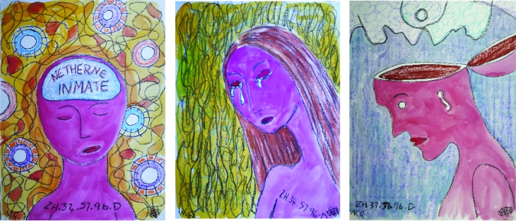
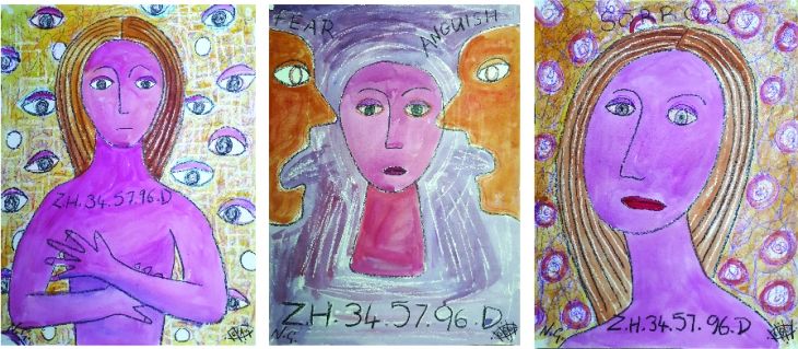
I wanted to use this pose to illustrate the subject of the drawing which is based on Joan Wisdom exploring the experience of being committed to a Mental Hospital and what that actually meant for her, and in particular how she felt about being labelled with a number that was to become her identity.
The usual impression of the nude in artwork is often portrayed as a muse or as a sexual being, So I thought that it would an interesting exercise to combine the model nude with feelings that are symptoms of mental health problems.
Using Wax crayons, a T-Light candle that I used as a resist and poster paint on 22 x 17 inch lining wallpaper. I drew all figure and background in using the wax crayons first, textured the body and background with the wax from the candle, which is not so easy as you cannot see where you have drawn with it as it is clear! and then adding watered down paint layers. Finally to finish the image off I used a black oil pastel to create the heavy black line. The oil pastel gives a greater depth of colour than the black wax pastel.
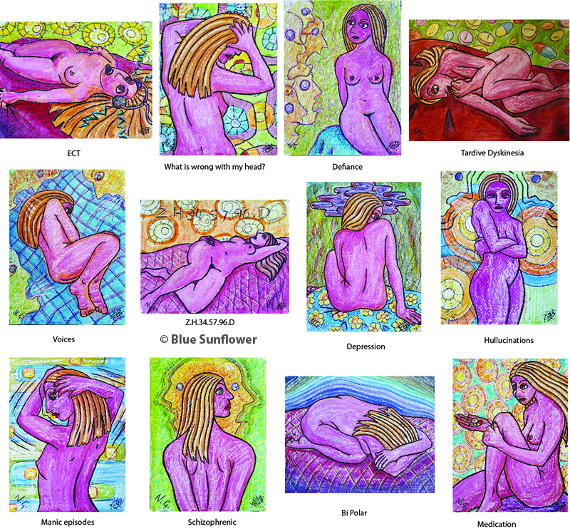
With the image Schizophrenia I wanted to convey the confusion and detachment that the condition can cause the sufferer to feel, the voices or Hallucinations and confused thinking and desire to possibly withdraw form society. The turning away of the head shows a dis-interest and the pose indicates a level of trappedness. ‘Medication’ as the name implies, looks at the drugs that are prescribed to help manage the conditions. Taking medication daily is not always easy and the fact that taking medication can often have its own side effects.
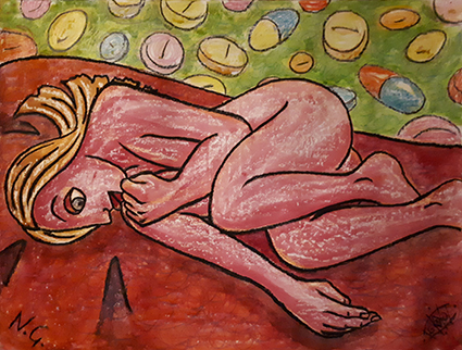
Tardive Dyskinesia is a possible side effect of anti-psychotic medication. It can cause the body to make sharp twitching or slow twisting movements which you can’t control. It can have lasting effects even if the medication is stopped. The pose is fragile and vulnerable with a sense of fear and uncertainty.
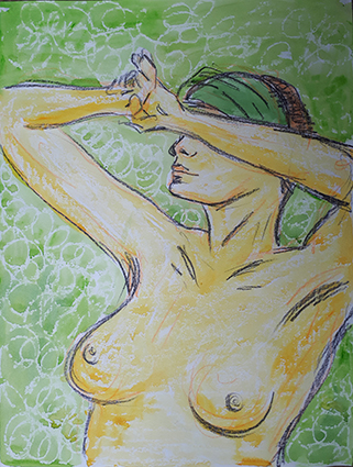
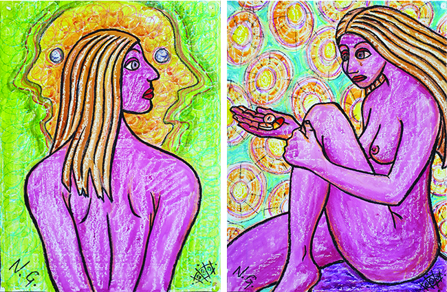
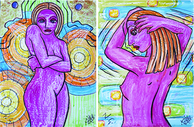
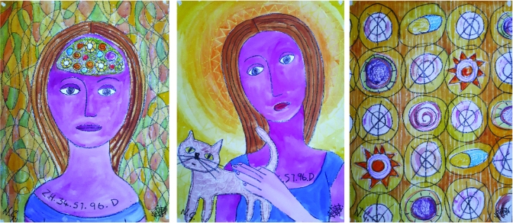
Drawing on the information that I had gained from looking at Joan Wisdom’s work and looking at such websites as www.Mind.org.uk I have selected 12 life drawing poses that help convey different aspects of Mental Health conditions. I wanted to look at what it must be like to be affected by mental health conditions and not understanding why you felt different from everyone else in ‘What is wrong with my head?’. The complex interconnection of the patterns in the background imply the confusion and complexity of such things as the chemical imbalances that can occur in our brains. Using graphic elements such as the cloud of depression also helps convey the emotion of the condition. The inclusion of flowers on the fabric indicates bright and positive aspects of life that remain unseen by the person suffering from depression
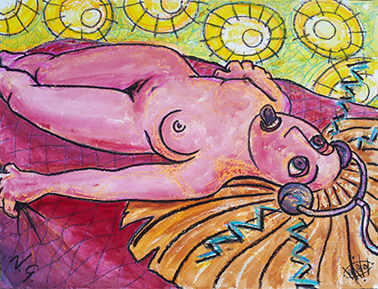
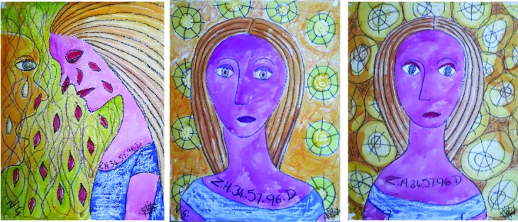
I find this image really powerful; the fact that a patient has a protector to bite on while experiencing ECT is very telling of the effects of the treatment. It was not necessary to shave the head for this treatment which is now often done under anesthetic, but this was not always the case. ECT was used far more widely in the past, today it is only used for a few specific conditions. The treatment can be painful and can cause memory loss and feelings of detachment, which pass after a short time; a few hours or days.
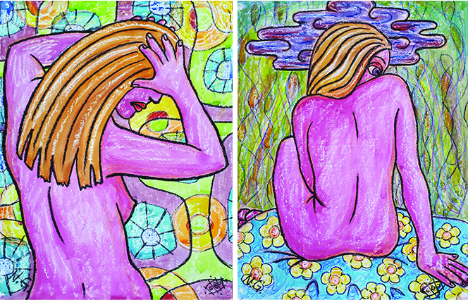
Hearing voices is a fairly common problem and is experienced by many people, for many the voices are not a problem , however for some people the voices are frightening and distracting. The figure surrounded by the voices and retreating into a fetal position I think gives an impression of what it must feel like. In ‘Defiance’ I wanted to show the strength of suffers as they learn to manage their particular problem, her body is slightly recoiling, but she faces her demons to let them know that she will not let them beat her.
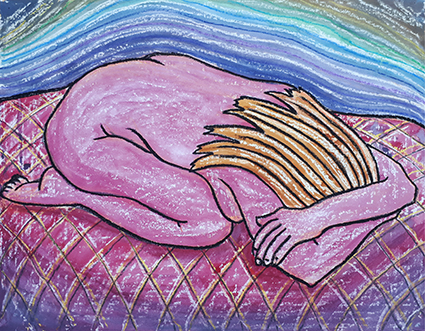
With the Bipolar pose I wanted to show an illustration of that feeling of wanting to be swallowed by a black hole when in a depressive state. Bipolar symptoms include both manic (high) and depressive (low) episodes and is characterized by these mood swings. Using the contour lines and the gradated toning that I drew from Joan Wisdom’s artwork along with the darker cold blues wrapping the womb-like warm burgundy reds in the center where the figure curls up to hide in a classic ball-like pose.
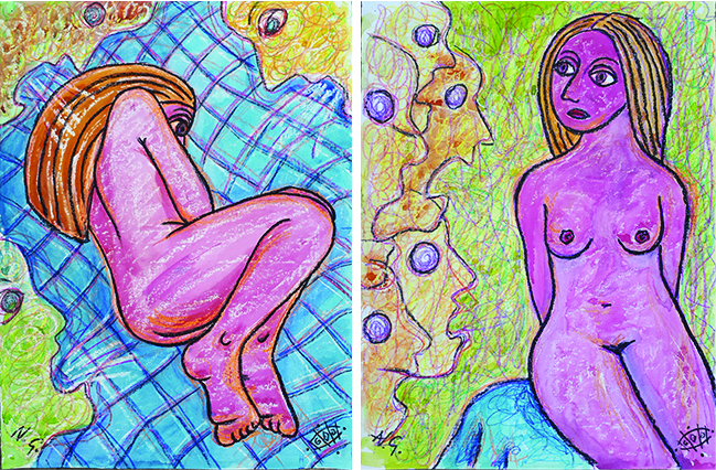
I also wanted to explore Hallucinations where the sufferer will see and hear things that others cannot, a common trait that sufferers experience while in a psychosis, or are having a psychotic episode. This is when they are said to loose touch with reality, or suffer disorganized thinking or muddled speech. Finally I explored Mania or Hypomania where the sufferer will experience manic episodes of overactive thoughts, these can lead to states ranging from creativeness to confusion.
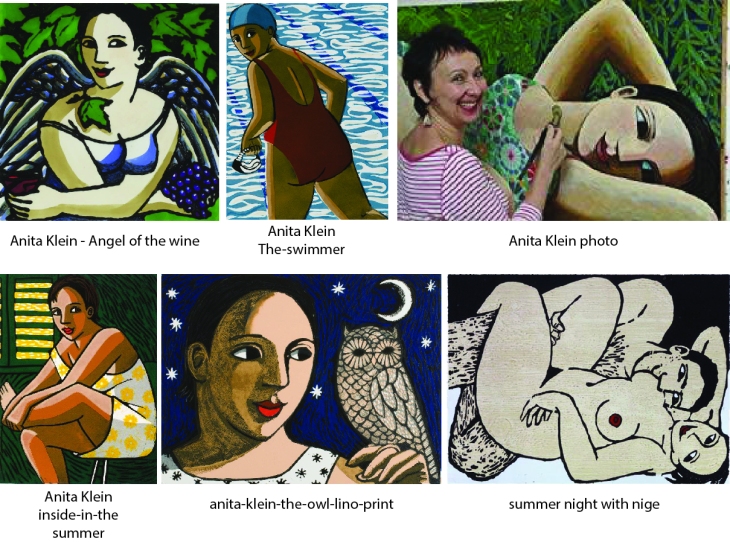
I have chosen to combine this exercise with some research work that I have been doing with Outside In on their Step Up Course at the Wellcome Trust looking at the Adamson Collection which is where I discovered the work of Joan Wisdom in the uncatalogued archives. I have written blog posts on my research on my website www.bluesunflower.com documenting my research and my study of her work.
Having looked through all of the work in the Adamson Collection held at the Wellcome Trust that Joan Wisdom produced while she was a patient at Netherne Mental Hospital in the 1960’s, I really felt that I had made a connection with her.
My task was to produce an artistic response to her work, I was a little unsure about how that would actually come to fruition, but I made a conscious effort to be completely intuitive about the process and open minded about what I finally produced.
My first thought was to make a short film of Joan’s work, looking at the textures and compositions in detail and compiling them in After Effects with tracks, pans and fades between the works and put to music. I started, but after only a few image placements I decided that this was not the way forward for now, although this may be an avenue that is worth pursuing in the future.
What I actually had an overwhelming urge to do was to have a go at experiencing producing artwork in the same way that Joan would have done. I set myself up with an easel and a table and purchased the materials that would have been available to Joan in Edward Adamson’s studio at Netherne; Poster Paints, wax Crayons, a thick and thin paintbrushes and some Lining Wall Paper folded and torn into pieces of the correct size, approximately 22 x 16 inches, which I then pinned to a wooden board set on the easel.
I looked really hard at Joan’s work, noticing which lines she drew first, what order the layers were put down in and what colours she used. I wanted to keep all my drawings faithful to the original source so I did not rough the shapes out first, I drew everything straight up having just planned and thought out the image in my head before I started. This method is quite open to mistakes and error in placement of line, colour and wax resist, but I felt that authenticity to the process was vital.

I tried to incorporate elements and patterns that I saw in Joan’s work while imagining what it must have been like for her living at Netherne derived from the clues that I found in her work.
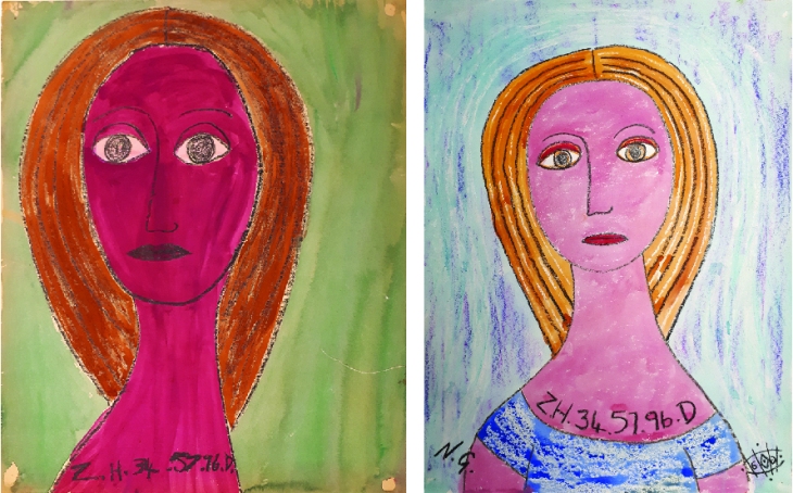
I wanted to crate images that Joan herself might have painted, in the same style and by the same rules. The image ‘Crying’ I later realised did not conform as Joan did not draw three-quarter views of the face, she only drew them face on or in profile, she also did not draw realistic tears, she drew tears as petals in red, and in this drawing I feel that she is a little out of character.

I looked closely at Joan’s paintings and tried to apply the colours that she used for her complexion when she was feeling emotional or unwell to try and convey how she felt that she was being treated. I emulated Joan’s Lost Souls painting by giving the lost souls a Netherne makeover by turning them into flowers, I think in an effort to give them some identity.
I always thought that Joan’s patterns would make great wallpaper designs so I had a go at conveying them in that way. I wondered if the circles that she used prolifically in her designs reflected in any way the drugs that she was given, so I wanted to include this element in the design. I felt that I needed to add some more cats to the collection, so I included Joan stroking the cat together in the picture as I felt that this showed a tender side to her and her relationship with the cats. The last image reflects what she felt the doctors had done to her brain with their treatments.
.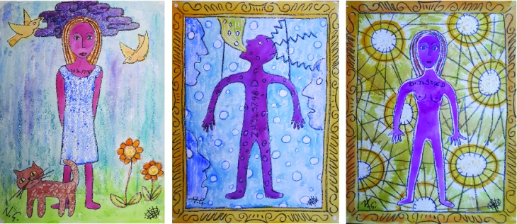
Joan occasionally drew a full figure of herself and rarely drew scenes, the only one being her ‘Bird and Cat’ drawing. I noticed that in the images that she wore clothes she wore just a simple blue dress, and where she depicted herself naked she made herself androgynous with her hospital number emblazoned across her. She writes her hospital number on many of her works, so I applied that same rule to my drawings, it was a form of identifying herself in an impersonal manner. By placing her in a frame I am alluding to the focus and scrutiny that she must have felt. In the spotlight image I gave her breasts so as to give her her femininity back.
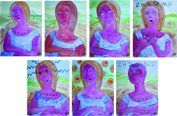
Having by chance caught a glimpse of The Mona Lisa I realised that Joan had a similar mystery about her so I produced a series that I felt told her story. By this time I had realised that the images that I was painting told Joan’ story and would work well as a slide show movie. Having finished this series, I then realised that I had to do the whole series again, be more specific about the story and put her in a frame, so I did them again!
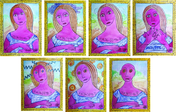
In this second series I included the depression cloud in the second image and the screaming faces in the background of the third. I think they make a far better series with the frames included.
I wanted to explore how Joan would have felt and emulate some of her works that expressed her emotions. By now I have got better at using the wax to create texture and the amount of pigment and water to use in the paint to get the right effect.
I re-did the crying image to make it more true to Joan’s original and finished by doing a couple of portraits of her to conclude the story that the movie slideshow would tell.
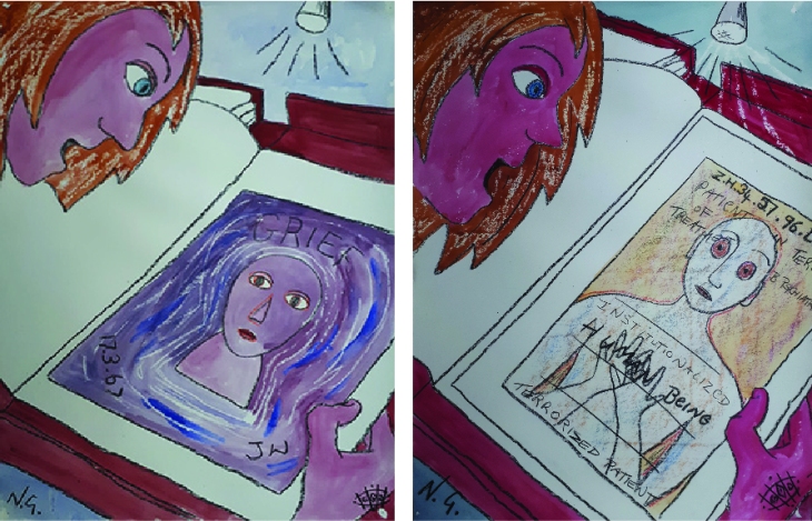
I realised that for my story I would need an introductory image so I drew myself looking at her work, which would also familiarize the viewer with her style of work. The first one I drew I was looking at her grief painting, however later I realised that I should use the ‘Institutionalized Human Being’ painting as this was the one that I discovered and managed to get rightly re-attributed to her and was therefore a more pertinent addition to the story.
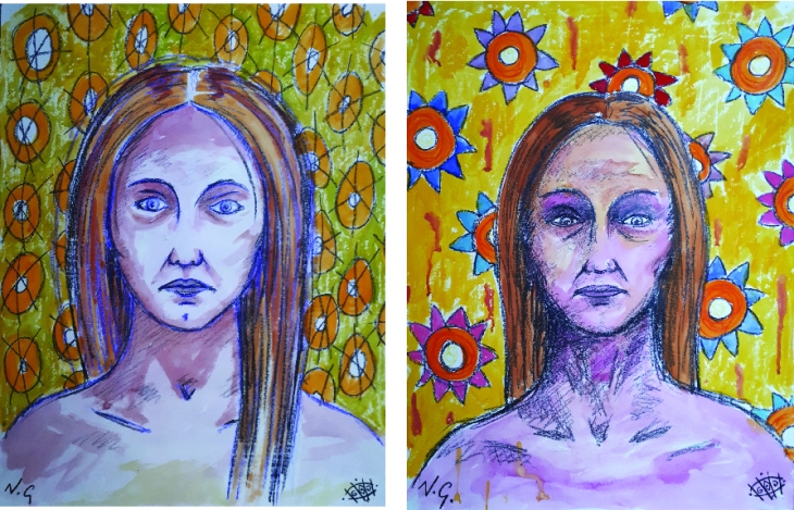
I am doing a Distance learning drawing and painting degree for which I had to produce a portrait of someone that I imagined or had only had a fleeting glance of. Taking clues from her paintings and keeping elements of her style (wax crayons and poster paint on wallpaper) I have tried to imagine what Joan Wisdom may have looked like. I drew on the delicate features that she expresses in the profile images, her long straight brown hair and slightly undernourished frame, drawn from the fact that she mentions the lack of nourishing food at Netherne in her work. Unsure as to how old she was, I have tried a couple of age ranges, possibly in her twenties and the other in her 30’s or 40’s.
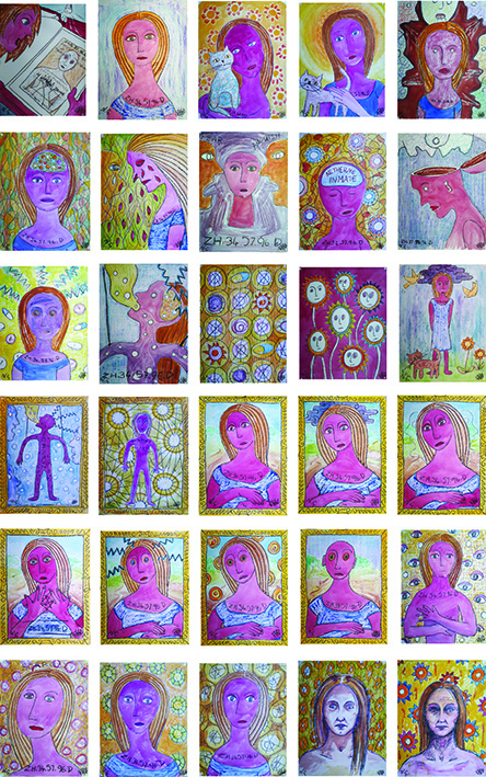
I have collated all the imaged that I included in the Slideshow movie in order into a single portrait of multiple images as one that tells her story in a portrait.
By Niki Gibbs
August 2018
I have been working for the last few weeks in wax crayons, candle wax and poster paints so I decided to apply the same technique to this session of Life drawing.
All these examples are timed as to the length of the pose. In all cases I added the background, the paint and the heavy black lines later at home.
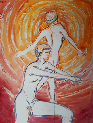
The models are Jose and Cordi
Having drawn both models throughout the hour long pose firstly in light orange wax crayon to rough it out then refining in steadily darker tones of different colours I had the composition completely drawn up by the end of the pose. I added the background as a sort of city-scape inspired by the patterns that I had been drawing while studying the work of Joan Wisdom. I wanted to reflect a 1960’s feel to the shapes, and by leaving the background line in wax crayon and the line defining the figures in darker oil pastel, I think the two planes differentiate well. I like the fact the the two models are passively interacting as they gaze across a landscape as if in a high-rise building.
Here I just wanted to accentuate the figure by highlighting the background. The texture is created with a wax candle to apply some resist to the paint, I think this simple technique really accentuates the figure.
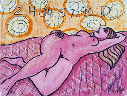
With this pose the model had a lot of weight on her wrist and she did really well to hold the pose for so long. The lean of her body inferred that she was looking over an edge at something, so I put her in a slightly romantic position as if she were gazing into a pool of water. I think is quite interesting to re-visit the drawing later and add a few lines that change the environment in which the model is situated.
This was a strong pose from the model hat I wanted to capture as if a statue. The head is a bi big, but I like the monotone quality of the Quink ink wash that I added at home with the black wax crayon line.
Roughing out this pose in blue gave her a different feel, I added the black line in and the paint wash at home.
I think adding a wash to the life drawing at home really gives the sketch a new dimension that I think enhances the figure well. It is quite liberating to sketch in wax crayon. They are fairly unforgiving as mistakes show, but by using lighter colours to begin with and defining with successive darker colours is a good manageable way to approach the quick poses.
Research artists’ self portraits. Look at historic examples such as Rembrandt and Van Gogh as well as some self portrait styles that have emerged in contemporary art. How do contemporary artists approach tone, medium, pose, story etc. Try looking at Tracey Emin’s self portraits.
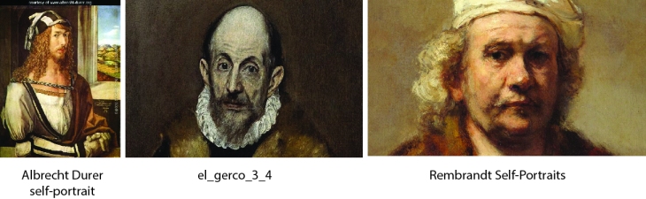
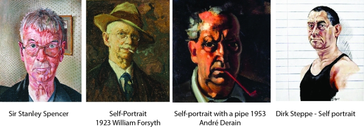
Self portraits have long been a genre that artists have included in their repertoire or body of work. Self portraits can be very revealing of the artist; They can tell us what the artist looked like, the era the artist lived by their dress, sometimes the depict themselves with tools of their trade, an accessory such as a pipe.
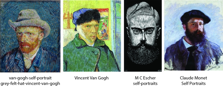
Artists also use the Self Portrait to example a style of painting and to depict themselves at different stages and ages throughout their lives.
Artists often paint Self portraits in the style that they are best known for, but sometimes use them as an experiment to try out something new.
Contemporary artist Bryan Lewis Saunders is a Tennessee-based performance artist who has a vast collection of nearly 9000 self portraits bound in hardback sketchbooks. The series he is well known for is the series of 50 Self Portraits done on 50 different drugs done in 50 consecutive days.
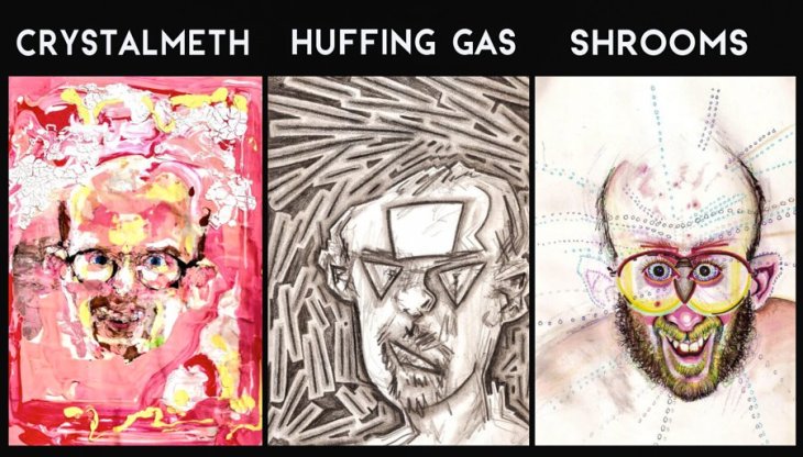
The collection is a real exploration of different styles and emotions, some I think depicting how you might expect to feel on the drug, some free experimentation of actually how you actually feel on the drug and the resultant image showing how the drug affected the ability of mark making.
Bryan Lewis Saunders does not necessarily want to be known for his 50 portraits on drugs, yet this experimentation does remain one of his most notable bodies of works. A single self portrait can come to define an artist in our memories, often if you say an artist’s name, it is their self portrait that helps you put their rendition of their face to their name.
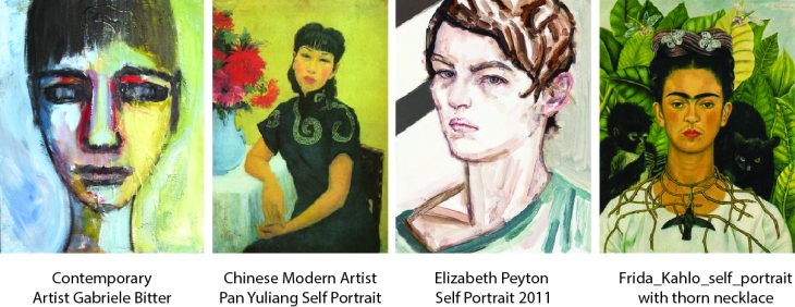
I wanted to have a look at some female artists self portraits. The selection that I have chosen all depict strong women, often face on to the viewer and all fairly colorful.
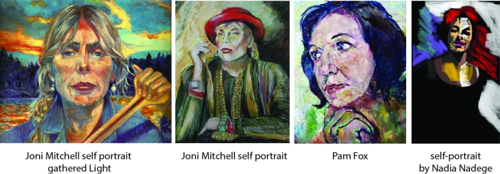
In the case of Joni Mitchell, looking at the two examples, depicting one set on a canoe in the wilderness, the other smoking; it is interesting how these two images tell us quite a lot about her ; how she dresses, her like of the outdoors, that she smokes.
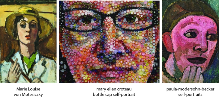
Self portraits also do not even have to be drawings, Mary Ellen Croteau used bottle caps to construct her self portrait, to me this shows an interest in the environment and our social use of plastics as well as just using a recycled/found medium.
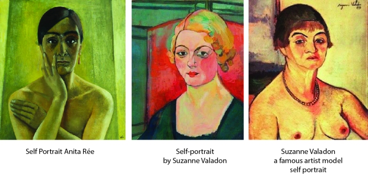
Suzanne Valadon’s piece was the only one of a female artist that has depicted herself naked, I know that Lucian Freud has done naked self portraits. This is both bold and unashamedly open about themselves. Suzanne, however being a life model, it is appropriate for her to depict herself in this way.
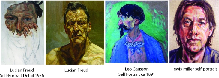
The colours that the artist chooses to use as well as the composition all go together to give us an impression of his or her personality. Close-up views, bright colours and extreme angles can be very dramatic as a way of conveying personality.
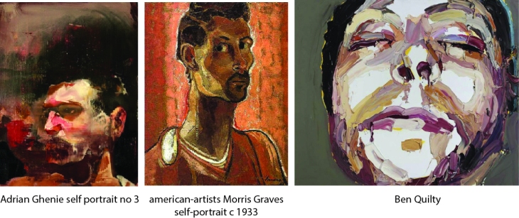
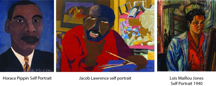
I also wanted to example a couple of black artist’s self portraits which here are done in distinctive styles using a fairly flat palette.
Pushing the boundaries of self portraits within a style can be seen in the following 3 self portraits, a slightly cubist, an abstract and s really sketchy style.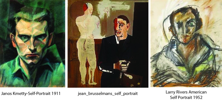
Pablo Picasso is also very well known for his very striking styalized work and bold use of line and colour and against Man Ray’s boxed self portrait, both present a very individualistic approach.
Th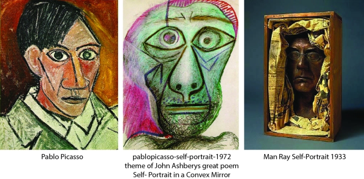
Self portraits are very often done face on which creates a very intense stare, however just varying this face on with a tilt of the head, a change of focus or composition can create a very different final result.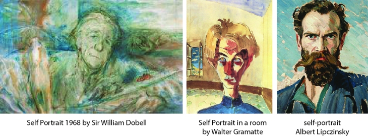
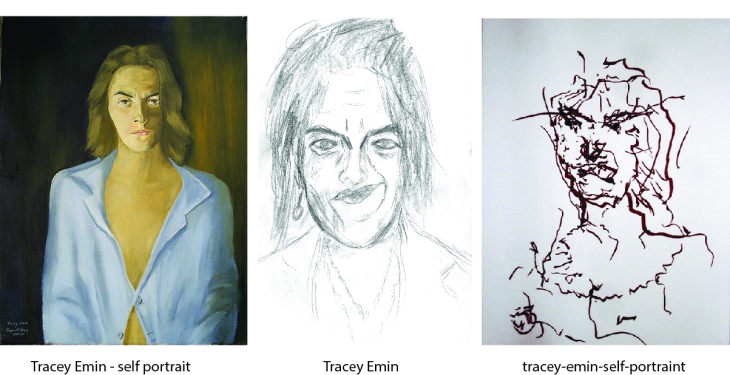
I managed to find these three distinctly different self portraits by Tracey Emin which really example the range of her work. They have a lot of energy and do not always represent absolute reality, but she does explore many ways of producing her work from mono-prints, blind drawings, embroidery and sketches.
Looking at such a wide range of artists and the many styles that they work in is very inspiring. I would hope to have some of their ideas seep into my own work, even if it is just encouraging me to free up and experiment a bit with my own styles.
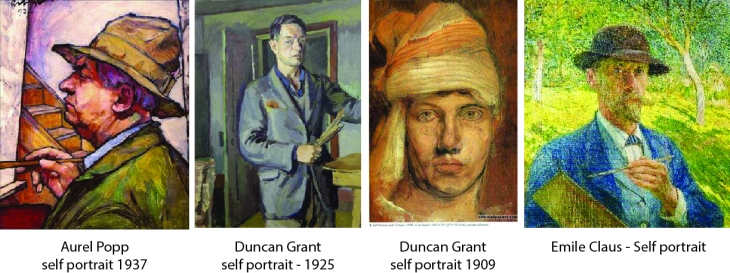
https://en.wikipedia.org/wiki/James_Paterson_(painter)
http://theplaidzebra.com/this-artist-drew-self-portraits-on-50-different-drugs-photos/
