Part 5; Hornsey Road Fire Fighters working sketches and Research
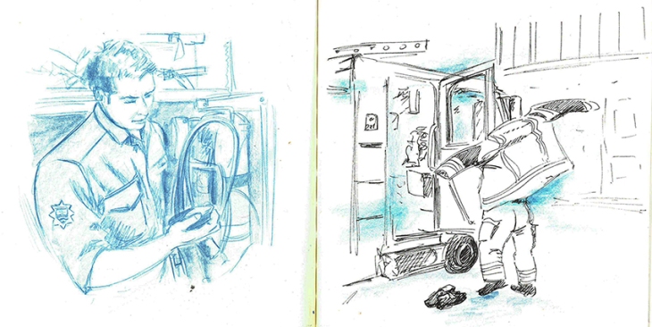
I went to Hornsey Road Fire Station to photograph the Fire Fighters following getting permission from the Station Chief. I did not really know what to expect, whether I would just get some portraits of crew members and shots of the Fire Station or something more. As it turned out the crew were really accommodating and allowed me to photograph them as they went about their regular and daily testing procedures. I could not really draw there as they had no time to pose for me, and would tend to get called out at a moment’s notice, so it was better to do my research photographically and sketch from that reference later.
From a wide selection of photographs I selected some of the ones that I felt made good story telling compositions as well as the ones that I felt would make good portraits.
It was the process of selecting the storytelling images and sketching them out that I decided to divide my project into two paths, one series of portraits that I would do in oil pastels, another that I would do in a more sketchy style that represented daily life.


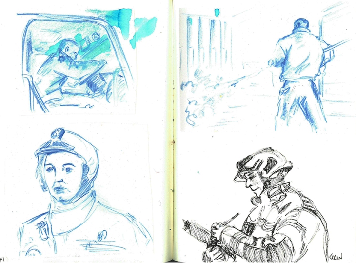
The conditions that I had agreed to with my contact at the Fire Station stipulated that I would represent the crew fairly and in correct uniform in my artwork, so although I was not after a photo-real look I wanted to have some level of accuracy about my drawings. I felt that if I was to have accurate sketches, I could introduce an element of looseness and energy into my drawings with the colour element. I drew on some of the research I had done on the recommendation of my tutor and looked at a few suggested artists:

Andy Warhole by Marlene Dumas
I really liked the simple use of limited colour, loose organic painterly brush work and slight translucency of the colour whilst still retaining an element or realism and accuracy.

Joan Eardley Two Glasgow Lassies 1962-3
With Joan Eardley’s work I liked the sketchy line work over the rough colour base. The characters are maybe more stylized than I wanted to go for, but there is an energy in her work that I wanted to draw from.

Franck Lesieur Jenny Saville 2011
This close up by Jenny Saville was inspiring for the painterly brushwork. I like the powerful composition, but did not want to create cropped portraits for my work as I wanted to show the Fire Fighters in their official kit, but I did want to take from her work the layering and painterly effect in the tonal aspect of her work and apply some of this to my oil pastels in the colours and mark making that I used.

Nick lepard – Radiometric and Speed Dating 2009 oil on canvas 66×54 inches
With Nick Lepard’s work I wanted to draw from the energetic mark making with colour to bring out the light and dark areas and loose abstract background.

Yan Pei-Ming – Life Souvenir
Looking at Yan Pei-Ming I was inspired by the monochrome and drippy nature of the overlaid mark making, an aspect that really wanted to utilize.

Jerome Lagarrigue -The Poet and the Moon
This image by Jerome Lagarrigue I also found very inspiring, His work was being exhibited by Galerie Oliver Whitman in Paris. The focus on the face with the additional smaller background focus, as well as the markmaking were aspects that I wanted to draw upon for my portraits in Oil Pastel. I did decide to do the backgrounds of my portraits in Conte Pastel and very minimal as this would knock the background back while still showing enough to give the image context and hopefully bring more focus to the portrait.
The final image that I wanted to draw from as inspiration was one that I did with spot colour in Part 4 of Drawing 1:

I had really enjoyed using pen to draw with and the way the red brought the image to life and represented the England Colours. In my Fire Fighter sketches I wanted to pull the main colours that stick in your mind when you think of Fire Fighters which is Red and Yellow. I wanted the colours to sit on top of the paper rather than sink into it as felt that that would help accentuate the detail.

I put the base down of Quink Ink to create the monochrome look over the drawing, from the sketches I found that it was better to draw the image first with permanent pens, I preferred the Faber Castelle PITT pens after buying and testing a number of brands to ensure that they did not bleed when I went over then with a wash. My tests explores mixing the colours with water to thin the colour and mixing them together to get an orange. I realised that I had to be careful as acrylic inks are very unforgiving, no mistakes allowed!

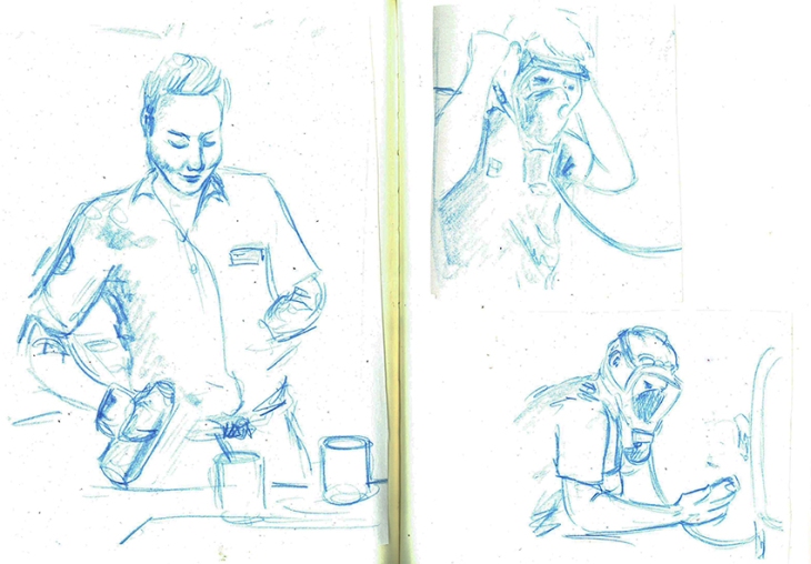
After one visit to the Fire Station when I was asked to do a drawing of the whole watch I did some experimentation with how I might represent them. I tried doing a mixed size compilation composition, however I moved away from this idea in the end in favour of depicting the crew in official line up for my oil pastel series as I felt this gave the individuals more authority and respect.

Having drawn Green Watch and then red Watch in a line up, I decided that as a series it would be more interesting to draw the watch getting into uniform, so when I came to draw White watch I took lots of pictures of the individuals getting ready and put the chosen images together into the composition.

I felt that having the figures in action made for a much more interesting image, and as a series it would tell the story of the sequence of dressing that they had to go through in order to wear their full kit.
I found that I was more confident in bringing a compilation of images together to make up my composition as I had completed more of my drawings. The fact that I had not captured the image that I wanted in my research photographs no longer mattered so much as I could tell the story in my image by bringing together material from different photos.
Research:
All accessed January 2019
marlene dumas portraits
Jenny Saville portraits
https://www.google.com/search?biw=1366&bih=632&tbm=isch&sa=1&ei=yRjGW-OHCIKugQb55774BA&q=jenny+saville+portraits&oq=Jenny+Saville&gs_l=img.1.1.0j0i67k1j0l8.18724.20763.0.22583.2.2.0.0.0.0.203.345.0j1j1.2.0….0…1c.1.64.img..0.2.343…0i30k1.0.MYLOE_aaKZI#imgrc=Jpgj5rHQuo8PIM:
Nick Lepard’s paintings
http://koikoikoi.com/2010/05/nick-lepards-paintings/
Yan Pei Ming
Joan Eardley
