Assignment 5 – Sketchbook and Research

Part 5; Hornsey Road Fire Fighters working sketches and Research

Sketch Training_web

I went to Hornsey Road Fire Station to photograph the Fire Fighters following getting permission from the Station Chief. I did not really know what to expect, whether I would just get some portraits of crew members and shots of the Fire Station or something more. As it turned out the crew were really accommodating and allowed me to photograph them as they went about their regular and daily testing procedures. I could not really draw there as they had no time to pose for me, and would tend to get called out at a moment’s notice, so it was better to do my research photographically and sketch from that reference later.

Sketch Training individuals_web

From a wide selection of photographs I selected some of the ones that I felt made good story telling compositions as well as the ones that I felt would make good portraits.

Sketch checks_web

It was the process of selecting the storytelling images and sketching them out that I decided to divide my project into two paths, one series of portraits that I would do in oil pastels, another that I would do in a more sketchy style that represented daily life.

Sketch Changing Kit_web   Sketch Map_web


The conditions that I had agreed to with my contact at the Fire Station stipulated that I would represent the crew fairly and in correct uniform in my artwork, so although I was not after a photo-real look I wanted to have some level of accuracy about my drawings. I felt that if I was to have accurate sketches, I could introduce an element of looseness and energy into my drawings with the colour element. I drew on some of the research I had done on the recommendation of my tutor and looked at a few suggested artists:

Marlene Dumas A Warhol

Andy Warhole by Marlene Dumas

I really liked the simple use of limited colour, loose organic painterly brush work and slight translucency of the colour whilst still retaining an element or realism and accuracy.

Joan Eardley Two Glasgow Lassies 1962-3

Joan Eardley Two Glasgow Lassies 1962-3

With Joan Eardley’s work I liked the sketchy line work over the rough colour base. The characters are maybe more stylized than I wanted to go for, but there is an energy in her work that I wanted to draw from.

franck-lesieur-jenny-saville-2011

Franck Lesieur Jenny Saville 2011

This close up by Jenny Saville was inspiring for the painterly brushwork. I like the powerful composition, but did not want to create cropped portraits for my work as I wanted to show the Fire Fighters in their official kit, but I did want to take from her work the layering and painterly effect in the tonal aspect of her work and apply some of this to my oil pastels in the colours and mark making that I used.

lepard-Radiometric-and-Speed-Dating-2009-oil-on-canvas-66x54-inches

Nick lepard – Radiometric and Speed Dating 2009 oil on canvas 66×54 inches

With Nick Lepard’s work I wanted to draw from the energetic mark making with colour to bring out the light and dark areas and loose abstract background.

Yan Pei-Ming - Life Souvenir

Yan Pei-Ming – Life Souvenir

Looking at Yan Pei-Ming I was inspired by the monochrome and drippy nature of the overlaid mark making, an aspect that really wanted to utilize.

Jerome Lagarrigue -The Poet and the Moon

Jerome Lagarrigue -The Poet and the Moon

This image by Jerome Lagarrigue I also found very inspiring, His work was being exhibited by Galerie Oliver Whitman in Paris. The focus on the face with the additional smaller background focus, as well as the markmaking were aspects that I wanted to draw upon for my portraits in Oil Pastel. I did decide to do the backgrounds of my portraits in Conte Pastel and very minimal as this would knock the background back while still showing enough to give the image context and hopefully bring more focus to the portrait.

The final image that I wanted to draw from as inspiration was one that I did with spot colour in Part 4 of Drawing 1:

20180708_175629

I had really enjoyed using pen to draw with and the way the red brought the image to life and represented the England Colours. In my Fire Fighter sketches I wanted to pull the main colours that stick in your mind when you think of Fire Fighters which is Red and Yellow. I wanted the colours to sit on top of the paper rather than sink into it as felt that that would help accentuate the detail.

Sketch Colour tests_web

I put the base down of Quink Ink to create the monochrome look over the drawing, from the sketches I found that it was better to draw the image first with permanent pens, I preferred the Faber Castelle PITT pens after buying and testing a number of brands to ensure that they did not bleed when I went over then with a wash. My tests explores mixing the colours with water to thin the colour and mixing them together to get an orange. I realised that I had to be careful as acrylic inks are very unforgiving, no mistakes allowed!

Sketch comp_web

After one visit to the Fire Station when I was asked to do a drawing of the whole watch I did some experimentation with how I might represent them. I tried doing a mixed size compilation composition, however I moved away from this idea in the end in favour of depicting the crew in official line up for my oil pastel series as I felt this gave the individuals more authority and respect.

Sketch Portraits_web

Having drawn Green Watch and then red Watch in a line up, I decided that as a series it would be more interesting to draw the watch getting into uniform, so when I came to draw White watch I took lots of pictures of the individuals getting ready and put the chosen images together into the composition.

Sketch White Watch_web

I felt that having the figures in action made for a much more interesting image, and as a series it would tell the story of the sequence of dressing that they had to go through in order to wear their full kit.

I found that I was more confident in bringing a compilation of images together to make up my composition as I had completed more of my drawings. The fact that I had not captured the image that I wanted in my research photographs no longer  mattered so much as I could tell the story in my image  by bringing together material from different photos.

Research:

All accessed January 2019

marlene dumas portraits

https://www.google.com/search?q=marlene+dumas+portraits&source=lnms&tbm=isch&sa=X&ved=0ahUKEwii8Zu7t4veAhVQglwKHZbtBlsQ_AUIDigB&biw=1366&bih=632

Jenny Saville portraits

https://www.google.com/search?biw=1366&bih=632&tbm=isch&sa=1&ei=yRjGW-OHCIKugQb55774BA&q=jenny+saville+portraits&oq=Jenny+Saville&gs_l=img.1.1.0j0i67k1j0l8.18724.20763.0.22583.2.2.0.0.0.0.203.345.0j1j1.2.0….0…1c.1.64.img..0.2.343…0i30k1.0.MYLOE_aaKZI#imgrc=Jpgj5rHQuo8PIM:

Nick Lepard’s paintings

http://koikoikoi.com/2010/05/nick-lepards-paintings/

Yan Pei Ming

https://www.google.com/search?q=yan+pei+ming&source=lnms&tbm=isch&sa=X&ved=0ahUKEwjyxOnj_5zeAhXRfFAKHe6gDPEQ_AUIDigB&biw=1366&bih=632#imgrc=_

Joan Eardley

https://www.studiointernational.com/index.php/joan-eardley-a-sense-of-place-review-national-galleries-scotland

Assignment 5 – Hornsey Road Fire Fighters

After Grenfell_web

Hornsey Road Fire Fighters

Daily Life

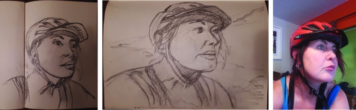
For this series I decided to work in a limited palette; I guided my composition in blue Col-erase pencil first, sometimes I had to make alterations to my drawing or combine two photographs from the photographic reference to tell the story that I wanted in my composition.

I then drew up the work in Faber Castelle PITT pens mainly the (S)small, (M)medium, (C)Calligraphy and (B)Brush nibs, often drawing up a number at a time and working through the set many times to work them up to their finished state. Having completed my pen work I next wet the whole page with a sponge and clean water to dampen the paper in order to add the ink top layer. To keep the feeling of the composition as sketch-like as possible I wanted to apply the ink quickly so that it ran and blended over the image and only had a hard line when I wanted it to. The Black Quink Ink I chose to use has hints of blues in it and id bleachable, turning the black area that has had a dilute solution of bleach an ochre/sandy shade of varying strengths.

Having applied the Black Quink Ink in varying strengths of shade across the whole image to define the environment I built up tonal ranges in the figures and foregrounds. The main colours that the Fire Fighters wear are Dark Blue and Red, with yellow present on their official call-out uniforms and truck. So to give the compositions I used some spot colours of mainly red and yellow to bring out some focal points to the image. I chose to use an Acrylic ink as the colour sits more physically on the surface of the paper which I felt appropriate and for the look that I wanted. Occasionally I needed to use a mix of the red and yellow to give me an orange, and the blue and yellow for a green. When the red or yellow spot colour was limited the image had less impact, another colour would bring the scene to life, so by adding inks more soaked into the paper and subtler (which was better to use a bleachable D PH Martins ink or really watered down acrylic); blue was used more to depict light and reflection, green was laid down more flat a solid colour depicting a solid object.

I think the limited use of colours really ties all the series together to show the depiction of daily life, the monochrome feel and spot colour leaves a lot of the image to the imagination so you want to look more into the picture. There is also an element of seeing things in black and white or monochrome (ie; sepia) that has a sense of nostalgia and a record of the past that suits this medium of storytelling.

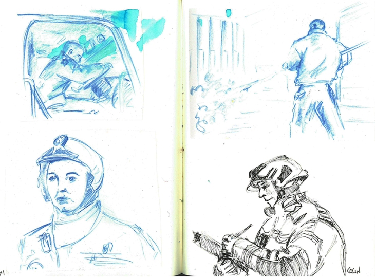
On Parade in official uniform

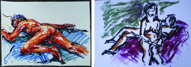
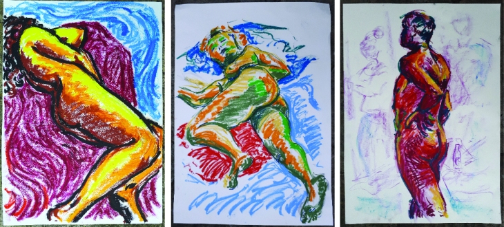
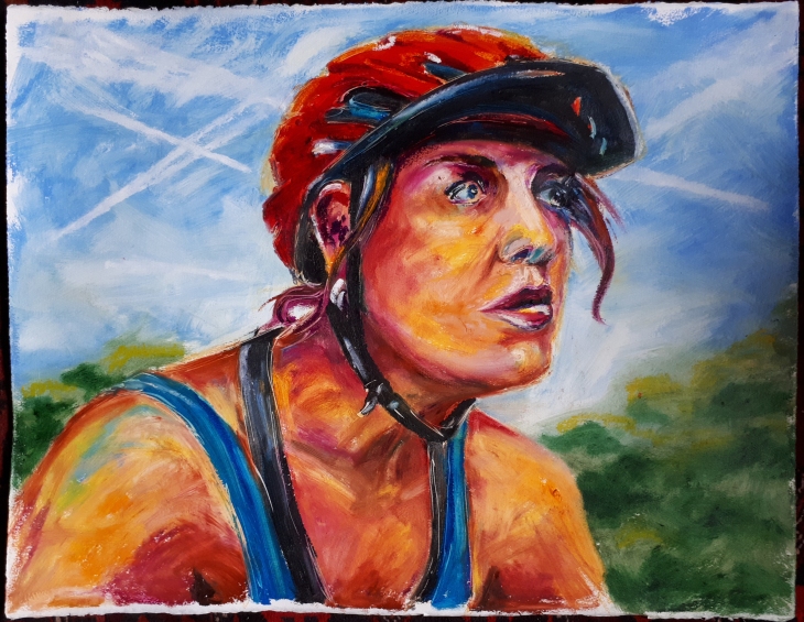
For this series I felt it important to present the individual as well as the drawing, a more solid medium in bold colours would give the individual a presence and officidum. I had been working with oil pastels quite a lot in my life drawing classes and considered that this felt like a good medium to convey the look that was in my head; solid, correct but not photo-real, conscious and sometimes bold in the colour palette and strong and proud in front of a hint of a background which I would complement the oil pastel with a chalk pastel or Conte stick to add suggestions to aspects of the background.

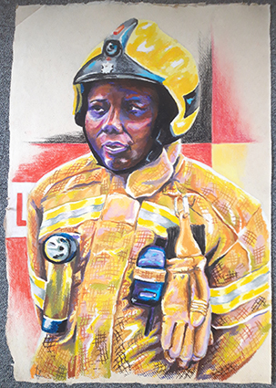
The first Fire Fighters that I chose to draw were the only two female crew; 2018 being the year of the women and all that! Having completed these two portraits I went on to draw some other of the crew members. I couldn’t do all of them, so I just decided to take a select a few photographs that I felt would be suitable for a series. I had a few that showed the Fire Fighter in the act of doing something, putting on a helmet and taking the register, I felt that a mix of these different poses would make the viewer more engaged with the subject if they could relate to them as people, not just to attention.

The paper that I decided to work on is a rag paper which is approximately 78 x 57cm, the brown flecks in the paper are bagasse (Sugar cane) or other fibers and the paper feels like it has a sort of gum in it, it has a good surface for the oil pastes, a tooth, but not too much, an organic surface with natural edges. I used a half sheet for the portraits and 3 quarters of a sheet for one work. When I went back to get some more paper I discovered that they were out of stock and then later that they are discontinuing the line! I found a white rag paper with a similar feel to the surface, but not the flecks colour of the original choice, typical! I will just have to do the remaining ones on white!

I then got asked if I would do a group drawing of Green Watch, which would fit nicely on a full sheet of paper. Then slowly as I was doing it I realised that I would have to do one of each of the Watches now, the project would not be complete if any watch was missing and I didn’t want to appear bias in any way!! Then when I returned to each watch to photograph them in uniform in a line-up the other Watches have 5-7 members, I would have to get more white rag paper and stick two pieces together.


Daily Life Images

All the Daily Life images are done on 200gsm A2 Cartridge with Quink Ink, Diluted Bleach, FW Daler Rowney Acrylic Inks and Dr PH Martin inks.

testng the hose_web

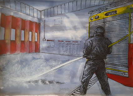
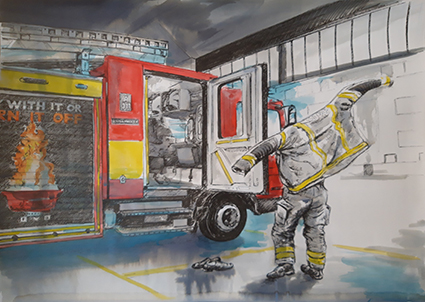
Testing the hose (Red Watch)

This was the first sketch that I did for this series. I was getting to grips with my subject and my drawing methods. I made some mistakes with the size of the Truck, but succeeded to leave them in as I think that not only do they tell the story of my drawing, but add to the sketchy look. The spot colour helps keep the eye away from the mistakes. The red was also applied very selectively on the doors to help create areas of light and shade, and the water spray is done in a soft white pastel that sits on top pf the background wash to depict the spray.

testing the mask_web

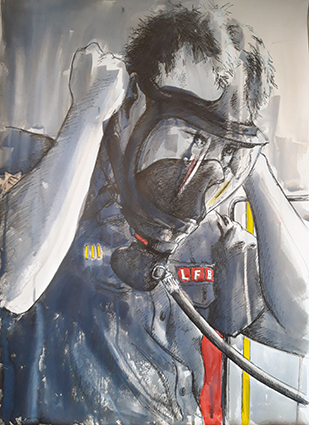
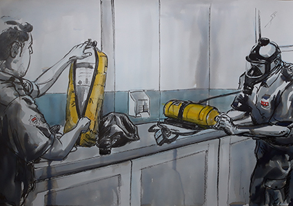
Testing the Mask (White Watch)

It took me two attempts to get the proportions right on this sketch, the mask was really dark in my reference and I struggled to make out its form. There is not much colour in this drawing, however I think it is one of the stronger compositions. The soft reflections in the glass on the mask really help , and there is a focus about subject testing the equipment.

testing the pressure_web

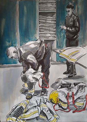
Testing the Pressure (Red Watch)

I like he intensity of the focus here, the equipment being functioning properly can be a matter of life and death. This has to be done every change of shift. There is just enough a hint of the background to imply that it is the truck. I used a little bleach in this one to draw some highlight to the arm, and a little on the face to imply the skin.

making tea_web

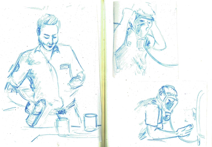
Making Tea (Red Watch)

Fire Fighters make a lot of tea, a lot more than they get to drink tho! I wanted to capture that ordinary function of making some tea and just having a chat whilst doing it. I am happy with the composition, however there is not much spot colour, just a bit of T-shirt and some buttons on the coffee machine. It is here that I realised that I would need to introduce  some additional colour. A pale wash of blue would indicate shine on the stainless steel surface and the blue and yellow ink made a nice green for the milk lid, this also gives an importance to the humble milk bottle that is so integral to the ritual of tea making.

the mess table_web

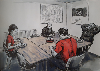
The Mess Table (White Watch)

Having made food for the whole crew Lexi sits down to eat with her Watch, I go and literally 2 minutes later when I was up the road, the truck drove past sirens blaring. I wanted to capture a rare moment when they actually all got to sit down and eat together. I wanted to capture the starkness of the Mess room. The wooden tables were emphasised better with some bleaching turning the black ink sandy colour to represent the wood, it also softened the image and drew you into the table more. The head of the female Fire Fighter seems a bit big to me, but I live with my mistakes!!

checking the map_web

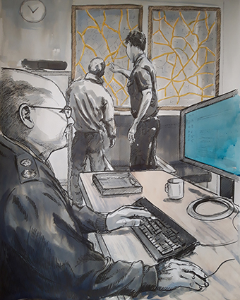
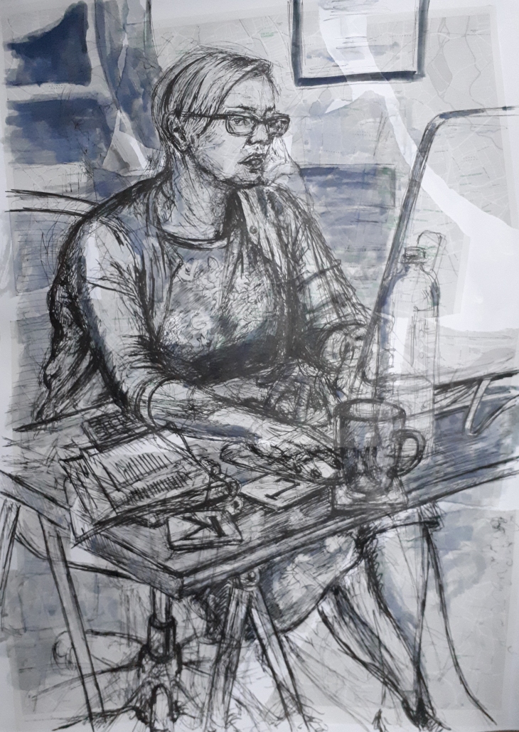
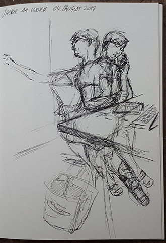
Checking the Map (Red Watch)

This is a compiled composition; I wanted to capture the Sargent doing his work on the computer while the Fire Fighters work out where they are headed by studying the large map of the area. This composition has some depth as the scale helps draw the viewer through to the map, the yellow on the roads was not enough to pull the picture together, then as I looked at the computer screen I realised that the Microsoft Blue light coming from the screen held the answer. You don’t really see it, it just draws you past it, but the figure is intently looking into it!

call out_web

The Call Out (White Watch)

This was the sketch the made me realise that I would need to use other colours other than just red and yellow! I needed a blue to show the siren lights and to mix the red and yellow to show the flames on the graphics on the side of the truck. I felt important to show this composition into the story, introducing the truck, the act of quickly putting on the kit, leaving the day shoes ready to get into the open door and drive off into the light outside. By putting the coloured ink over the top of the tonal Quink Ink I can give some idea of texture and shade.

Mobilize Mobilize lettering_web

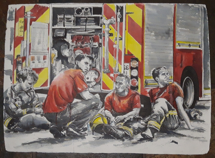
Mobilize Mobilize (Red Watch)

I now wanted to show what the station looked like once the crew had gone out on call, any food was left half eaten, I was warned that every time they cooked together the meal was interrupted by a call-out! This was the only sketch that I felt warranted text, I wanted to convey what was said over the tannoy. It is surprisingly quiet as an alert, not a loud siren that would make you jump out of your skin! For this reason I have done the lettering sketchy and not solid. A bit of bleach on the bun gives a feel for the bread while the beans required some orange mix. The sketch came to life when I added the blue on the stainless steel and then the secondary focus on the First Aid Kit, the green object giving another point of interest.
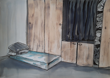
night watch_web

Night Watch

I was shown around and delighted to see the sleeping quarters used by the Night Watch. The mattresses were supposed to be put away, however fortunately for me this one was still out. It felt very basic and 1950’s in the feel of the built-in wardrobes that stored the sleeping bags and mattresses. The only real colour was a bit of blue in the pattern on the mattress, so I added colour in this sketch by bleaching back the doors to represent the wood. The lone small mattress looked quite bleak in the corner, so I wanted to keep an element of bleakness to this drawing.

changing kit_web

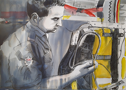
Sorting Kit (White Watch)

Having come back from a Call-Out the Fire Fighter has to change his soiled uniform for a new one. New uniforms were introduces a few months ago, now every time they get a bit dirty or contaminated they are sent off for either cleaning or disposal. New kit is stored in plastic bags in the lockers behind. When I painted these blue it was too dark and I forgot that it did not bleach, the Quink Ink behind it did bleach a bit and it left the doors looking quite streaky and a little busy, but I have to live with my mistakes! I really like the way they have to put their trousers over their boots to enable quick dressing and get away.  In this sketch I wanted to show the way that they do this, the way that the clean their kit, and record and unwrap the stiff pristine new uniform.

no pressure_web

No Pressure, Changing the air tanks (Blue Watch)

This is what the daily checks are for. The tank was not up to pressure and had to be changed for a new one. There is a side room where all the spare tanks are kept, it was stark and lacking any colour except for a pale blue/grey stripe around the wall which I had to use a very dilute wash over the dilute Quink Ink, the yellow covers for the tanks and the embalms on their uniforms being the only other spot colour.

sargent carrying kit_web

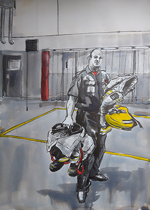
Sargent Carrying Kit (Blue Watch)

I wanted to show just how bulky the kit is that they have to carry, this shot of the Sargent, denoted by the black and white stripe on his helmet. This view, which I used a bit of artistic licence in the background, also shows the Fire Poles behind the clear plastic blinds, I don’t think they are used that much, but they are an integral part of our stereo typical idea of a Fire Station. I really like the minimal spot colour in this sketch, and the deliberate drips add to the textural interest.

checking the hose_web

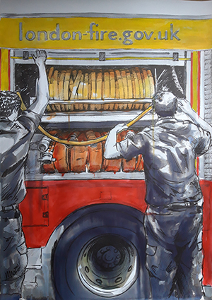
Checking the Hose (Blue Watch)

The hose is obviously an integural part of the truck; the automatic rotation to coil the hose needs to be checked, sometimes if not returned correctly the hose can become jammed. There are two sorts of hoses, ridged yellow ones and more flexible red ones. When the wound hose is correctly coiled, the shutter door is pulled down. This sketch is the one that I have used the most colour in so far, varying shades of orange are used for the hoses flanked by the red and yellow of the Truck. I kept it qiute rough, drippy and sketchy to keep some textural interest, I didn’t want the colour to be too neat and become to tight and dead visually.

the truck_web

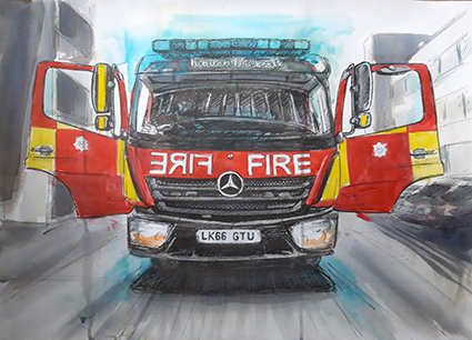
The Truck (Blue Watch)

Had to draw the Truck, it is a part of the Family! I wanted the background visible, but a bit softer as if bleached out by the bright sun. The Truck, ready and waiting for a Call-Out sits waiting like a butterfly ready to take off and fly. The crew run regular checks on the siren lights to ensure that they are working, giving the Truck a sort of blue halo! I like that the background looking as if it is whizzing past even though the Truck is stationary, it gives it a sense of life.

After Grenfell

After Grenfell Sketch_web

For a culmulation of this series of daily life, testing and training I was given a photograph taken by one of the Fire fighters of Red Watch when they had attended the fire at Grenfell Tower in North Kensington, it was such an emotive image that I felt it would make a fantastic final image for this series, this is what all the work, training and preparation is for.

After Grenfell_web

Once I had added the spot colour on the truck and clothing this artwork really came to life. Tammy, on the left hand side of the picture is still in full uniform, the old dark blue wear that was replaced towards the end of 2018. Getting the expressions right was critical to this image, the viewer questions what they are looking at which is only given away by their demeana and the title. The loose almost abstract ink work conveys the exhaustion and soot, the colour gives the Fire Truck context.

Officially in Uniform

These portraits are a celebration of the men and Women who serve at Hornsey Road Fire Station
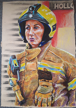
lexi_web

Lexi

I wanted to start my oil pastel drawings by drawing the female Fire Fighters first as 2018 was the year of the women. Lexi was so hospitable and helpful showing me around I wanted to do her first. This is the first time I would work out how to represent the uniforms and tones. This part of my project enables me to explore tone and colour while trying to keep a freshness about my mark making, I had to work out some mark making and methods of application that I could apply to this and future portraits.
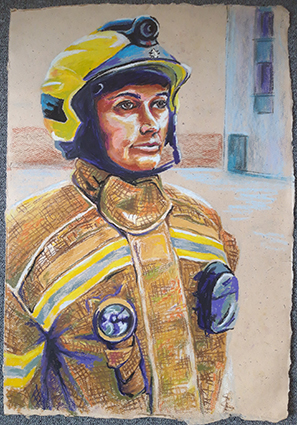
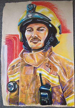
tammy_web

Tammy

I got some new oil pastels so that I had some differing colours and density of oil pastels, some harder (the Daler Rowney ones) some medium hardness (Neopastels) and softer ones (Selinner) I also got some cheap ones (Giotto) to add to my tonal selection. This portrait is quite official in Parade pose, but it does emanate a strength and defiance of character.
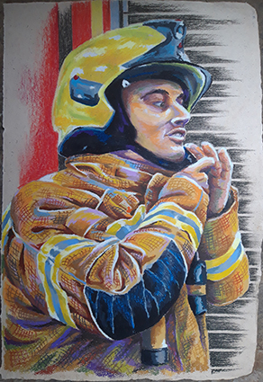
colin_web

Colin

I wanted to illustrate another aspect of Parade, so I drew Colin checking his crew with a clipboard. Compositionally this needed to be larger than half a sheet so I used about three quarters of a sheet which looked most comfortable. The minimum use of colour done in Conte pastel just indicates his surroundings rather than drawing too much in.

brian_web

Brian

Here I wanted to try rendering a different colour skin tone, I had seen Brian standing in on an extra Watch and felt his dedication needed to be recognised! This was a good exercise to see how far I could push the colour tones to bring out his character.

reece_web

Reece

When I went in to photograph Green Watch Reece was particularly helpful and had a really outgoing character, so I felt he would be a good subject for a portrait, slightly cheeky and always smiling! It was also this Watches’ idea that they would like a group drawing, what had I got myself into?
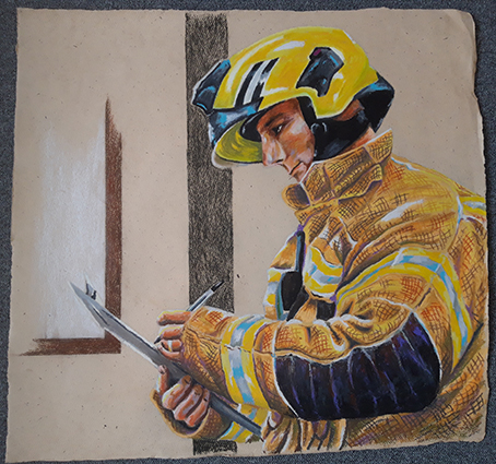
unknown_web

Dan

I wanted to capture this portrait in the act of dressing in uniform putting on the helmet as drawing someone in mid movement can create an interesting composition. As with the other portraits, I laid out my composition in blue Col-erase pencil which I then rubbed out lighter with a putty rubber before building up firstly the uniform, secondly the face, then finally the dark areas on the helmet and clothing and the cross hatching over the top of the uniform.

Group drawings of each Watch

green watch_web

Green Watch

A single comment from one of the crew inspired this drawing, he wanted one of the whole watch so that he could put on the inside of his locker. Drawing the crew smaller was more difficult as representing detail in oil pastel at this size is not as easy as it is on a bigger scale. I had to add uniform trousers to this drawing as they had posed only in jackets, I got this reference from pictures of White Watch. I wanted to capture them official, but a bit relaxed as I felt that this would give each one an identity and personality easier than if they were stood fully to attention. All these group drawings are done on A1 sheets stuck together to make the appropriate landscape length.
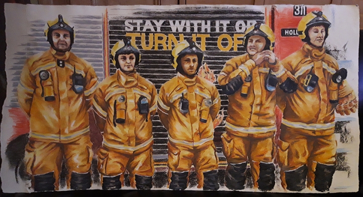
Red Watch_web

Red Watch

Once I had done Green Watch I realised that I had to do all the Watches, it would not be fair to just do one, I had to do all four watches. When depicting Red Watch I felt it added an extra level of interest to the scene if one of the crew was doing up his helmet. By the time I started this drawing I had shown some of the drawings to the Curator of Islington Museum who indicated that they would be interested in having a future exhibition around the Fire Fighters to celebrate their work, this also made me realise that I could work on a slightly bigger scale by sticking sheets of paper together to make a landscape and fit all the crew on rather than making the figures even smaller. I intend to show them clipped and unframed as they are on 350gsm cotton rag paper which is fairly rigid. The bagassee and Gunny paper that I had been working on had been discontinued, so I had to find an alternative.  I did prefer the brown off white background, but I could not find suitable alternative paper in brown, so I had to suffice with a white background.
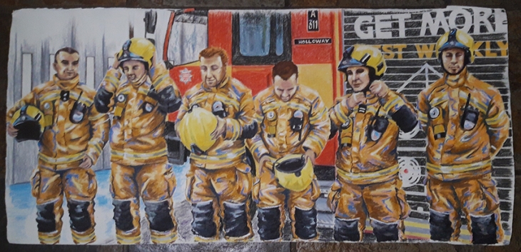
Blue Watch_web

Blue Watch

For green watch I had used a green base to the uniforms, for Red Watch an orange tone, then for Blue watch I added a blue highlight and a white highlight for White Watch. I had liked the crew member putting on the helmet in the previous drawing, so in this group image I wanted to show the process of putting on the helmet. I had to compile this image from a collection of photographic reference, I like the wave line that is created through the image of the different stages of putting on their helmets. I am not 100% satisfied with my depiction of the faces, maybe sometimes the heads are a bit big, but the proportions were challenging when you place a human figure in an over size uniform! I could not change it, so I had to go with the result that I created, they do all have individual characters, and I think that the aspect that I have depicted the truck in does add an additional interest as it also includes the station doors implying the way out when opened. With 6 characters in the crew, the paper had to be a bit linger. I wanted to keep the heads not on a paper join seam, so I had to add additional paper to each side to accommodate the composition.
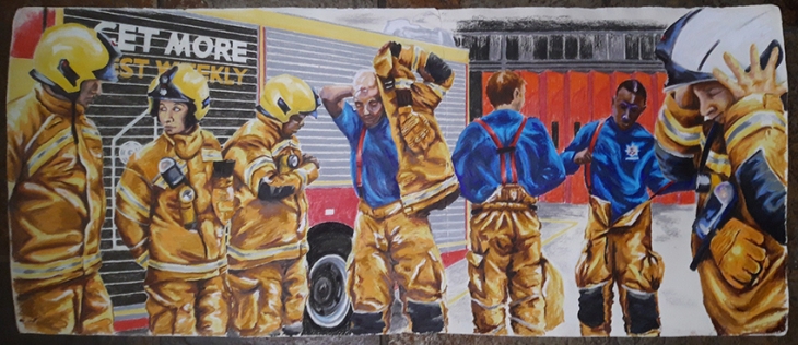
White Watch_web

White Watch

Finally I had White watch to draw. Some of the crew were a bit drawing shy, but they did all dress in uniform for me as I photographed them. I had in mind that I wanted to depict them getting dressed in uniform to show the layers and sequence of dressing. This image is the longest as a full maximum crew of seven were to be depicted. This is a complete compilation from many different photo’s and was the most difficult of all of them to complete. I chose to show a different view of the truck and the station so that I had a full gamut  of scenes. this is my favourite of all the group portraits, I think it has the most movement and storytelling in it and is therefore the most interesting, especially as it includes a different aspect of the station back doors as well.

In all the portraits I have used Conte sticks to depict the backgrounds. I had to use the edge of a sheet of paper to get the straight lines, and although I was depicting the truck and the environment I was careful not to do so fully so as to leave something to the imagination. I like the contrast in technique as it gives the eye two aspects to look at that do not fight each other.

I may have done more images than is strictly required for this part of the course, but I felt that I had a story to tell, and that story could not have to be told in few images. I needed a bit of extra time to finish all the drawings as the big ones took a couple of days to do in total at least as it could take some time to get the composition right to start with and I have been working full time throughout December and January, although I did have some well needed time off over Christmas that I put to good use with my drawings.

I have really enjoyed this project and have relished getting into producing a series of works that have evolved and developed over the period of time that I was executing them. Working in two styles gave me scope to tell two parallel stories that depicted the sides that you see and don’t see publically. I hope that I have achieved my goal of celebrating the work of Hornsey Road Fire Fighters, and I have to thank them for their generosity in accommodating me doing this project.


Assignment 5: Artist’s Statement; Celebrating the work of the Hornsey Road Fire Fighters in inks and oil pastels

A Personal Project

I wanted to take the opportunity to explore further drawing the figure and portrait. I had enjoyed  part 4 the most out of the whole of Drawing 1, this was where I had explored new styles and materials the most and been the most expressive in my work.

With this in mind I struggled at first to settle on a subject matter and theme. Looking through my previous works I was drawn to the monochrome portrait that I did of Threasa May in front of Grenfell Tower, and to a figure of a fire fighter or inspector that was a part of the collage that I had made the background up out of. This small aspect of the image was to become the inspiration for my final project. I contacted my tutor to put forward my idea, she approved and I visited the local Fire Station in Hornsey Road in London and found out who I should write to to ask permission to photograph the firefighters and draw them for this my final project for this module. Unfortunately my contact was on leave and it took a few weeks for him to get back to me. He gave me permission to photograph the crew and the fire station with the caveat that I must represent them in their official uniforms and not demonstrate any political statements as the drawing of Threasa May does.

20180809_175346

My motivation for this project is to look at the life of the Fire Fighter when they are on duty and to celebrate their work. I knew that I would have to work from photographs for this project as the crew would not have time to sit for me and could be called out at a moment’s notice. So I talked to the crew as they went about testing the equipment and was kindly shown around the station so I could get a feel of what daily life is like.

There are 4 crews; Red Watch, Green Watch, Blue Watch and White Watch. They work two days on, followed by two nights on, followed by 4 days off, although often there are stand-ins from other stations and the individuals may work a different Watch shift at times. At each change of watch the crew has to run their equipment checks to ensure that it is all working and stored properly, then there might be a round of Tea. Fire Fighters seem to drink a lot of tea, although they don’t always get a chance to finish tea or meals as a call out could come at any time. They only have one truck and are scheduled to go out on a daily basis to check and fit smoke alarms at various locations. So for me to photograph each Watch, in uniform and performing daily tasks, I had to visit fairly frequently and keep going back to see if they were in or not, often I would go by and the station was unmanned as all the crew would be out on a call. Each Watch is made up of a minimum of 5 and a maximum of 7 members, I made a lot of Banana Bread to give one to each Watch as I first met them, the bribery/ thank you gift went down well and all the Watches were really accommodating and helpful.

It was really important for me to spend time photographing and talking with the Fire Fighters as I experienced Station life and the individuals themselves to get a feel of my subject matter before I put pen to paper. This helped me form an idea of how I wanted to approach the project as a whole.

I decided to approach the project from two angles; the first would be a series of looser limited palette sketches that depicted daily life behind the scenes at the Fire Station that culmulates in a working image of Red Watch after Grenfell. The second would be a series of more formal portraits, firstly depicting the two women Fire Fighters at the station and some of the other crew members then a series of larger images that depict each watch as a group.

The project definitely evolved as I progressed through the work, I worked on both paths of my approach at the same time rather than one at a time as it helped me to be more considerate and reflective to each style as I had time to step back and look and consider it as I worked on the other style series. It also gave me the opportunity to go back to the Fire Station and take additional reference photographs in order to get images that would help me tell a more complete story.


Part 4; Assignment 4

Complete two large figure studies (A1) size and a portrait/self portrait (any size) – three drawings total together with supporting studies, experiments etc.

1. Figure study using line (A1) – Seated model in an upright chair

Assignment 4 - Jackie at work

For this portrait I wanted to try and create an impression of my model at work at her desk, the sketchy lines creating an impression of movement. I knew that she would not be able to sit exactly still for two or more hours so I felt that some ghosting of other positions would help create a busy feel to the drawing. This technique is quite unforgiving as you can not rub pen out and any mistakes remain visible, but I do like the effect that that much drawing creates.

The office is quite small, I had little option as where to sit comfortably with my A1 board, but I did manage t o get an angle that suited the composition that I was after where I could see her legs and base of the chair as well as enough of the desk to show what is going on, yet not concealing too much of the body.

I found the whole process quite interesting, building up the figure with a very sketchy line. I did go wrong a few times, focusing in on a hand and a corner of the table before I had established that it was in the correct position and to the correct proportion on the page. This did end up creating some dark details in the wrong place , but also helped create a sense of movement as she went about her tasks at the computer.

I had found a map of bookshops in London that I tore up an collaged to a sheet of A1 cartridge. I liked the light tones of the map that meant that there was a light random texture across the background. Jackie is an Accountant, so book had a fairly loose connection.

I think I was a bit nervous going into the drawing as I knew that she wouldn’t be happy if I asked to sit in the office again, so I had to get it right first time. At first I struggled to get my positions and proportions in the right place, and had to keep reminding myself to relax, move on and look at it as a whole and not be afraid to move on and re-draw a more correct version. It’s amazing how much even the stuff moves around the desk over a few hours. Getting the feet in a position that felt comfortable with the position of the torso was difficult as she kept changing foot positions and crossing her legs in a variety of ways.

There was one point where I felt like giving up and starting again, but I only had one pre-collaged piece of A1 paper, so I persevered and the end result is growing on me as it sits on the floor uncurling as I had to carry it rolled. I think adding the Quink ink to help define some areas helped pull it together, especially the background which works better with a softer line, it puts it on a different plane. The middle of the torso is a bit dark and jumps at you as the darkest area, which was not my intention!

Initial sketch

20180908_185504_web

I took some photographs and produced these initial sketches. It gave me a fairly good idea of what I was aiming at, and made me realise that I would need some additional interest in the background.

Picture reference

Assignment 4 comps 1

Looking back at the artists that I have studied throughout this course, there were a couple that I think influenced me for this sketch, I like the overworking of the lines and the sketchy style. These are both way more refined that the drawing that I have produced, but I think I have tried to capture some of the energy in these works.

Assignment 4 comps 2

interior perspective 07 Rorik Smith

2A. Figure study using tone (A1) – Reclining model

20180911_123455

For this assignment I used Oil sticks, oil pastels and spirit on a prepared piece of A1 mount board that I coated with gesso first. I sketched out the composition in my sketchbook then lightly in Conte stick on my A1 board, before drawing the figure and sofa in oil pastels. I spent about 4 hours in total, building all my areas up in tonal value, then using a cloth blending the oil pastels.

I noticed having got nearly to the end that I had somehow got her bum too big, so I had to wait until the oil pastel had dried a bit before I could make amendments and build the white of the duvet back on top of the dark blue of the jeans.

For this reclining pose I wanted my model on the phone to continue this modern social trait in my work. I also really felt it important to include her rescue dog Leon that having suffered cancer has had Chemotherapy treatment and is in recovery. They are very close so a portrait of her would not have been complete without Leon in it,

I still feel that I am experimenting with the Oil sticks, so this was an opportunity to have another go at them and see how they worked when producing a piece of work based on tone. I liked the contrast of the light walls, dark sofa, light cloud duvet an dark model. I have interpreted the pattern on the duvet and simplified it, I think it adds a dimension to the cloud that gives it much more interest.

I also used a rubber tipped tool to scratch in a few highlights and give some textural interest to the drawing. Before I have made some alterations to the picture I am not that happy with it as a finished piece, I think stepping back for a day or so is necessary to see the erky bits and know confidently howto fix them.

I thought that I had got the composition that I was happy with fairly quickly having done it in my sketchbook first, however I think the sofa and figure could have been placed higher in the frame on reflection having see the finished piece.

Initial sketch

20180909_202559

Working with the oils has evolved for me. The first times I used them I was really just drawing with them.

Niki’s Life drawings in Oil sticks

assignment comp 2

assignment comp1

But then I began to smudge them and realised that this gave a whole new dimension to the drawings, and creating a gradated tonal value was achievable with a cloth and sometimes a bit of white spirit. It is from these drawings that I have chosen to draw from for this final assignment piece. The last example was the first time I had used this medium without enclosing the figure in a black line.

assignment comp 3

Monochrome version

Then having got home and re-read the brief I wondered if I should not have used colour for my tone, maybe I should have done it in monochrome as this would have accentuated the use of tone. I had to work from the photographic reference to complete this second version.

Colour inspiration

assignment comp 4

2B. Figure study using tone (A1) – Reclining model – Monochrome version

20180913_112305

This version was built up in a much more blocky fashion, looking harder at the tonal values. I used Quink ink, Lagoon Blue Inktense pencil with wash and a bit of blue Conte stick. I think the pattern on the duvet really helped the cloud like effect that I wanted to convey. I had prepared the background with a Qunk ink wash that I then bleached back with a watered down bleach solution to give a sandy yellow textured ground which gives the finished image a slightly muted feel. I like the building up of layers in the different mediums. This method is far less forgiving as mistakes are not as easily rectified as with Oil Sticks that you can just go over once dry!

Monochrome preparatory sketches

assignment comp 6

I used a brown conte for the first sketch, but felt it too stark, so for the second sketch I gave the background a pale yellow which warmed it up. The final test sketch was done on top of a Quink ink bleached background, this was the one that I decided to take forward.

Colour inspiration

assignment comp 5

I wanted to have a fairly soft look to my drawing and took from these examples the need to ensure I had enough really dark areas that would help bring the light areas forward.

Reference photograph

20180909_163512

3A. A portrait or self portrait combining line and tone (any size)

For this part of the assignment I decided to draw Lady Jill Freud who I had met at my life drawing classes. I had to do the portraits from photographs as it was not possible to arrange a time for a sitting. I had drawn myself 5 times in the previous exercise so fancied a change. From the selection of the few photographs that I took I chose one where I was slightly looking down at my model. She often wears pastel colours, so I wanted to keep my palette in that tone.

Trial sketches for portrait

assignment comp 7

First of all I wanted to get used to drawing her face so I sketched it in blue Col-erase. I then wanted to experiment with what medium I would do the portrait in so I had a go at soft pastels, but I wasn’t convinced that I would incorporate the ‘line and tone’ aspect of the brief. So the next sketch I did in acrylic and ink line.

20180917_173841_web

The first drawing I did took about 2 hours and is done in wax crayons and acrylic paint with some candle resist in the background on Royal watercolour society 300gsm Hp paper (52x65cm). I incorporated the abstract spotlight as my model is an actress and the pale blue background compliments the pink jumper. I off set the position of the model to the left as it looked a bit boring set in the centre, I think that the background and the figure fight a little, the wax crayons are also a little clumsy, but I am glad that I had a go and experimented and so I decided to have another go.

3B. A portrait or self portrait combining line and tone (any size)

20180917_173901_web

For this second drawing I used acrylic paint, Ecoline and calligraphy ink on Royal watercolour society 300gsm NOT paper (52x65cm). I find the space around a little awkward, but engaging at the same time. The ink went a bit off course, but that grew on me too. I think this is the better of the two portraits, although maybe the chin and mouth are not 100% accurate. I drew on the research that I had done for the previous two A1 drawings, particularly that of Elizabeth Peyton, at the Royal Drawing School classes the tutor had alluded to my work having a resonance with her work, so I wanted to expand on that. I like the looseness of the line that describes the body and the colours suit my subject as these are the colours that she wears.

As a final reflection I can say that with the addition of my attending life drawing classes throughout this part 4 of the course, I have really enjoyed drawing the figure, and feel that I can see development and progression of my work as I have experimented with different mediums. Drawing the figure I feel that I have loosened up from my tight drawings of buildings, and working at an easel has enabled me to work more with my whole body and stand back to observe what I am drawing in a more productive manner.


Project 6; Exercise 3, Portrait from memory or the imagination – Meeting Joan Wisdom – An Artistic Response

Part 4; Project 6; The head, Exercise 3 – Portrait from memory or the imagination.

I have chosen to combine this exercise with some research work that I have been doing with Outside In on their Step Up Course at the Wellcome Trust looking at the Adamson Collection which is where I discovered the work of Joan Wisdom in the uncatalogued archives. I have written blog posts on my research on my website www.bluesunflower.com documenting my research and my study of her work.

Joan Wisdom – A portrait from memory or the imagination

A portrait of Joan Wisdom 10

A Portrait of Joan Wisdom – Joan’s Story

Having looked through all of the work in the Adamson Collection held at the Wellcome Trust that Joan Wisdom produced while she was a patient at Netherne Mental Hospital in the 1960’s, I really felt that I had made a connection with her.

A portrait of Joan Wisdom 12

Original ‘Self Portrait by Joan Wisdom’

and ‘A Portrait of Joan Wisdom’ by Niki Gibbs

My task was to produce an artistic response to her work, I was a little unsure about how that would actually come to fruition, but I made a conscious effort to be completely intuitive about the process and open minded about what I finally produced.

My first thought was to make a short film of Joan’s work, looking at the textures and compositions in detail and compiling them in After Effects with tracks, pans and fades between the works and put to music. I started, but after only a few image placements I decided that this was not the way forward for now, although this may be an avenue that is worth pursuing in the future.

What I actually had an overwhelming urge to do was to have a go at experiencing producing artwork in the same way that Joan would have done. I set myself up with an easel and a table and purchased the materials that would have been available to Joan in Edward Adamson’s studio at Netherne; Poster Paints, wax Crayons, a thick and thin paintbrushes and some Lining Wall Paper  folded and torn into pieces of the correct size, approximately 22 x 16 inches, which I then pinned to a wooden board set on the easel.

I looked really hard at Joan’s work, noticing which lines she drew first, what order the layers were put down in and what colours she used. I wanted to keep all my drawings faithful to the original source so I did not rough the shapes out first, I drew everything straight up having just planned and thought out the image in my head before I started. This method is quite open to mistakes and error in placement of line, colour and wax resist, but I felt that authenticity to the process was vital.

A portrait of Joan Wisdom 01

Joan Wisdom Portrait, Joan with Cat and ‘Everyone telling me what to do’

I tried to incorporate elements and patterns that I saw in Joan’s work while imagining what it must have been like for her living at Netherne derived from the clues that I found in her work.

A portrait of Joan Wisdom 02

Nrtherne Imnate, Looking inside my Head and Crying

I wanted to crate images that Joan herself might have painted, in the same style and by the same rules. The image ‘Crying’ I later realised did not conform as Joan did not draw three-quarter views of the face, she only drew them face on or in profile, she also did not draw realistic tears, she drew tears as petals in red, and in this drawing I feel that she is a little out of character.

A portrait of Joan Wisdom 03

Treatment, Treatment plan and Lost Souls of Netherne

I looked closely at Joan’s paintings and tried to apply the colours that she used for her complexion when she was feeling emotional or unwell to try and convey how she felt that she was being treated. I emulated Joan’s Lost Souls painting by giving the lost souls a Netherne makeover by turning them into flowers, I think in an effort to give them some identity.

A portrait of Joan Wisdom 04

‘They Played with my Brain’, Joan Stroking the Cat and Pills in patterns

I always thought that Joan’s patterns would make great wallpaper designs so I had a go at conveying them in that way. I wondered if the circles that she used prolifically in her designs reflected in any way the drugs that she was given, so I wanted to include this element in the design. I felt that I needed to add some more cats to the collection, so I included Joan stroking the cat together in the picture as I felt that this showed a tender side to her and her relationship with the cats. The last image reflects what she felt the doctors had done to her brain with their treatments.

.A portrait of Joan Wisdom 05

Joan in the Gardens, Doctors observing Treatment and In the Spotlight

Joan occasionally drew a full figure of herself and rarely drew scenes, the only one being her ‘Bird and Cat’ drawing. I noticed that in the images that she wore clothes she wore just a simple blue dress, and where she depicted herself naked she made herself androgynous with her hospital number emblazoned across her. She writes her hospital number on many of her works, so I applied that same rule to my drawings, it was a form of identifying herself in an impersonal manner. By placing her in a frame I am alluding to the focus and scrutiny that she must have felt. In the spotlight image I gave her breasts so as to give her her femininity back.

A portrait of Joan Wisdom 06

The Mona Lisa Series 1

Having by chance caught a glimpse of The Mona Lisa I realised that Joan had a similar mystery about her so I produced a series that I felt told her story. By this time I had realised that the images that I was painting told Joan’ story and would work well as a slide show movie. Having finished this series, I then realised that I had to do the whole series again, be more specific about the story and put her in a frame, so I did them again!

A portrait of Joan Wisdom 07

The Mona Lisa Series 2

In this second series I included the depression cloud in the second image and the screaming faces in the background of the third. I think they make a far better series with the frames included.

A portrait of Joan Wisdom 08

All eyes on Joan, Fear and Anguish and ‘Sorrow’

I wanted to explore how Joan would have felt and emulate some of her works that expressed her emotions. By now I have got better at using the wax to create texture and the amount of pigment and water to use in the paint to get the right effect.

A portrait of Joan Wisdom 09

Crying tears of Petals, A Portrait in the Spotlight and A portrait of Joan Wisdom

I re-did the crying image to make it more true to Joan’s original and finished by doing a couple of portraits of her to conclude the story that the movie slideshow would tell.

A portrait of Joan Wisdom 11

Meeting Joan Wisdom ‘Grief and  Meeting Joan Wisdom ‘Institutionalized Human Being’

I realised that for my story I would need an introductory image so I drew myself looking at her work, which would also familiarize the viewer with her style of work. The first one I drew I was looking at her grief painting, however later I realised that I should use the ‘Institutionalized Human Being’ painting as this was the one that I discovered and managed to get rightly re-attributed to her and was therefore a more pertinent addition to the story.

A portrait of Joan Wisdom 10

Imaginary portraits of Joan Wisdom

I am doing a Distance learning drawing and painting degree for which I had to produce a portrait of someone that I imagined or had only had a fleeting glance of. Taking clues from her paintings and keeping elements of her style (wax crayons and poster paint on wallpaper) I have tried to imagine what Joan Wisdom may have looked like. I drew on the delicate features that she expresses in the profile images, her long straight brown hair and slightly undernourished frame, drawn from the fact that she mentions the lack of nourishing food at Netherne in her work. Unsure as to how old she was, I have tried a couple of age ranges, possibly in her twenties and the other in her 30’s or 40’s.

A Portrait of Joan Wisdom

Print

I have collated all the imaged that I included in the Slideshow movie in order into a single portrait of multiple images as one that tells her story in a portrait.

Additional Images

Print

Sun, Blue Whale and Blue Sunflower


By Niki Gibbs

August 2018


Part 4: Project 6; Exercise 2, Your own head

Part 4: Project 6; The Head, Exercise 2 – Your own head

Create two interesting images of your own head. Think about the pose, measuring, tonal variation, lines and marks. Don’t worry about producing an attractive or accurate likeness; the aim is to create a believable head with features in more or less the right place.

Look at yourself in the mirror and draw several 5 minute studies of your head, neck and shoulders. Slightly adjust the angle of your gaze to avoid a disconcerting straight ahead stare.

Once you have completed a full self portrait, take a break before revisiting the image and consider how it might have been better. For the second image position your self differently, and try using a different medium and approach.

In the end I had an enjoyable time experimenting so I ended up doing 5 different portraits in a few different styles.

Self Portrait 1 – On my bike

20180819_114527

My first self portrait was done on watercolour paper (51 x 65cm) treated with gesso and with oil sticks and white spirit. I roughed out the position of the figure with a light ochre small oil pastel, the added the background using quite a lot of spirit to wash the oil sticks. I added the airplane contrails at the end. I am still experimenting with this medium and wanted to take my time with them and really consider what I was doing rather than rush and make hasty decisions as you do in a life drawing situation where you have a limited time on a pose. I did photograph myself and used a printout as reference along with wearing my helmet and posing in the mirror. I used far less spirit on the body than on the background which I think helps differentiate the two planes within the composition. I laid all the colour down first then smudged it with a rag, adding some highlights and dark shadow areas and drawing in more detail over the top. I also scratched back some of the areas to add sharp highlights and provide another layer of texture. I think I spent about 3 hours on the drawing initially, then having looked at it for a few days added a few details to the features that were niggling me once the surface had dried a bit.

I chose this composition as riding my bike is my main form of transport so this likeness portrays me doing something that I love and do often! I think over all I like the colours and composition, however I don’t think I have got the eyes and mouth right.

Self Portrait 2 – Thinking

20180821_103151

This is A2  cartridge is collaged with articles that drew my attention from the Saturday Telegraph 18th August 2018. I sketched out some positions in my sketch book (below) and decided on this pose. I wanted to do a portrait with a prop and a hand in it, and off setting the composition I think balances the interest a little between the text in the background and the figure, I like the idea that the image suggests what is being thought about. Having sketched the figure in coloured Conte stick I added some tone wash with Quink ink, then worked over the top in mid tone and light pastel, adding the darkest areas last. I have been trying this technique a few times in Life drawing classes, but again I wanted to enjoy taking my time over it rather than rushing it. I think it took about 2 and a half hours in the end. I avoided putting a black line around all of it as I had done in the past, and tried to work over the line that I did put in so it was not too heavy. The shoulder next to the hand is a bit big, but on the whole I am happy with the outcome.

Self Portrait 3 – Looking Away

20180821_103214

I wanted to have a go at drawing a self portrait in pen so for this self portrait I used Faber Castelle PITT pens, medium, fine and Brush tips and on A2 cartridge, adding some Dr Martins ink to the background. I am happy with the texture of the woolen fabric of the cardigan, however The eyes are a bit high on the face and the neck is a bit narrow and long. Working in a fine pen does tend to make you concentrate on detail even if I did work all over the picture as I was drawing it. I wanted to contrast the fine mark making with some bold brush strokes of ink, having looked at Elizabeth Peyton’s mark making and mixing it with a more drawn approach. I like the technique, but my proportions are not great, and I ended up with a heavy line down the profile in order to slim the face down a bit. I think this drawing took about 2 and a half hours.

Self Portrait 4 – Magnifying glass

20180821_103338

This is A2  cartridge is collaged with articles that drew my attention from the Saturday Telegraph 18th August 2018, this time collaged in portrait. I used a similar technique as the second self poftrait, working over the Quink ink in soft pastel. I liked this pose in the sketches that I had done earlier, the magnifying glass is a bit close to the face, but I like the oddity of the left eye being much bigger. Using the yellow/orange ink in the background really livens the overall self portrait up, I tried to use lively mark making and colours, having some softer areas and some more sketchy areas.

Self Portrait 5 – Quick sketch

20180821_103414

I looked at the sketches that I had done and really liked some of their line qualities and looseness. On A2 cartridge I roughed out the self portrait really quickly in Faber Castelle PITT Brush pen and then added ink washes in Quink and Dr Martins inks. I think that this is one of my favorite drawings in this exercise, I like the energy and contrast in the mark making as well as the composition of the pose its self. I wanted to do a quick pose as there are qualities in a sketch that I usually loose when working a drawing up. This time I had got all the other drawings out of my system and felt free enough to do a quicker more fluid drawing, this was done in about 30 mins.

Self Portraits – Rough sketches

First I sketched out my cycling pose using the mirror and a photographic reference as the view I wanted was difficult to capture in a mirror on its own.

portrait sketches comp 1

Next I wanted to do some poses that I could do completely in the mirror. I looked at some other artists and the sort of poses that they had painted and drawn and tried to put a bit of my own personality and interest into them.

portrait sketches comp 2

My first attempts in conte were not exactly successful, I look distorted and grumpy!

portrait sketches comp 3

Next I tied my hair back as I was looking a bit fluffy, 80’s Goth look! I liked the contrast of pen and ink and decided that this was a technique I would like to work up further.

portrait sketches comp 4

I tried looking at the viewer and gazing away. I think it works best when the portrait is almost looking at the viewer. not dead on, but a slight twist to the head and the addition of the hand adds interesting focuses to the composition. I enjoyed this exercise, drawing yourself is not easy, but you get to control the timing of the pose!


Research: The Face

Look at contemporary as well as historic artists who work on the face in different ways. Use your research to inspire your own experiments.

Look at Graham Little’s use of coloured pencils and the more fluid blocking tone of Elizabeth Peyton. Both artists draw the face in a painterly manner.

Elizabeth Peyton

Elziabeth Peyton comp

Elizabeth Peyton was born in Connecticut in 1965, she studied at the School of Visual Arts in New York, where she now lives and works. Her works; inspired by photographs in the media and from life and is made up using oil paint, watercolour, ink and pencil are small yet bold and powerful. She captures that face in a few bold tonal marks with greater detail focused on the facial features, the eyes, mouth and nose. Her use of bold, fairly flat colours and classic composition of iconic images of familiar figures that we are used to seeing as photographs makes you look twice at the image and give them a really edgy look.

Graham Little

Graham Little comp

Graham Little born in Dundee, UK, 1972, studied at Goldsmiths College London, in contrast uses coloured pencils in his finely detailed almost romantic views of women in domestic situations. He to sources his subject matter from the media, taking glossy magazine articles and advertisements and re visualizing them to suit his own vision. The photo-real drawings are rich and powerful and take months to complete.

I then went on to look at a number of artists and have selected those whose styles struck me as having an energy and distinctive styles.

Ernst Ludwig Kirchner

Ernst Ludwig Kirchner comp

Ernst Ludwig Kirchner (1880-1938) was a driving force in the Die Brücke group that flourished in Dresden and Berlin before World War I, he was a talented and influential German Expressionist. He uses quite lurid bright colours in a naively painterly style that is really powerful.

Gwen John

Gwen John comp

Gwendolen Mary John (22 June 1876 – 18 September 1939 in Wales) worked in France for most of her life. Her portraits are of whistful female sitters of varying ages in gently closely related tomes. She painted in a very considered fashion and only had one solo show in her lifetime although much of her early work was purchased by an American Collector.

Leon Kossoff

Leon Kossoff comp

Leon Kossoff (born 10 December 1926) is a British figurative painter known for portraits, life drawings and cityscapes in London. I saw his Chldren’s swimming pool painting at the All too Human Exhibition at the Tate Modern, standing back from the huge canvas the bold brush marks make more sense and the image comes to life. I was interested to see how this bold mark making translated to portraiture, which it does so with great energy.

Margaret Olly

Margaret Olly comp

Margaret Olley (1923-2011) was one of Australia’s most respected and well-loved painter. Mainly a Still Life painter her work represents crowded objects in an organised clutter. This example with the reflection in the mirror examples her portrait work in her style show the figure as almost doll like and painterly. I also found this other artist’s portrait of her in a much looser painterly style.

Marlene Dumas

Marlene Dumas comp
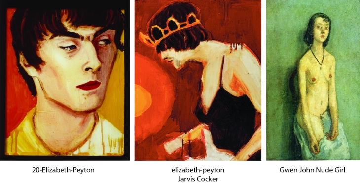
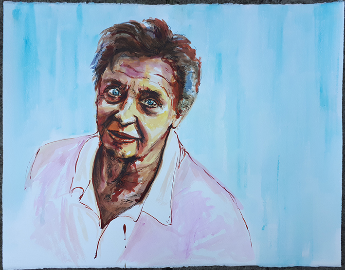
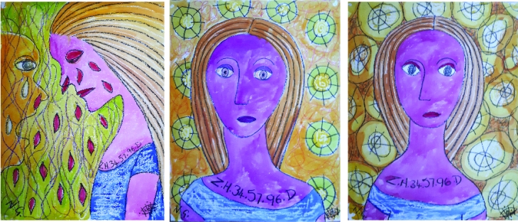
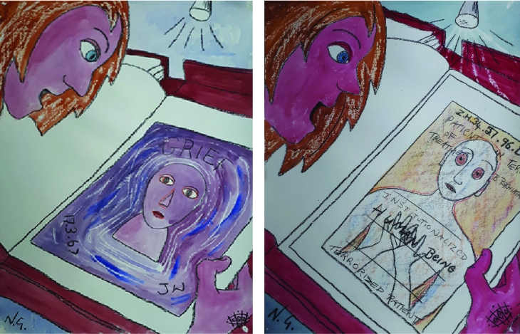
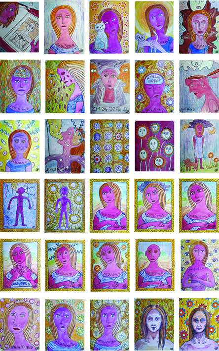
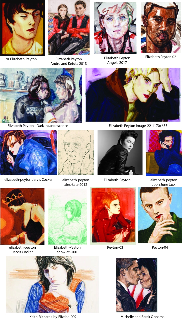
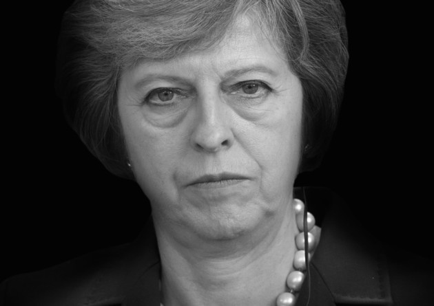
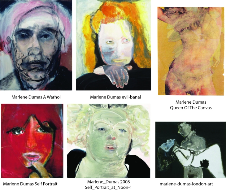
Marlene Dumas (b1953) has been called ‘the world’s most interesting figure painter’. Her practice centres around the human figure and examples of her work can be found in museums around the world. Like Elizabeth Peyton she draws on collected images and popular culture, her style is bold and painterly in a really interesting way, she captures a character with unconventional shading and line.

Paul Gauguin

Paul Gauguin comp

Eugène Henri Paul Gauguin (June 1848 – 8 May 1903) was a French painter recognized for his experimental use of colour. He was very influential to French avant-garde painters and modern artists. I really like the brushwork and colours that he uses and is a really refined painterly style.

Sylvie Gilliot

Sylvie Guillot comp

Sylvie Guillot was born in 1972 in Paris and studied at The Paris School of Fine Arts. Her work centres around the human figure and she shows a really interesting exploration of skin tone, shape and tone. Her work conveys tension and draws the viewer to the part of the drawing that she finds of most interest by emphasizing the depth of colour in those areas of the composition.

William Kentridge

William Kentridge comp

William Kentridge (born 28 April 1955) is a South African artist best known for his prints, drawings, and animated films. I like his sketchy monotone work and have been inspired by it for my last exercise. I am drawn to his pocket drawings and charcoal work as I am really interested in the storytelling in images and I think black and white is a powerful technique.

Ephrem Solomon

Ephrem Soloman comp

Whilst looking at different artists I came across Ephrem Solomon, an Urban African artist who uses collage and woodcut to produce these bold graphic portraits which depict the daily life of Ethiopians and the issues that they face depicted in the facial expressions of the subject. I found his work really moving, I am drawn to work that uses strong line that even though looks basic, is really expressive in its simplicity.

Dereje Shiferaw

Dereje-Shiferaw comp

On the same site I found this work by Dereje Shiferaw also an Urban African artist who also works in a painterly manner that in this case is done in watercolour. I especially like the background in the far right example contrasting with the figure. He paints people performing their daily activities in a couple of lines, forms and asymmetric shapes to record the rapidly changing environment and values that are present in his society.

Compilations

mix face comp

Finally I have compiled a couple of collections of portraits that I came across on my research but couldn’t find out much about who they were by, but saw something in their technique that caught my eye.

portrait mix comp

The Loui Jover portrait caught my attention as it is worked on newspaper, this is a medium that I have too be working on recently, I like the minimal colour use here.

Reference sources

Elizabeth Peyton

https://fineartmultiple.com/elizabeth-peyton/

https://www.google.com/search?q=elizabeth+peyton+artist&client=firefox-b&source=lnms&tbm=isch&sa=X&ved=0ahUKEwi4jfq6surbAhXIKcAKHfK_Cq0Q_AUICigB&biw=1366&bih=631#imgrc=zJOTgFYzJcst6M:

https://www.interviewmagazine.com/art/elizabeth-peyton

William Kentridge

http://nitramcharcoal.com/charcoal-inspiration-william-kentridge/

https://www.google.com/search?q=william+kentridge+artworks&client=firefox-b&source=lnms&tbm=isch&sa=X&ved=0ahUKEwipgJz7t-rbAhXkKcAKHct2BpIQ_AUICigB&biw=1366&bih=631#imgrc=OCU8NG_j3R637M:

http://www.tate.org.uk/art/artists/william-kentridge-2680

https://en.wikipedia.org/wiki/William_Kentridge

Sylvie Guillot

https://www.sylvieguillot.com/about

https://www.google.com/search?q=Sylvie+Guillot&client=firefox-b&source=lnms&tbm=isch&sa=X&ved=0ahUKEwiSsK_CxOrbAhXOFsAKHUhLAWcQ_AUICigB&biw=1366&bih=631#imgrc=npaixDlLOEg8UM:

Gwen John

https://en.wikipedia.org/wiki/Gwen_John

https://www.google.com/search?q=gwen+john&client=firefox-b&source=lnms&tbm=isch&sa=X&ved=0ahUKEwiO3-mJzOrbAhWrKsAKHbu1CeQQ_AUICigB&biw=1366&bih=631

Marlene Dumas

https://www.google.com/search?q=Marlene+Dumas-+looser+use+of+media+for+figure+for+the+next+part&client=firefox-b&tbm=isch&source=lnms&sa=X&ved=0ahUKEwj8vMDFzerbAhXlLMAKHRnRAWQQ_AUICygC&biw=1366&bih=631&dpr=1

http://www.tate.org.uk/context-comment/articles/show-or-not-show

Leon Kossoff

https://www.google.com/search?q=Leon+Kossoff-+related+to+building,+chaos+and+figures+to+add+narrative&client=firefox-b&source=lnms&tbm=isch&sa=X&ved=0ahUKEwiO2JyzzerbAhXLD8AKHSn4DToQ_AUICigB&biw=1366&bih=631#imgrc=x8VNWN5tjoLbcM:

https://en.wikipedia.org/wiki/Leon_Kossoff

Ernst Ludwig Kirchner

https://www.google.com/search?q=Ernst+Ludwig+Kirchner-+more+expressive+use+of+media&client=firefox-b&source=lnms&tbm=isch&sa=X&ved=0ahUKEwisks-gzerbAhVMJ8AKHUV9C4sQ_AUICigB&biw=1366&bih=631#imgrc=P7SkaNSxLnlgFM:

https://www.theartstory.org/artist-kirchner-ernst-ludwig.htm

Paul Gauguin

https://en.wikipedia.org/wiki/Paul_Gauguin

https://www.google.com/search?q=gauguin&client=firefox-b&source=lnms&tbm=isch&sa=X&ved=0ahUKEwjyivjU1OrbAhUJa8AKHfinCckQ_AUICigB&biw=1366&bih=631#imgrc=SMD9z_-scOE7QM:

Margaret Olley

https://cookshillgalleries.com.au/pages/margaret-olley-artist

https://www.huffingtonpost.co.uk/entry/17-visual-artists-you-should-know-in-2016_us_5673587ae4b0b958f65620c8

Ephrem Solomon and Dereje Shiferaw

http://www.urbanafricans.com/studio-visits-to-ethiopian-artists/

Compilation

https://www.google.com/search?q=artists+who+represent+the+face+and+head&client=firefox-b&tbm=isch&tbs=rimg:CcaMNggfjxUCIjgeapUeXCe30afa06cjeFsMk9Rf2ELgFdOj8Zhf–ATHJvf0lNtI32UanXcmr3m2K_1AOhf7x921dSoSCR5qlR5cJ7fREWHlIdyGNDEkKhIJp9rTpyN4WwwRMX0iJcPQ8GwqEgmT1F_1YQuAV0xFKd-6SDMMkZyoSCaPxmF_174BMcEcGstSDQ5JlCKhIJm9_1SU20jfZQRDFDTvMqbMX8qEglqddyavebYrxEBlo1PqJ7zayoSCcA6F_1vH3bV1EQBlPS7QX9Me&tbo=u&sa=X&ved=2ahUKEwit_MCEm-LcAhXrAcAKHcSJCVkQ9C96BAgBEBs&biw=1366&bih=631&dpr=1#imgrc=k9Rf2ELgFdOaPM:

Part 4: Project 6; Exercise 1, Facial features

Part 4: Project 6; the head, Exercise 1 – Facial features

Look at people (including yourself) in magazines, on TV and elsewhere and study the individual features. Practice drawing these in your sketchbook, a couple of pages per feature.

When you feel confident draw an entire head. Do not erase your mistakes.

Threasa May

For this project I combined the exercise with another project that I had to complete outside of the course. My brief was to do a portrait of Threasa May. I sketched a couple ideas in my sketchbook, and although one was favoured over the other, I decided to do both anyway! For this drawing I collaged articles that I had collected about the fire at Grenfell Tower and a few other articles that featured Mrs May. I wanted to create a discussion about the disaster and the manner in which she reacted, which in my opinion was not sympathetic to the victims. Done in monotone I wanted to bring the dirty sooty feel of the burnt out building into the portrait and have bits of the newspaper cuttings peeking through in a ghostly manner.

20180809_175346

I have not used a rubber at all on this exercise, however I have worked over it quite a lot. I think there are still aspects of the face that are not quite right notably subtally, the shape of the face and the mouth, but they are close and I think it is recognizable as Threasa May herself! I actually think that the overworking adds to the portrait and additional drawing of some burnt out windows in the background looming towards her and the fire fighter over her left shoulder all add to the ominous feel to the overall composition. I also included a chain around her neck, something she has often worn to signify a sort of imposed constraint of her personality, being chained to a position where she does not step out of line, even compassionately in this case.

The styles that I have drawn from for this image are those of William Kentridge and possibly a bit from Tactia Dean with her stunning black and white work.

Threasa May preliminary sketches

May comp

I did some preliminary sketches for this drawing as well as some other drawings to look at some different expressions, facial features and body positions.

Threasa May Expression sketches

Sketch expressions 01

Sketch expressions 02

I found her face really expressive and the individual facial features very interesting. The eyes have heavy circles below them and dark thin shadows across the top lid. Her chin is not symmetrical, the left hand side of the chin is drawn in and flatter, muscles below the skin pull in more than the right. The lines running from the nose edge to the mouth have indents higher than the mouth, and the neck tapers directly from the back of the chin.

Facial features studies – The Mouth

20180807_144113

With the mouth the shading and often the lack of line I think is key to defining the shape and amount of protrusion of the lips. The teeth are also an integral part of the mouth and the amount that they show can define one particular expression from another in a very subtle way, as can the shape the lips make through varying emotions and speech.

Facial features studies – The Nose

20180807_144142

Noses vary not only in their profile, but with the width of the base and tip and not only the shape of the nostrils, but whether they can be viewed when the face is seen front on or not.

Facial features studies – The Eyes

20180807_144153

Eyes are also really expressive, the direction that they look, the amount that the lid is raised or lowered and also the age of the person. The skin around the eye becomes looser as the story of someones life is drawn in the wrinkles that form around the eye and the eyelid.

Facial features studies – The Chin

20180807_144203

The chin also varies significantly in its shape, length and width, as well as the weight of the person. A double chin changes the shape of the face and the addition of facial hair also changes the character of the person. Facial hair also varies dramatically, from a small tuft to a beard that is bigger than the visible face of the owner!

Facial features studies – The profile

20180809_093959

I was also particularly interested in different profiles that occur between men and women, different ages and ethnic origins; the flatter Asian face, the protruding chin, the receding chin, hooked noses and sloping foreheads have an endless combination of possibilities. It has been really interesting to look at the face in such detail and I look forward to applying these observations to my future work.

Pictorial reference

image