Assignment 5 – Hornsey Road Fire Fighters

After Grenfell_web

Hornsey Road Fire Fighters

Daily Life

For this series I decided to work in a limited palette; I guided my composition in blue Col-erase pencil first, sometimes I had to make alterations to my drawing or combine two photographs from the photographic reference to tell the story that I wanted in my composition.

I then drew up the work in Faber Castelle PITT pens mainly the (S)small, (M)medium, (C)Calligraphy and (B)Brush nibs, often drawing up a number at a time and working through the set many times to work them up to their finished state. Having completed my pen work I next wet the whole page with a sponge and clean water to dampen the paper in order to add the ink top layer. To keep the feeling of the composition as sketch-like as possible I wanted to apply the ink quickly so that it ran and blended over the image and only had a hard line when I wanted it to. The Black Quink Ink I chose to use has hints of blues in it and id bleachable, turning the black area that has had a dilute solution of bleach an ochre/sandy shade of varying strengths.

Having applied the Black Quink Ink in varying strengths of shade across the whole image to define the environment I built up tonal ranges in the figures and foregrounds. The main colours that the Fire Fighters wear are Dark Blue and Red, with yellow present on their official call-out uniforms and truck. So to give the compositions I used some spot colours of mainly red and yellow to bring out some focal points to the image. I chose to use an Acrylic ink as the colour sits more physically on the surface of the paper which I felt appropriate and for the look that I wanted. Occasionally I needed to use a mix of the red and yellow to give me an orange, and the blue and yellow for a green. When the red or yellow spot colour was limited the image had less impact, another colour would bring the scene to life, so by adding inks more soaked into the paper and subtler (which was better to use a bleachable D PH Martins ink or really watered down acrylic); blue was used more to depict light and reflection, green was laid down more flat a solid colour depicting a solid object.

I think the limited use of colours really ties all the series together to show the depiction of daily life, the monochrome feel and spot colour leaves a lot of the image to the imagination so you want to look more into the picture. There is also an element of seeing things in black and white or monochrome (ie; sepia) that has a sense of nostalgia and a record of the past that suits this medium of storytelling.

On Parade in official uniform

For this series I felt it important to present the individual as well as the drawing, a more solid medium in bold colours would give the individual a presence and officidum. I had been working with oil pastels quite a lot in my life drawing classes and considered that this felt like a good medium to convey the look that was in my head; solid, correct but not photo-real, conscious and sometimes bold in the colour palette and strong and proud in front of a hint of a background which I would complement the oil pastel with a chalk pastel or Conte stick to add suggestions to aspects of the background.

The first Fire Fighters that I chose to draw were the only two female crew; 2018 being the year of the women and all that! Having completed these two portraits I went on to draw some other of the crew members. I couldn’t do all of them, so I just decided to take a select a few photographs that I felt would be suitable for a series. I had a few that showed the Fire Fighter in the act of doing something, putting on a helmet and taking the register, I felt that a mix of these different poses would make the viewer more engaged with the subject if they could relate to them as people, not just to attention.

The paper that I decided to work on is a rag paper which is approximately 78 x 57cm, the brown flecks in the paper are bagasse (Sugar cane) or other fibers and the paper feels like it has a sort of gum in it, it has a good surface for the oil pastes, a tooth, but not too much, an organic surface with natural edges. I used a half sheet for the portraits and 3 quarters of a sheet for one work. When I went back to get some more paper I discovered that they were out of stock and then later that they are discontinuing the line! I found a white rag paper with a similar feel to the surface, but not the flecks colour of the original choice, typical! I will just have to do the remaining ones on white!

I then got asked if I would do a group drawing of Green Watch, which would fit nicely on a full sheet of paper. Then slowly as I was doing it I realised that I would have to do one of each of the Watches now, the project would not be complete if any watch was missing and I didn’t want to appear bias in any way!! Then when I returned to each watch to photograph them in uniform in a line-up the other Watches have 5-7 members, I would have to get more white rag paper and stick two pieces together.


Daily Life Images

All the Daily Life images are done on 200gsm A2 Cartridge with Quink Ink, Diluted Bleach, FW Daler Rowney Acrylic Inks and Dr PH Martin inks.
testng the hose_web

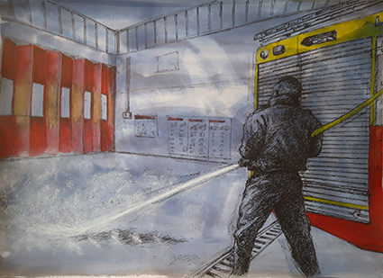
Testing the hose (Red Watch)

This was the first sketch that I did for this series. I was getting to grips with my subject and my drawing methods. I made some mistakes with the size of the Truck, but succeeded to leave them in as I think that not only do they tell the story of my drawing, but add to the sketchy look. The spot colour helps keep the eye away from the mistakes. The red was also applied very selectively on the doors to help create areas of light and shade, and the water spray is done in a soft white pastel that sits on top pf the background wash to depict the spray.
testing the mask_web

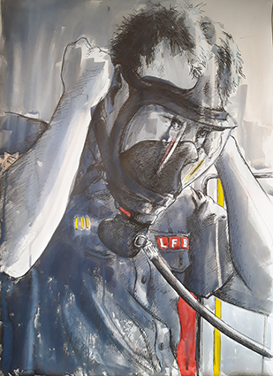
Testing the Mask (White Watch)

It took me two attempts to get the proportions right on this sketch, the mask was really dark in my reference and I struggled to make out its form. There is not much colour in this drawing, however I think it is one of the stronger compositions. The soft reflections in the glass on the mask really help , and there is a focus about subject testing the equipment.
testing the pressure_web

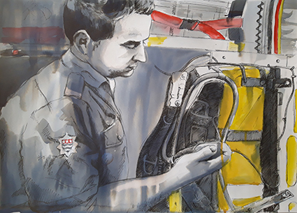
Testing the Pressure (Red Watch)

I like he intensity of the focus here, the equipment being functioning properly can be a matter of life and death. This has to be done every change of shift. There is just enough a hint of the background to imply that it is the truck. I used a little bleach in this one to draw some highlight to the arm, and a little on the face to imply the skin.

making tea_web

Making Tea (Red Watch)

Fire Fighters make a lot of tea, a lot more than they get to drink tho! I wanted to capture that ordinary function of making some tea and just having a chat whilst doing it. I am happy with the composition, however there is not much spot colour, just a bit of T-shirt and some buttons on the coffee machine. It is here that I realised that I would need to introduce  some additional colour. A pale wash of blue would indicate shine on the stainless steel surface and the blue and yellow ink made a nice green for the milk lid, this also gives an importance to the humble milk bottle that is so integral to the ritual of tea making.
the mess table_web

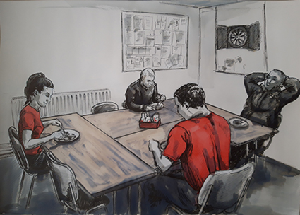
The Mess Table (White Watch)

Having made food for the whole crew Lexi sits down to eat with her Watch, I go and literally 2 minutes later when I was up the road, the truck drove past sirens blaring. I wanted to capture a rare moment when they actually all got to sit down and eat together. I wanted to capture the starkness of the Mess room. The wooden tables were emphasised better with some bleaching turning the black ink sandy colour to represent the wood, it also softened the image and drew you into the table more. The head of the female Fire Fighter seems a bit big to me, but I live with my mistakes!!
checking the map_web

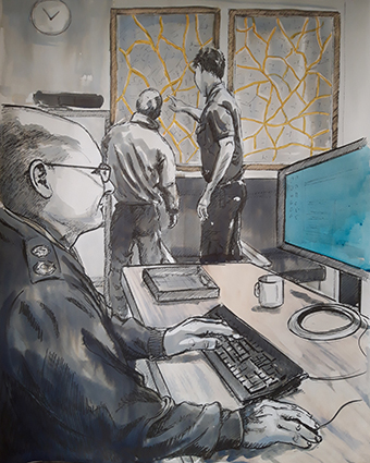
Checking the Map (Red Watch)

This is a compiled composition; I wanted to capture the Sargent doing his work on the computer while the Fire Fighters work out where they are headed by studying the large map of the area. This composition has some depth as the scale helps draw the viewer through to the map, the yellow on the roads was not enough to pull the picture together, then as I looked at the computer screen I realised that the Microsoft Blue light coming from the screen held the answer. You don’t really see it, it just draws you past it, but the figure is intently looking into it!
call out_web

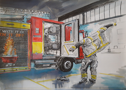
The Call Out (White Watch)

This was the sketch the made me realise that I would need to use other colours other than just red and yellow! I needed a blue to show the siren lights and to mix the red and yellow to show the flames on the graphics on the side of the truck. I felt important to show this composition into the story, introducing the truck, the act of quickly putting on the kit, leaving the day shoes ready to get into the open door and drive off into the light outside. By putting the coloured ink over the top of the tonal Quink Ink I can give some idea of texture and shade.

Mobilize Mobilize lettering_web

Mobilize Mobilize (Red Watch)

I now wanted to show what the station looked like once the crew had gone out on call, any food was left half eaten, I was warned that every time they cooked together the meal was interrupted by a call-out! This was the only sketch that I felt warranted text, I wanted to convey what was said over the tannoy. It is surprisingly quiet as an alert, not a loud siren that would make you jump out of your skin! For this reason I have done the lettering sketchy and not solid. A bit of bleach on the bun gives a feel for the bread while the beans required some orange mix. The sketch came to life when I added the blue on the stainless steel and then the secondary focus on the First Aid Kit, the green object giving another point of interest.
night watch_web

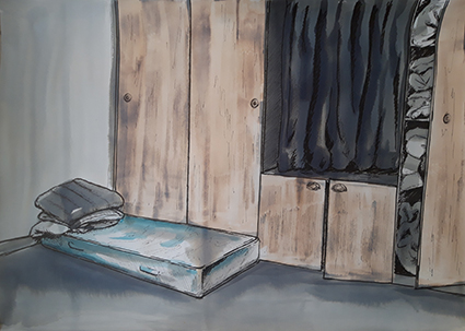
Night Watch

I was shown around and delighted to see the sleeping quarters used by the Night Watch. The mattresses were supposed to be put away, however fortunately for me this one was still out. It felt very basic and 1950’s in the feel of the built-in wardrobes that stored the sleeping bags and mattresses. The only real colour was a bit of blue in the pattern on the mattress, so I added colour in this sketch by bleaching back the doors to represent the wood. The lone small mattress looked quite bleak in the corner, so I wanted to keep an element of bleakness to this drawing.
changing kit_web

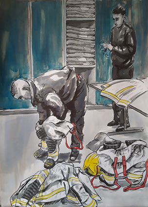
Sorting Kit (White Watch)

Having come back from a Call-Out the Fire Fighter has to change his soiled uniform for a new one. New uniforms were introduces a few months ago, now every time they get a bit dirty or contaminated they are sent off for either cleaning or disposal. New kit is stored in plastic bags in the lockers behind. When I painted these blue it was too dark and I forgot that it did not bleach, the Quink Ink behind it did bleach a bit and it left the doors looking quite streaky and a little busy, but I have to live with my mistakes! I really like the way they have to put their trousers over their boots to enable quick dressing and get away.  In this sketch I wanted to show the way that they do this, the way that the clean their kit, and record and unwrap the stiff pristine new uniform.
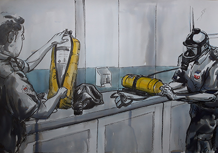
no pressure_web

No Pressure, Changing the air tanks (Blue Watch)

This is what the daily checks are for. The tank was not up to pressure and had to be changed for a new one. There is a side room where all the spare tanks are kept, it was stark and lacking any colour except for a pale blue/grey stripe around the wall which I had to use a very dilute wash over the dilute Quink Ink, the yellow covers for the tanks and the embalms on their uniforms being the only other spot colour.
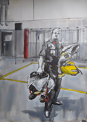
sargent carrying kit_web

Sargent Carrying Kit (Blue Watch)

I wanted to show just how bulky the kit is that they have to carry, this shot of the Sargent, denoted by the black and white stripe on his helmet. This view, which I used a bit of artistic licence in the background, also shows the Fire Poles behind the clear plastic blinds, I don’t think they are used that much, but they are an integral part of our stereo typical idea of a Fire Station. I really like the minimal spot colour in this sketch, and the deliberate drips add to the textural interest.
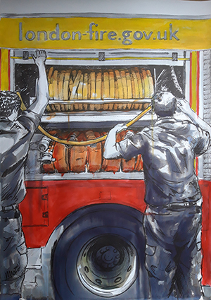
checking the hose_web

Checking the Hose (Blue Watch)

The hose is obviously an integural part of the truck; the automatic rotation to coil the hose needs to be checked, sometimes if not returned correctly the hose can become jammed. There are two sorts of hoses, ridged yellow ones and more flexible red ones. When the wound hose is correctly coiled, the shutter door is pulled down. This sketch is the one that I have used the most colour in so far, varying shades of orange are used for the hoses flanked by the red and yellow of the Truck. I kept it qiute rough, drippy and sketchy to keep some textural interest, I didn’t want the colour to be too neat and become to tight and dead visually.
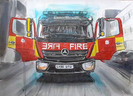
the truck_web

The Truck (Blue Watch)

Had to draw the Truck, it is a part of the Family! I wanted the background visible, but a bit softer as if bleached out by the bright sun. The Truck, ready and waiting for a Call-Out sits waiting like a butterfly ready to take off and fly. The crew run regular checks on the siren lights to ensure that they are working, giving the Truck a sort of blue halo! I like that the background looking as if it is whizzing past even though the Truck is stationary, it gives it a sense of life.

After Grenfell

After Grenfell Sketch_web

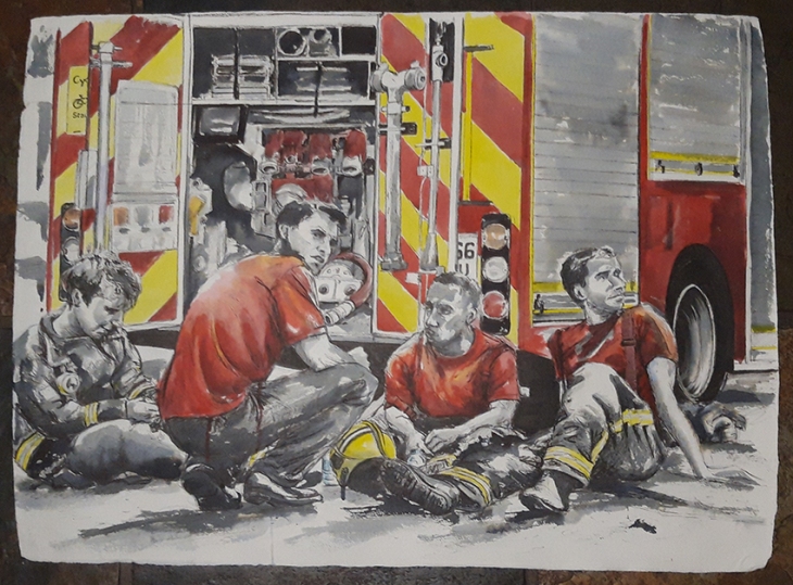
For a culmulation of this series of daily life, testing and training I was given a photograph taken by one of the Fire fighters of Red Watch when they had attended the fire at Grenfell Tower in North Kensington, it was such an emotive image that I felt it would make a fantastic final image for this series, this is what all the work, training and preparation is for.
After Grenfell_web

Once I had added the spot colour on the truck and clothing this artwork really came to life. Tammy, on the left hand side of the picture is still in full uniform, the old dark blue wear that was replaced towards the end of 2018. Getting the expressions right was critical to this image, the viewer questions what they are looking at which is only given away by their demeana and the title. The loose almost abstract ink work conveys the exhaustion and soot, the colour gives the Fire Truck context.

Officially in Uniform

These portraits are a celebration of the men and Women who serve at Hornsey Road Fire Station
lexi_web

Lexi

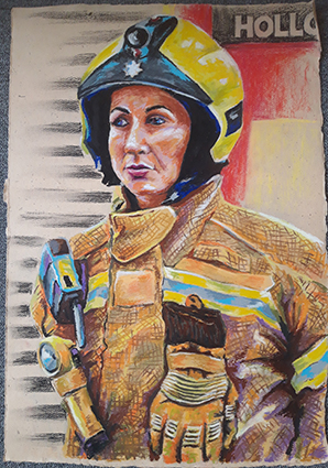
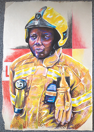
I wanted to start my oil pastel drawings by drawing the female Fire Fighters first as 2018 was the year of the women. Lexi was so hospitable and helpful showing me around I wanted to do her first. This is the first time I would work out how to represent the uniforms and tones. This part of my project enables me to explore tone and colour while trying to keep a freshness about my mark making, I had to work out some mark making and methods of application that I could apply to this and future portraits.
tammy_web

Tammy

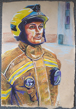
I got some new oil pastels so that I had some differing colours and density of oil pastels, some harder (the Daler Rowney ones) some medium hardness (Neopastels) and softer ones (Selinner) I also got some cheap ones (Giotto) to add to my tonal selection. This portrait is quite official in Parade pose, but it does emanate a strength and defiance of character.
colin_web

Colin

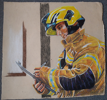
I wanted to illustrate another aspect of Parade, so I drew Colin checking his crew with a clipboard. Compositionally this needed to be larger than half a sheet so I used about three quarters of a sheet which looked most comfortable. The minimum use of colour done in Conte pastel just indicates his surroundings rather than drawing too much in.
brian_web

Brian

Here I wanted to try rendering a different colour skin tone, I had seen Brian standing in on an extra Watch and felt his dedication needed to be recognised! This was a good exercise to see how far I could push the colour tones to bring out his character.
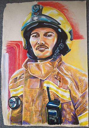
reece_web

Reece

When I went in to photograph Green Watch Reece was particularly helpful and had a really outgoing character, so I felt he would be a good subject for a portrait, slightly cheeky and always smiling! It was also this Watches’ idea that they would like a group drawing, what had I got myself into?
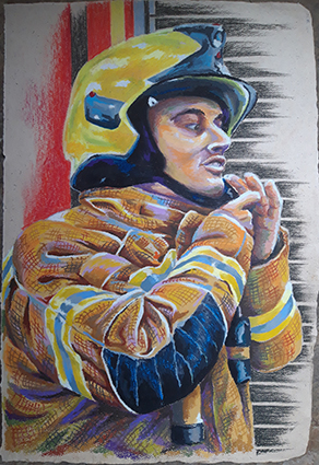
unknown_web

Dan

I wanted to capture this portrait in the act of dressing in uniform putting on the helmet as drawing someone in mid movement can create an interesting composition. As with the other portraits, I laid out my composition in blue Col-erase pencil which I then rubbed out lighter with a putty rubber before building up firstly the uniform, secondly the face, then finally the dark areas on the helmet and clothing and the cross hatching over the top of the uniform.

Group drawings of each Watch

green watch_web

Green Watch

A single comment from one of the crew inspired this drawing, he wanted one of the whole watch so that he could put on the inside of his locker. Drawing the crew smaller was more difficult as representing detail in oil pastel at this size is not as easy as it is on a bigger scale. I had to add uniform trousers to this drawing as they had posed only in jackets, I got this reference from pictures of White Watch. I wanted to capture them official, but a bit relaxed as I felt that this would give each one an identity and personality easier than if they were stood fully to attention. All these group drawings are done on A1 sheets stuck together to make the appropriate landscape length.
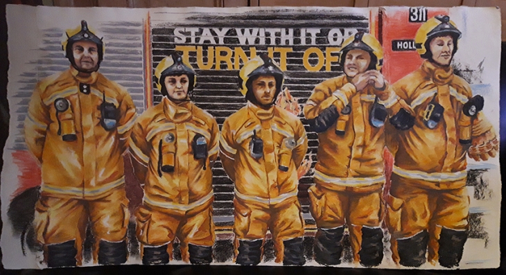
Red Watch_web

Red Watch

Once I had done Green Watch I realised that I had to do all the Watches, it would not be fair to just do one, I had to do all four watches. When depicting Red Watch I felt it added an extra level of interest to the scene if one of the crew was doing up his helmet. By the time I started this drawing I had shown some of the drawings to the Curator of Islington Museum who indicated that they would be interested in having a future exhibition around the Fire Fighters to celebrate their work, this also made me realise that I could work on a slightly bigger scale by sticking sheets of paper together to make a landscape and fit all the crew on rather than making the figures even smaller. I intend to show them clipped and unframed as they are on 350gsm cotton rag paper which is fairly rigid. The bagassee and Gunny paper that I had been working on had been discontinued, so I had to find an alternative.  I did prefer the brown off white background, but I could not find suitable alternative paper in brown, so I had to suffice with a white background.
Blue Watch_web

Blue Watch

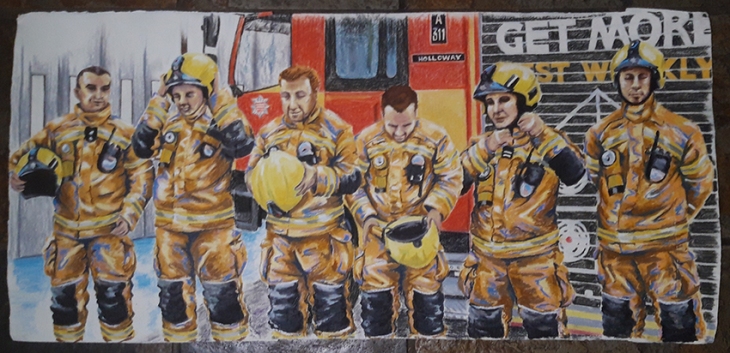
For green watch I had used a green base to the uniforms, for Red Watch an orange tone, then for Blue watch I added a blue highlight and a white highlight for White Watch. I had liked the crew member putting on the helmet in the previous drawing, so in this group image I wanted to show the process of putting on the helmet. I had to compile this image from a collection of photographic reference, I like the wave line that is created through the image of the different stages of putting on their helmets. I am not 100% satisfied with my depiction of the faces, maybe sometimes the heads are a bit big, but the proportions were challenging when you place a human figure in an over size uniform! I could not change it, so I had to go with the result that I created, they do all have individual characters, and I think that the aspect that I have depicted the truck in does add an additional interest as it also includes the station doors implying the way out when opened. With 6 characters in the crew, the paper had to be a bit linger. I wanted to keep the heads not on a paper join seam, so I had to add additional paper to each side to accommodate the composition.
White Watch_web

White Watch

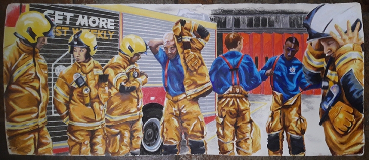
Finally I had White watch to draw. Some of the crew were a bit drawing shy, but they did all dress in uniform for me as I photographed them. I had in mind that I wanted to depict them getting dressed in uniform to show the layers and sequence of dressing. This image is the longest as a full maximum crew of seven were to be depicted. This is a complete compilation from many different photo’s and was the most difficult of all of them to complete. I chose to show a different view of the truck and the station so that I had a full gamut  of scenes. this is my favourite of all the group portraits, I think it has the most movement and storytelling in it and is therefore the most interesting, especially as it includes a different aspect of the station back doors as well.

In all the portraits I have used Conte sticks to depict the backgrounds. I had to use the edge of a sheet of paper to get the straight lines, and although I was depicting the truck and the environment I was careful not to do so fully so as to leave something to the imagination. I like the contrast in technique as it gives the eye two aspects to look at that do not fight each other.

I may have done more images than is strictly required for this part of the course, but I felt that I had a story to tell, and that story could not have to be told in few images. I needed a bit of extra time to finish all the drawings as the big ones took a couple of days to do in total at least as it could take some time to get the composition right to start with and I have been working full time throughout December and January, although I did have some well needed time off over Christmas that I put to good use with my drawings.

I have really enjoyed this project and have relished getting into producing a series of works that have evolved and developed over the period of time that I was executing them. Working in two styles gave me scope to tell two parallel stories that depicted the sides that you see and don’t see publically. I hope that I have achieved my goal of celebrating the work of Hornsey Road Fire Fighters, and I have to thank them for their generosity in accommodating me doing this project.


Research Point: Positive and Negative Space

Positive and negative space_01

Gary Hume

Born in Tenterden, England in 1962

He was renowned for his works that he used high gloss house paint to depict everyday objects and came to prominence while a member of the Young British Artists alongside the likes of Damien Hurst. He studied at Goldsmiths College London in the late 1980’s and has gone on to become one of Britain’s most highly respected painters, a voyage of his work being displayed by the Tate. His Industrial and Hospital Door paintings which are life-size depictions brought him to the attention of Charles Saatchi and he represented Great Britain in the 1999 Venice Biennale. He explores colour in a highly innovative way and produces distinctive and dramatic compositions. His work can verge on the abstract as it depicts common recognisable objects and forms in a simplistic fragmented way, playing with the positive and negative spaces that the objects create in the composition.

Positive and negative space_02

The practice of experimenting with the positive and negative spaces in an image can be seen in some of the works that I have selected to demonstrate the practice. By concentrating on the background or spaces between the objects that make up the composition you are telling the eye to fill in the gaps and create the missing objects in your mind. The result can not only be a very accurate depiction of the form that is ‘not there’ if you got the shapes right, but a really interesting representation in a relatively abstract form.

Positive and negative space_03

Positive and negative space_04

While sourcing images for this research, I firstly found George Braque’s bird series that I felt showed the Artist that I had researched for the Still Life Genre, had used this principle to a very illustrative and designed effect in this lithograph. I then wanted to see some examples by other famous artists, the work above by Pablo Picasso a complex and dramatic composition that uses positive and negative space to great effect.
Positive and negative space_05

I was then inspired to look at the work of Escher, famous for his dynamic black and white transitional compositions that use positive and negative spaces to form the same repeated shapes. Finally I was reminded of the art of shadow puppets and decided to take a look at the art of traditional Indonisian designs for this practice of storytelling where the puppets are operated back-lit behind  transparent screen. It is interesting to compare and reflect on how this how the use of positive and negative space has evolved and influenced art in its many forms over time.

Reference:

http://www.artnet.com/artists/gary-hume/

http://www.tate.org.uk/whats-on/tate-britain/exhibition/gary-hume

http://www.drawingandpaintinglessons.com/Drawing-Lessons/Negative-Space-2.cfm

https://mymodernmet.com/negative-space-art/

https://www.google.co.uk/search?q=gary+hume&source=lnms&tbm=isch&sa=X&ved=0ahUKEwjzobrL1uHXAhWFK1AKHVW0AXkQ_AUICigB&biw=1366&bih=635#imgrc=3PE9N6F3lazUHM:

https://www.google.co.uk/search?q=contemporary+artists+still+life+positive+and+negative+space&source=lnms&tbm=isch&sa=X&ved=0ahUKEwjdgrTO2OHXAhWDaVAKHbYECVcQ_AUICigB#imgrc=BhCtq5uK9ZnEqM:

http://www.drawingandpaintinglessons.com/Drawing-Lessons/Negative-Space-2.cfm

https://www.google.co.uk/search?q=positive+and+negative+space+art&source=lnms&tbm=isch&sa=X&ved=0ahUKEwjIwNeRiunXAhWiA8AKHfvXA5AQ_AUICigB&biw=1366&bih=635#imgrc=o_U9kAPWIRe9pM:

https://www.google.co.uk/search?biw=1366&bih=635&tbm=isch&sa=1&ei=l6YiWuTjC4eXgAaTmKnYAQ&q=positive+and+negative+space+traditional+puppets&oq=positive+and+negative+space+traditional+puppets&gs_l=psy-ab.3…21636.23789.0.24967.7.7.0.0.0.0.68.378.7.7.0….0…1c.1.64.psy-ab..0.0.0….0.gOV7SP3CRkQ#imgrc=2yMmfoRuHilmGM:

https://www.google.co.uk/search?q=positive+and+negative+space+famous+artists+drawings+escher&source=lnms&tbm=isch&sa=X&ved=0ahUKEwjZjpyGs-vXAhVLKsAKHcuVBRQQ_AUICigB&biw=1366&bih=635#imgrc=ted6RpmDVjIBEM:

Research Point: Still Life Genre

Still Life Genre_01

Looking at 16th and 17th Century still life paintings there is some general and consistent themes; bowls of fruit, loose fruit and foods, curios, kitchenalia and anatomical bones, skulls in particular. The paintings are generally of a lavish and opulent nature and very photo-real. As photography was not invented in this era adorning walls with hyper- realistic images was commonplace.

Still Life Genre_02

The Chiaroscuro technique is one that uses strong tonal contrast to depict the three dimensional forms of solid objects. Still Life, however was considered bottom of the Genre scale below; History, Portraiture and Scenes of everyday life, then followed by Landscapes and Still lives, graded in this was as the lower ranking genre’s do not contain the human figure as subject matter.

Still Life Genre_06

Paul Cezanne

Born January 19th 1839 – Died October 22nd 1906 Aix-en-Provence, France.

Cezanne’s work is a link between the Impressionists and paving the way for the later Modernist movements of Fauvism, Cubism  and Expressionism. Cezanne painted in a very methodical and constructive manner, studying each object with great care representing it in what Cezanne called “a harmony parallel to nature”. The subject matter and compositions however still have a close relation to the traditional 16th and 17th Century compositions, although they appear much brighter, vibrant and more painterly, there is an energy that comes from Cezannes imagery that is not present in the previous comparatively more stayed and dower moodiness of the Chiaroscuro technique.

Still Life Genre_07

Still Life Genre_03

Georges Braque

Born French – 13 May 1882 – Died 31 August 1963

Georges Braque was a major 20th-century French painter, collagist, draughtsman, printmaker and sculptor working in the Impressionist movement before exhibiting with the Fauvists in 1905 and Cubist movements and having close association with Pablo Picasso.

Still Life Genre_04

In 1907 his work began to become influenced by the work of Paul Cezanne, some of these influences can be seen above in Still Life with Fruits  painted 1925. In these comparative studies I think that the drawing and painting styles show a clear evidence of the influence of Cezanne.

Still Life Genre_05

Braque then moved on to becoming more interested in geometrical forms that came to represent his Cubist works. These examples show the depth and diversity of Braques works. I find it really interesting to see the relation between the construction

Still Life Genre_13

of his cubist drawings and the way he then translates them into his paintings. They appear broken and disjointed, but this complexity results in really interesting compositions that are a feast for the eye, almost like looking at the still life through a broken and fragmented pane of glass.

Still Life Genre_08

Pablo Picasso

Born: October 25, 1881 – Malaga, Spain. Died: April 8, 1973 – Mougins, France

Picasso’s styles were Cubism, Symbolism and Surrealism and he worked in the mediums of drawing, painting, printmaking and sculpture. He was famed for his bold abstractions of familiar forms and bold use of colour.

Still Life Genre_09

He was very experimental in his work, his work ‘Still Life with Chair Caning’ is celebrated for being modern art’s first collage work, using a piece of printed oil cloth to represent the chair cane which is worked so as to be seen through a glass table.

Still Life Genre_10

Here, again we still see the use of themed objects, skulls, kitchenalia and foods, this time substituting the ttaditional fruits with vegetables, in this case leeks. The abstraction of the forms create bold geomettic shapes, very illustrative in nature and often bringing elements of the ‘designed’ background into the forms of the still life its self.

Having curatedthis series of images for this research, I notice that the subject matter of Still Life has remained very much consistent and is still consistant to a degree in recent modern compositions. Fruit, curios, kitchenalia, flowers and notably skulls are all very common subject matter and are worked in similar compositions over and over in various colour ways and stylistic variations.

Still Life Genre_11

Today many still Life works can be found in such galleries as Red Rag Galleries which specialises in contemporary Still Life paintings from a wide selection of British Still Life Artists. I think that today’s artists work in a much more diverse range of styles, no longer is the art world so much dictated by movements and trends, individual artists often strive to create their own styles, and it is this constant reconstituting and mixing of new styles, looks and techniques of traditional styles that new styles emerge with new twists and influences. This is actually quite an exciting progression as the mediums of Social Media allow both professional and amateur artists to put out their ideas and artworks on platforms that have a vast audience reach and offer a relatively level playing field of visual availability and exposure.

Still Life Genre_12

References:

https://www.google.co.uk/search?q=paul+cezanne+still+life&source=lnms&tbm=isch&sa=X&ved=0ahUKEwisi7WzwuHXAhWhB8AKHa5IDAoQ_AUICigB&biw=1366&bih=635#imgrc=VBdzr2hKWAkW-M:

https://www.google.co.uk/search?q=picasso+still+life&source=lnms&tbm=isch&sa=X&ved=0ahUKEwjl2oe8wOHXAhUlIMAKHaKFDEUQ_AUICigB&biw=1366&bih=635#imgrc=mIIgaxUgs_AfOM:

https://www.google.co.uk/search?q=braque+still+life&source=lnms&tbm=isch&sa=X&ved=0ahUKEwijsKbMwOHXAhXqC8AKHZn9DLMQ_AUICigB&biw=1366&bih=635#imgrc=kLv7HZUq3AsjhM:

https://www.google.co.uk/search?q=contemporary+still+life&source=lnms&tbm=isch&sa=X&ved=0ahUKEwjFqoTlwOHXAhVjGsAKHQE_DzQQ_AUICigB&biw=1366&bih=635

https://www.google.co.uk/search?q=16th+century+dutch+still+life+paintings&source=lnms&tbm=isch&sa=X&ved=0ahUKEwjS_NbByeHXAhXmD8AKHUPEChoQ_AUICigB&biw=1366&bih=635#imgrc=_

http://web-crayonstudio.com/lemons-in-a-plastic-bag/

https://en.wikipedia.org/wiki/Chiaroscuro

http://www.theartstory.org/artist-cezanne-paul.htm

http://www.tate.org.uk/art/art-terms/s/still-life

http://www.theartstory.org/artist-picasso-pablo-artworks.htm

http://www.tate.org.uk/art/artists/georges-braque-803

https://en.wikipedia.org/wiki/Georges_Braque

https://www.mallgalleries.org.uk/still-alive

http://www.redraggallery.co.uk/still-life-paintings.asp

Assignment 1

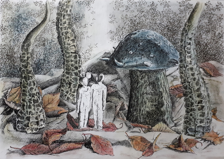
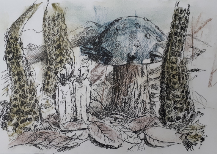
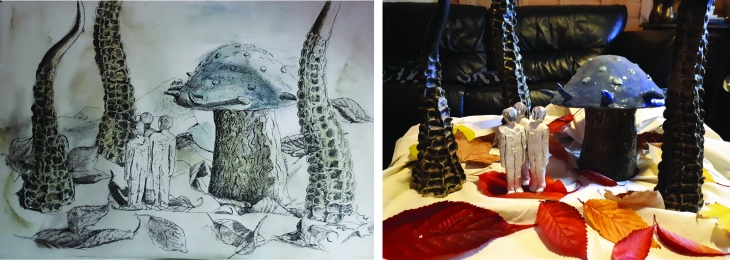
For Assignment 1 I chose to work on A2 cartridge on a selection of ornamental objects from my living room. I couldn’t face any more kitchenalia and wanted to create some sort of strange scene. I used my ceramic tentacles that I got from the affordable art fair some years ago with the spikey giant mushroom that I made myself in pottery class and placed them with the aliminumn figures that are also purchased pieces on a crumpled sheet. I wanted to contrast the hard man made forms with some leaves that I think give the still life a contrast of texture, also the autumn leaves are beautiful colours and add some colour into the composition. I chose to work in pen and ink as I have really enjoyed using the medium and like the way that it contrasts with the coloured graphite sticks that I couldn’t resist buying! The background I took from my mood test sheets representing ‘curiosity’. These marks are made with a brush and slightly watered down ink. I like the way the tonal mottled effect is built up withe the random mark making.
20171116_094425

Usually I would just dive straight into a piece when I could clearly see what I wanted to achieve in my head. Although I had a fairly good idea of what I wanted to achieve I did have a go at doing a rough sketch in my sketch book first. I really like the quality of sketches and am often fustrated that I tend to tighten up for the final piece, losing some of the overmarking freshness that is present in the original sketch. The final piece probably took about 6-8 hours, the A4 sketch about 2 hrs. that’s probably the key there, do it quicker!! However, from this sketch I can see that I need to build some depth into the final piece that will help bring the chatacters forward. It was also at this point that I decided that I would need to guide the eye to the figures, and considering the space-man other worldly feel of the composition that a subtle beam of light that the characters look up to would add an element of story telling to the piece.

20171113_154720

I did lightly sketch out the piece in pencil first to position the composition on the page, this took a couple of attempts, but I was glad that I did as diving straight in with pen I would have been well off the page! I sometimes find it useful to photograph work part way through as it can help you see where you need to work further on it. It was at this stage that I decided to add some colour to the piece in the leaves and use some of the mark-making that I had done on the mood sheets. I did replace some of the leaves that I first used in the composition as they dried, shrunk and curled up on me! I also had an angle-poise lamp to the right of the composition that is not on in the photograph as I realised that I needed some stronger cast shadows to give me more mood.

Assignment 1 final piece

I also wanted to draw some of inspiration from the research of Odilon Redon , bringing a dark fullness into my piece that is present in his drawings. Blocking in some of my areas with the block graphite colours helped create the soft tonal effects that I was trying to emulate. I am quite happy with my final piece. There are a few aspects that I would change now I have had a chance to look at the photograph. I will soften the light column on the right hand side (this I can do with a putty rubber), I also find the right hand figure’s face too dark and the fold in the material behind the figures is a little too dark, it conflicts a bit too much with the light beam, but does add a bit of oddness and mistique to the composition. These last two errors I could not change without adding white paint which I do not want to do! I also think that I could have represented the folds in the material better if I had controlled the shape of the lines in my cross-hatching to follow the contors rather than sticking to straight line cross-hatching and building that up in layers. All good learning though!

Exercise 4 – Shadows and reflected light

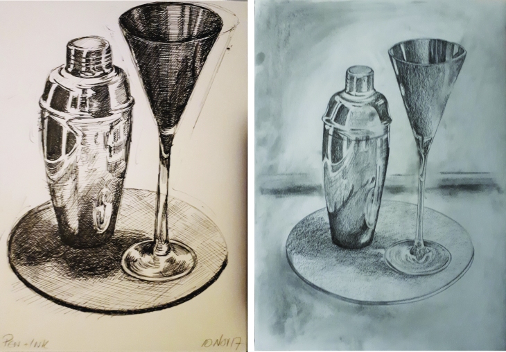
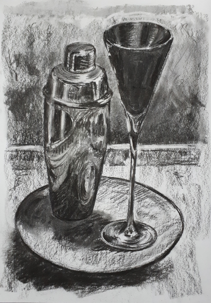
For this exercise the two objects with reflective surfaces that I chose were the cocktail shaker and cocktail glass. I did not use an external light source as it burned the reflections out, but just the light from the overhead light in the room and the light from the TV! I ended up doing a few versions in different mediums as I wanted to experiment a little and see how different the different mediums represented the exercise and subject matter.

Exercise 4 Shadows and reflexions

These are the first two versions that I worked on, the first A4 in my sketchbook in pen and ink, I am quite happy with the proportions and shapes and I like the effect of the pen and ink. The tonal work is less obviously gradated and the reflective areas on the cocktail shaker are very much less defined. In the next pencil version on A2 paper, the shapes of the cocktail shaker and the slate base are a bit off, too narrow on one side and not quite circular enough, however the reflections are much more accurate and representative of the actual still life. In reality the drawing should be darker if it were to be a true representation, but even though the tones and shadows are in a lighter scale, they do offer a clearer idea of shapes and tonal values that the reflections make.

20171111_094608_001

The exercise required the use charcoal and a putty rubber on a toothed paper, so in this version I used willow charcoal on A2 cartridge paper. I am not entirely happy with this version, I feel that I have not achived the gradations of tone that set out to achieve, It does have a element of a free drawing expression and the shapes that the reflections make have a but of a realistic sense, the tonal values probably more true to reality. It’s odd that in the looser charcoal version, the fat that some of the shapes are a bit off trouble my eye less, probably offset by the sketchy quality of the mark making. The other difference with the charcoal version was that I included a bit of background in this version which I think makes for a more rounded composition.

20171110_210439


Exercise 3 – Creating shadow using lines and marks

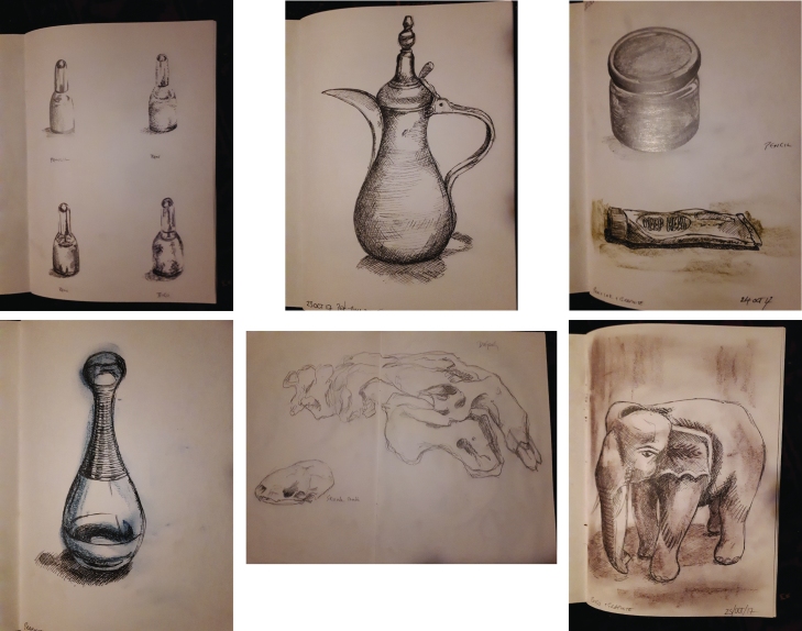
Firstly I took some nail polish as I liked the shape of the bottle and drew it using 4 suggested drawing techniques, pencil, pen, pen and ink and biro, all in different styles, stipple, shading, cross-hatch and scribble. I then, following a visit to the art shop where I found some chunky graphite sticks in various colours, tried out some other techniques, mainly a loose series of marks with the graphite sticks, some indiating shading, then pen and ink over the top. I drew all the images completely freehand without mapping out my image first, and was pleased to get results that I did. Quick crosshatching to describe line and shade is really expressive using pen and ink, and is set odd really effectively with the coloured graphite. I know this is a bit off brief, but I couldn’t resist trying out my new materials! I also visited the Grant Museum of Geology, and have included this sketch of a Dugong skull which I tried to sketch quickly in a loose scribbly style which contrasts with the tighter pen and ink and crosshatcing style.

Sketches Exercise 3

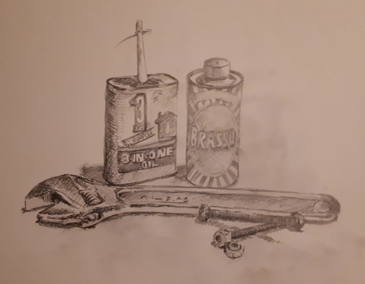
For the next part of the exercise I arranged a small group of objects, loosley inspired by my recent epic experience of changing the washer on my leaking tap! I like to have some sort of story attached to my choice of still life objects, I think it is important if I am to engage and ‘feel’ the composition and enjoy drawing it!

Tools sketch pencil

The exercise discourages drawing obvious outlines, creating the appearence of light, shade and form purely from tonal sahding. It is really hard to actively not draw outlines, and even to draw just in line when using pencil as the urge is to turn the pencil on the side and shade! On A2 cartridge I tried to sketch this still life fairly quickly, hence the lettering on the objects is very rough, but I wanted to create a feel for the drawing rather than one that was absolutely accurate. As I had been using pen and ink in my sketchbook, I then wondered what the same set up would look like if done in a different medium….

Tools sketch pen

This sketch was once again drawn without mapping out in pencil first, I am quite excited by pen and ink, the unforgiving nature of the mark making, the fact that you have to be fairly accurate with your sizing and proportions when mapping out your composition, and the building up of tone and shadow with a build up of mark making. I wanted to try and reflect the oily, grubby nature of object selection with the sketchyness of the line.

This is a photo of the still life (actually reset after I tidied it away too soon) for reference:

20171105_221606

Project 2: exercise 2 – Observing Shadow using blocks of tone.

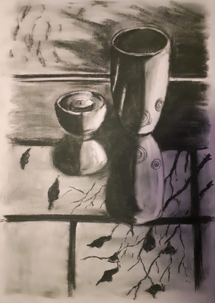
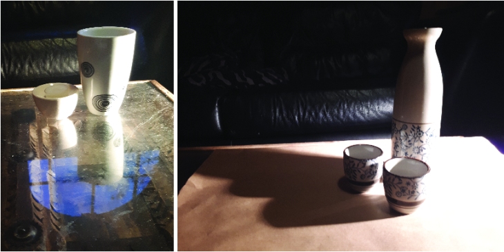
For this exercise I firstly used a black soft pastel on A2 paper, not having a conte crayon, this was the closest. It was a bit clunky to draw clean lines with and actually quite hard to get much tonal gradation. The composition that I chose only had a short amount of time to execute as I was really interested by the way the light was coming through the window and reflecting on the glass table the up-side down reflection of the window and the tree that was becoming more and more bare as winter encroaches, clinging on to it’s last few leaves. I found that by smudging the pastel I could create the illusion of tone, it’s a bit solid and would be better with a greater tonal value, but I think that would require a different medium. This image I quite like as the composition interests me.

20171023_175839

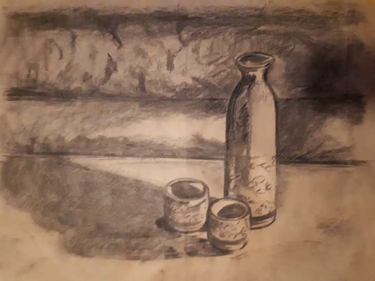
I then wanted to expirement with charcoal on brown paper. I chose a different set up, but used the same lighting source to create strong harsh shadows. I particularly liked the long cast shadows so chose to make a feature of them. The charcoal on the rough side of the brown paper too to a degree, but rubbed off really easily. I did spray the image with hairspray which did fix it a bit, but was hard to get some really dark tones. I did use a bit of conte pencil to put some dark tones to eccentuate the dark and light areas, but still was not happy with the depth and gradation of tone.

20171023_185615

The two different set-ups cast their shadows quite differently on the different surfaces. It was quite hard to leave the light areas with such bold drawing materials.

tone still life

Project 2: Exercise 1 – Groups of Objects

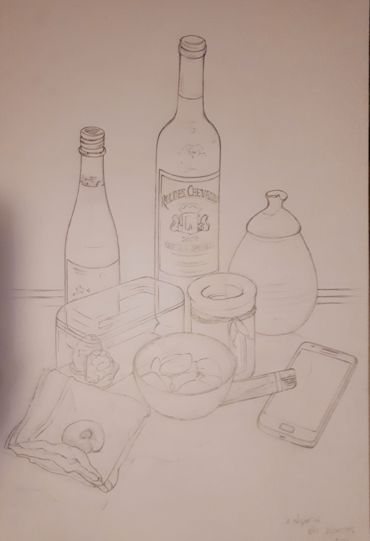
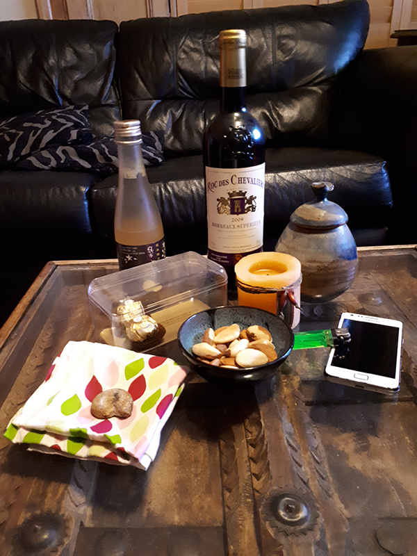
For this exercise I worked on A2 paper in pencil. I chose my objects as depicting a night in, some bottles of dring, bowl of nuts, candle, phone, lighter for candle (the only object that I think is unsuccessful in the drawing). I tried really hard to keep the proportion of the objects and their relationship to eachother true to the objects that I had in front of me. It was quite hard to refrain from shading areas in ans strictly stick to line only. Ensuring that the objects stayed true by following the lines as if seeing through the surrounding objects helped also ensure that the negative spaces and gaps remained true.

20171021_200357

I was also interested in the transparent box with the remaining two Ferrero Rocher and how the curved plastic distorted what I could see. I wanted to include a soft item which is why I included the handkerchief and some organic shapes, hence the nuts. The fossil ammonite is there for good measure! Below is the actual still life

20171021_still life small

Exercise 1 – Experimenting with expressive lines and marks.

Calm

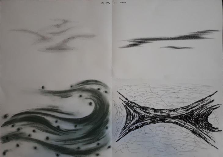
CALM – Mostly this sheet was epitomised by soft gentle shading, sweeping lines, shapes and emerging tones. The bottom right conte image, a mixture of hard an lightly drawn tones was calming to do, even if it does not look so soft and tonal as the other quadrants, it does draw you in which I feel is calming in it’s own way.

Anger

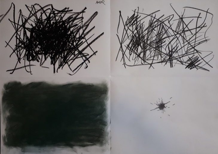
ANGER – I find this sheet the most disturbing and unsettling to view, both in the hard, quickly applied scribbly marks and the contrast of the solid black moody space adjacent to the dot. The scribbly angry dot is depicting the focus of anger and fustration on a singularity or specific point, the rough edges jarring and messy also depicting anger on all the panels.

Joy

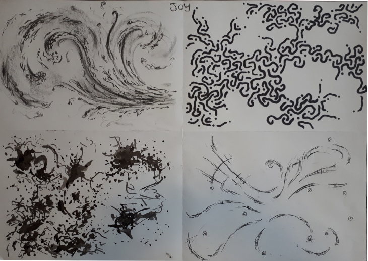
JOY – This emotion explores much more fluid lines, a release of energy exploding outwards, or lines that jiggle around eachother in a joyful way. I also notice that I have combined a mixture of lines and dots to explore this emotion, sweeping energetic movements with the hand as opposed to the hard jerky movements of anger and the soft smaller genlte movements of the hand when expressing calm.

Curiosity

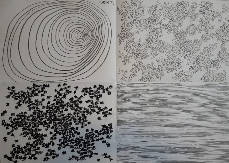
CURIOSITY – I chose this emotion as I wanted to explore a more controlled approach to my mark making, how depicting a repeated pattern of lines and building up that pattern over a defined space built the final image. I was curious as to how the pattern grew, building a random shape and at what point I felt comfortable with the pattern that filled the space and decided that it was finished. The spiral line was about drawing you in, the straight parallel lines about how by lifting the pen off the page at randon points over the drawing of the line, that a pattern was created. That on all the quadrants, the patterns draw you in your eye darting all over thespace continually interested in the shapes that have been created. All the markswere made in a controlled, considered and purposeful way.


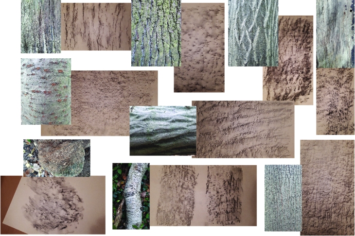
Exercise 2 – Tree Frottage

Tree Rubbings 01

Tree Rubbings 02

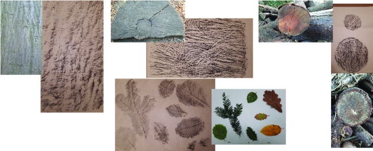
Taking rubbings from the tree bark and cut sections. The slightly smoother surfaces took the rubbings better, the conte waxy pencilon cartridge best. The cartridge worked better than the layout paper, seems some substance to the paper helps bring out the texture patterns better. The leaves, lighter textures worked better with the layout paper. The charcoal smudged a little too much and the soft pencils sharpened to a sharp point before I went out gave best detail.

Print

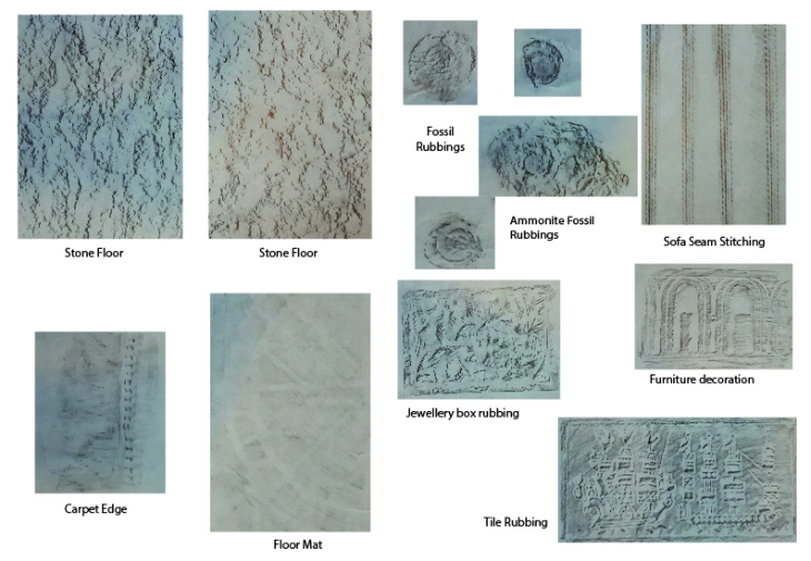
I wanted to get some textures from around my home, the stone floor gives impresions that are very similar to the wood and bark rubbings. The fossils can just be made out in the small rubbings, but it is quite hard to get a good impression as the surface is too raised. The stitched seam took a good impresion, the clearest impressions however from the tile, furniture and jewellery box gave the most detailed impressions.

The different papers that are used make a difference to the resultant image as does the type of medium used, thicker paper, less detail, blacker material, more definition if less detail. Pencil seemed to give the best detail except on the very soft surfaces.