Part 3, Project 2; Landscape
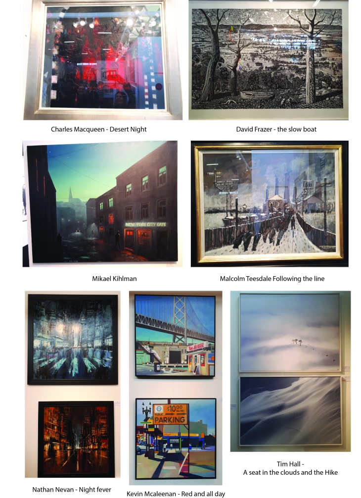
Research some historic and contemporary artists who work in series with landscape. You may already be familiar with works by Monet, Cezanne and David Hockney. Look also at works by Peter Diog, John Virtue and other younger artists working today. For example see Nicholas Herbert’s drawings of the Chiltern Hills.
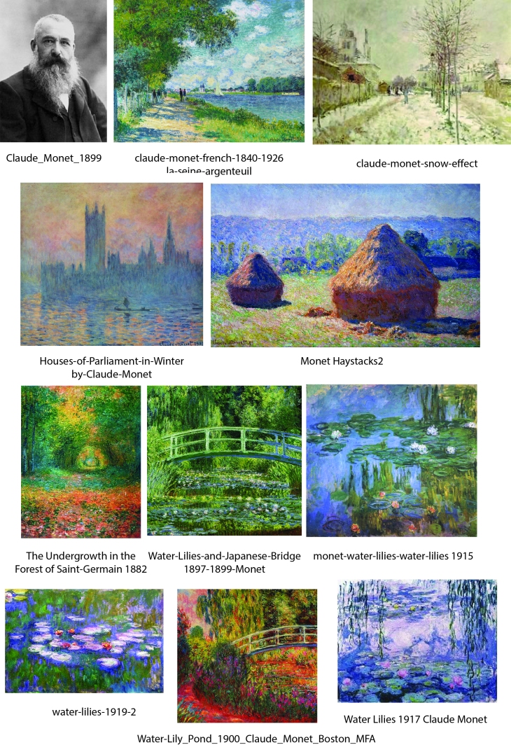
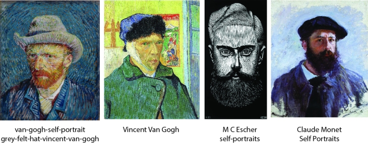
Claude Monet
Claude Monet was born 14 November 1840 and died 5 December 1926, he is considered to be the founder of the French Impressionist Movement. The term ‘Impressionism’ was derived from one of his painting entitled ‘Soleil Levant’ (Impression Sunrise) painted in 1872 and which he first exhibited in 1874.
Monet set out to document the French countryside throughout the seasons, studying the light at different times of day and times of year, he painted the same scene many times in order to capture this passing of time.
In 1883 he purchased a house in Giverny and embarked on an epic landscape project in which he began painting the Japanese bridge over the waterlilies which became his best known works. He then continued to paint vast water lily paintings that occupied the next 20 years of his life.
In 1873 Monet along with a group of his piers (Renoir, Pissarro, Sisley) organised Societe de anonyme des artistes peintres, sculpteurs et graveurs (Anonymous Society of Painters, Sculptors, and Engravers) to exhibit their works as the rather conservative Le Academie des Beaux-Arts who held their exhibitions at the Salon des Paris had been routinely rejecting their works. The artists were now able to show their works as they pleased and without the constraints of the jury selection of Le Academie des Beaux-Arts.
In 1923 he had an operation to remove cataracts from his eyes that had affected his vision and caused him to see colours differently; painting in a slightly reddish tone. Following his operation he is known to have re-painted some of his water lily paintings with stronger blue tones, as interestingly it is thought that he would have been able to see different light wavelengths, possibly including some ultra-violet.
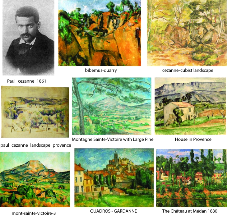
Paul Cezanne
Paul Cezanne was a French Artist born on 19 January 1839 and died 22 October 1906. He was a Post-Impressionist artist who is widely recognised for bridging the gap between the 19th century artistic movements to the radically experimental styles of the early 20th century. He painted in a particular style using planes of colour with complex brushstrokes to build up an intensive depth of field, a style highly recognisable that conveyed an intensive study of the subject matter. He represents shapes in a very geometric form and stylistic way and used a simplistic perspective in his compositions.
Cezanne’s work was not well received at the beginning of his career. He exhibited in the Salon des Refuses in 1863, but his submissions were rejected from 1864-1869, but he did continue submitting work until 1882 with success. He exhibited twice with the expressionists firstly in 1874 and then again in 1877. Despite his work becoming more recognised he chose to work in isolation in the South of France.
David Hockney
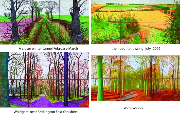
David Hockney was born in Bradford England on 9 July 1937 and a pivotal influence in the Pop Art movement. Living for half the in California and half the year in London, he is known for producing a wide variety of works and subject matter, however for this exercise I want to look at his paintings of the North Yorkshire Landscape in particular.
David Hockney exhibited a large selection of these landscapes at the Royal Academy 21 January — 9 April 2012 in his exhibition ‘A Bigger Picture’ which included works that spanned 50 years, including drawings that he did on his ipad. I was fortunate enough to attend this exhibition in person, which I found to be a powerful and memorable experience as well as inspiring.
I have chosen to example the large works that did that cover numerous canvasses as in the previous exercise we were to draw a 360 degree viewpoint which encouraged you to study a particular area in detail, these multi canvas brightly coloured paintings also break down a view into segments that encourage the artist and the viewer to study a detail or aspect of the scene as well as the scene as a whole.
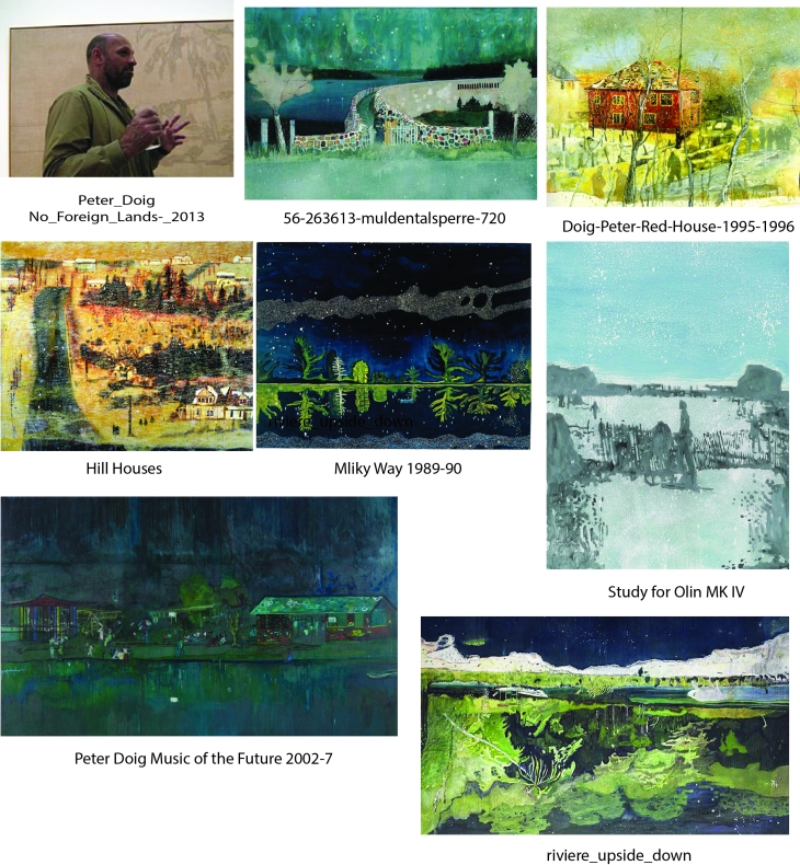
Peter Diog
Peter Diog is a Scottish painter born in 1957 who moved to and settled in Trinidad in 2002. He studied at Wimbeldon and St Martins & Chelsea School of Arts. He held the auction record for the highest valued painting sold at auction first in 2007 when his painting ‘White Canoe’ sold for $11.3 million, then subsequently in 2013 ‘The Architect’s Home in the Ravine’sold for $12 million.
Diog’s paintings have an abstract element to their technique. He often draws his inspiration from either his own or found photographs from many different sources, although his work is not photorealistic. He has frequently painted series paintings; examples of which depict urban environments and images inspired by films.
In 2008 he had a major solo exhibition at the Tate, and having exhibited all over the world his first exhibition in Scotland where he was born was in 2013. His love of film led him to set up his own weekly film club entitled StudioFilmClub with Trinidadian artist Che lovelace. He is known to paint the weekly poster for the screenings which he finds liberating in it’s immediacy.
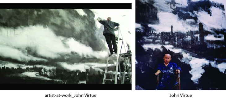
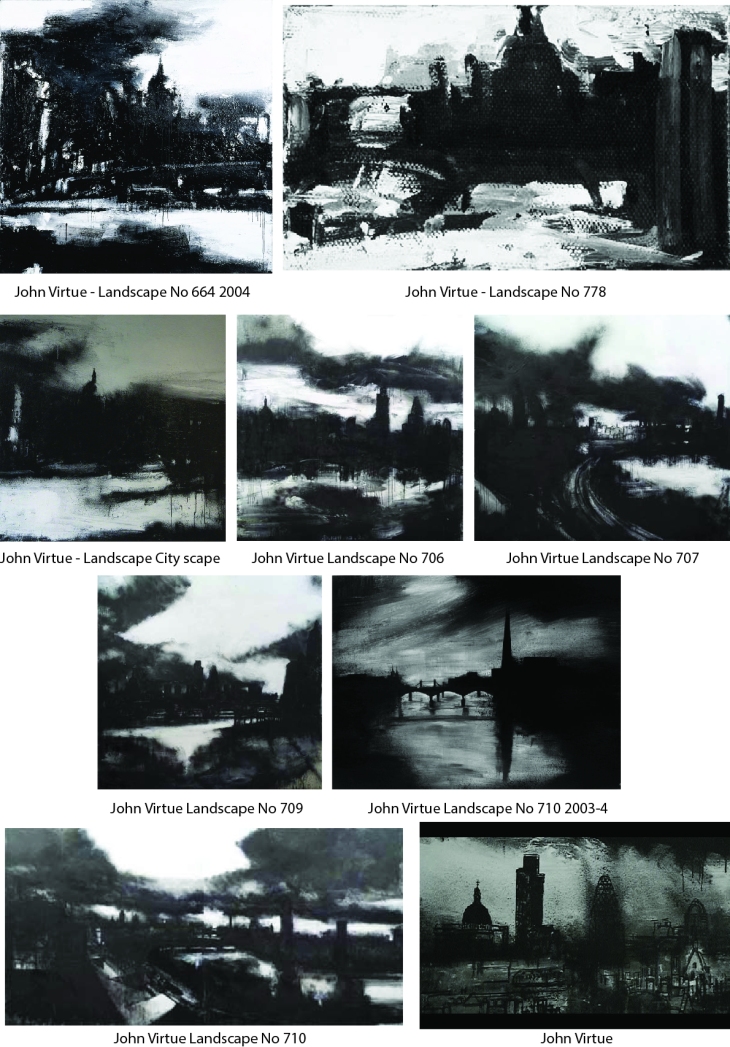
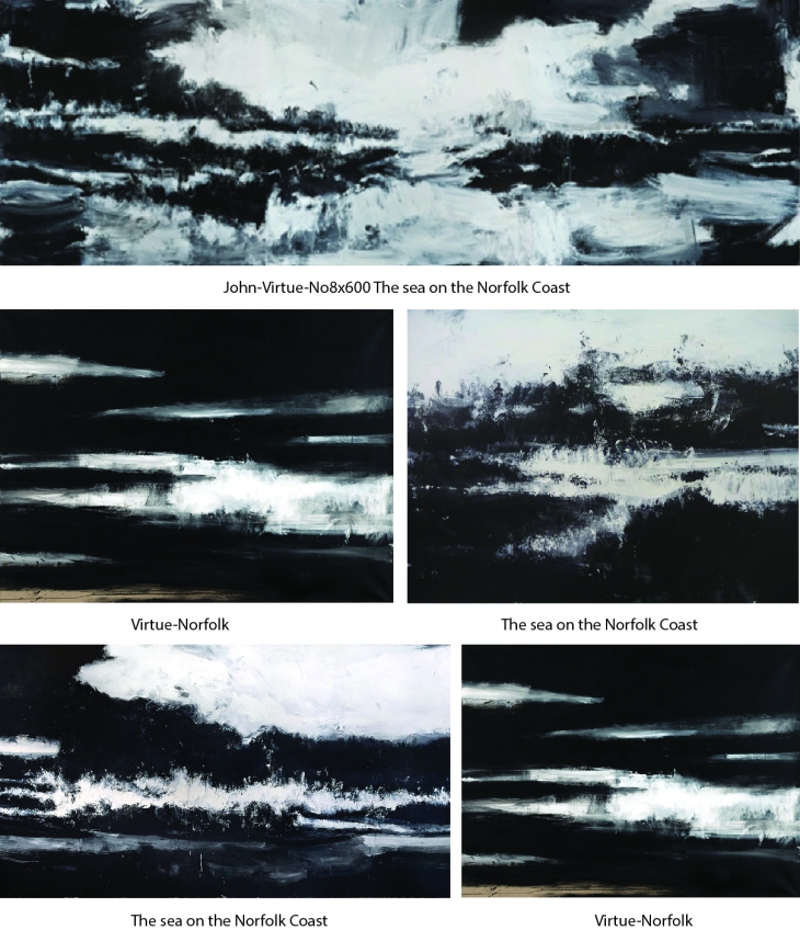
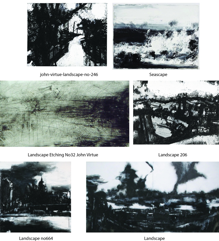
John Virtue
John Virtue is an English artist and was born in Accrington Lancashire in 1947. He is honoury professor of Fine Art at Plymouth University was the sixth associate artist at London’s National Gallery. He set aside painting in favour of pen and ink work around 1973. He then worked as a postman from 1978 until 1985 when he became a fulltime artist, moving to Devon until 2004. After a brief spell in Italy he then in 2009 he returned to Norfolk and has produced works influenced by this environment shown in his exhibition ‘The Sea’.
He is well known for his London paintings that have been exhibited in the National Gallery and focus on the iconic London skyline. He has won many prestigious prizes in his lifetime and has enjoyed an expansive career.
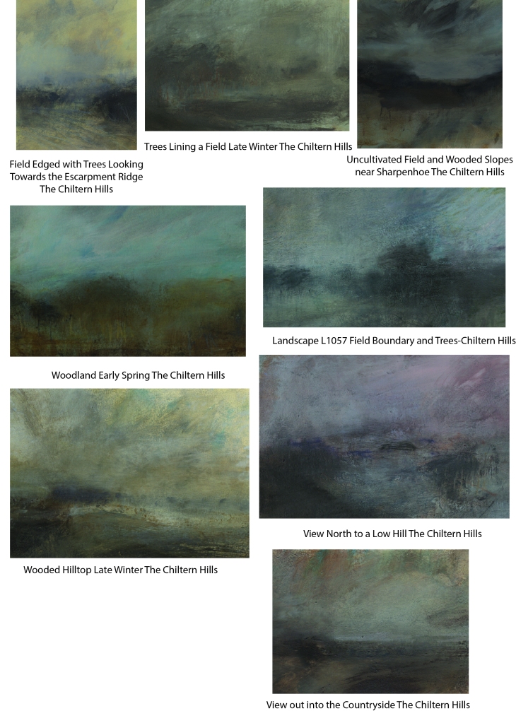
Nicholas Herbert
Nicholas Herbert was born in 1955 and lives and works in St Albans England. He studied at the Central School of Art and Design and then at Bath University. He is known for producing paintings, drawings and handmade books that are held in collections around the world.
Quote: “I deliberately use modest materials; a fusion of graphite, pencil, acrylics, gouache, chalk, soft pastel and soluble crayon on paper. My colour palette consists mostly of organic, neutral, desaturated and ‘unpretty’ pigments, which consciously de-romanticise the finished pieces.”
This series of works entitled ‘Silent Spaces’ which was exhibited in 2016 is inspired by the chalk uplands of the Chiltern Hills, It consisted of 25 mixed media landscapes. The images are abstract in their textural representation and mystically emotional in their feeling.
The work is drawn from his own personal experiences of the landscape, the images express the emotional and meditative state that the landscape exudes, reproducing his images of that the area in a visual language that speaks to him.
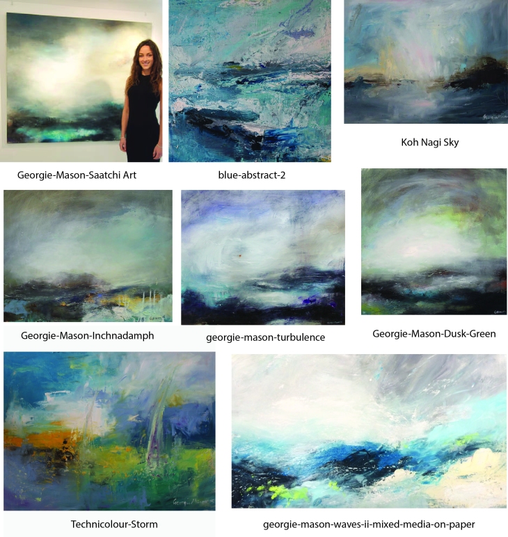
Georgie Mason
Georgie Mason was born in 1991 in Suffolk and graduated from Nottingham University in 2015. She is greatly inspired by the natural world around her and uses a variety of media and materials to create texture. She has exhibited internationally and judged young art East Anglia. She was awarded a 3 month residency at Oundle School and then a residential fellowship through the vice versa foundation which has taken her to India, where she will work towards her next solo show, of which she has already had six!
Georgie’s work makes a sensual series of landscapes in her distinctive style.
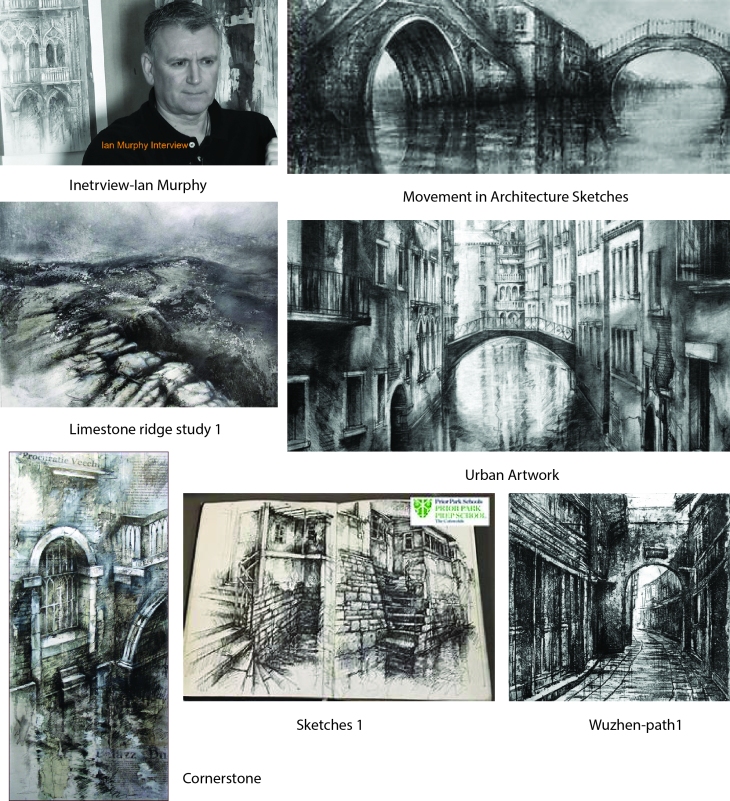
Ian Murphy
Ian Murphy was born in Wigan in 1963 and studied for his BA Hons in Fine Art, Printmaking and painting at Sheffield University in 1985. He was inspired by the industrial landscape that surrounded him, studying the detail in the architecture that drew his attention. The energy and creative insight that he gains from his work exploring urban and natural environments, often drawing out on location, he then feeds back in the form of workshops and open studio experiences.
Ian Murphy’s drawings are controlled yet accurate, he uses line not only to describe but to bring life to his drawings. With the underlying drawing accurate he then embarks upon exploring the texture and atmosphere of the architecture to create an exciting creative representation. Seen together Murphy’s drawings make a stunning series as his subject matter has a common base.
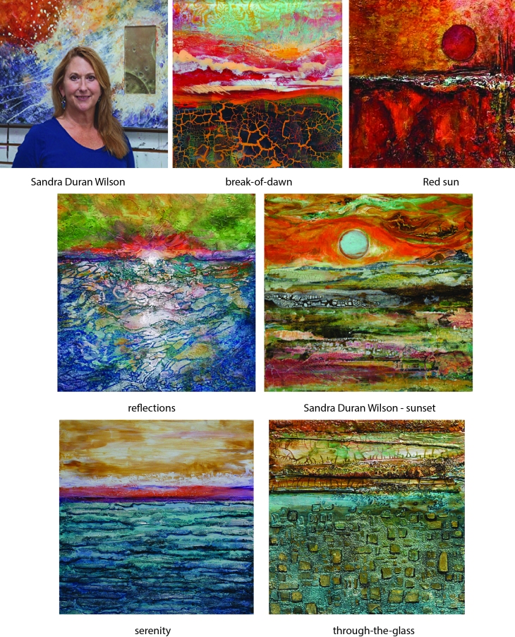
Sandra Duran Wilson
Sandra Duran Wilson was born into a family of artists and scientists, inspired by what she could see through a microscope she allows her imagination to roam and create. She grew up on the border of Mexico and her work has been greatly influenced by the culture, traditions, colours, music and art had a profound impact on her reality and work. Her work is also majorly influenced by science; concepts in biology, chemistry and physics and the keep her work continually evolving as she explores new materials, textures and techniques. She lives in Sante Fe New Mexico and teaches around the world as well as authoring many books and DVD’s.
Her work when seen together holds well as a series as she explores texture and technique to create some really interesting landscapes.
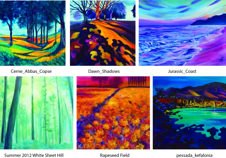
Carolyn Brettell
Caroln Brettell was brought up in Greece and Africa and highly influenced by the bright vibrant colours that surrounded her. She draws her inspiration mainly from the natural landscape, the trees and shadows exaggerated in the morning and evening light. She takes photos for her inspiration and creates images that draw on the bright colours that permeated her youth and applies them to the English landscape.
By concentrating on the English countryside Carolyn Brettell has created a series of work that is vibrant, illustrative and distinctive in its style and pallet.
Bibliography
Claude Monet
https://en.wikipedia.org/wiki/Claude_Monet
https://www.google.co.uk/search?q=monet+landscapes&source=lnms&tbm=isch&sa=X&ved=0ahUKEwijwvnltYXaAhVPMewKHcYJCgUQ_AUICigB&biw=1366&bih=594
Paul Cezanne
https://www.google.co.uk/search?q=cezanne+landscapes&source=lnms&tbm=isch&sa=X&ved=0ahUKEwiqirn1tYXaAhUrsKQKHXF_BokQ_AUICigB&biw=1366&bih=594
https://en.wikipedia.org/wiki/Paul_C%C3%A9zanne
David Hockney
https://www.royalacademy.org.uk/exhibition/david-hockney-a-bigger-picture
https://www.google.co.uk/search?q=hockney+landscapes&source=lnms&tbm=isch&sa=X&ved=0ahUKEwiWn7OItoXaAhXBy6QKHd6nDegQ_AUICigB&biw=1366&bih=594#imgdii=84CqcyN8APZ7eM:&imgrc=WX6SLXkxY0PQIM:
Peter Diog
https://www.google.co.uk/search?q=peter+doig+landscapes&source=lnms&tbm=isch&sa=X&ved=0ahUKEwjqpqeqtoXaAhUGzqQKHQWCCroQ_AUICigB&biw=1366&bih=594#imgrc=HgqLfbQ6Vs12gM:
https://en.wikipedia.org/wiki/Peter_Doig
John Virtue
https://www.google.co.uk/search?q=John+Virtue+landscapes&source=lnms&tbm=isch&sa=X&ved=0ahUKEwiO_rLGtoXaAhXHKewKHZQsD6wQ_AUICigB&biw=1366&bih=594#imgrc=WHlVhXwqhYP1VM:
http://www.tate.org.uk/art/artists/john-virtue-4829
https://en.wikipedia.org/wiki/John_Virtue
Nicholas Herbert
https://nicholasherbert.wordpress.com/tag/contemporary-landscape-painting/
http://www.nicholasherbert-drawings.co.uk/about.html
Georgie Mason
https://www.google.co.uk/search?q=georgie+mason+artist&source=lnms&tbm=isch&sa=X&ved=0ahUKEwiLh6vbuIXaAhUR66QKHRCuCSkQ_AUICigB&biw=1366&bih=594#imgrc=zGmTmKL08QMNBM:
http://www.georgiemason.co.uk/biography
Ian Murphy
https://www.google.co.uk/search?q=ian+murphy+artist&source=lnms&tbm=isch&sa=X&ved=0ahUKEwicoqySvYraAhUCyKQKHUgrA7YQ_AUICigB&biw=1366&bih=594
http://www.ianmurphyartist.com/about/
Sandra Duran Wilson
https://uk.images.search.yahoo.com/yhs/search;_ylt=AwrIRhVLh7ZaJUMAyHd3Bwx.;_ylu=X3oDMTByZmVxM3N0BGNvbG8DaXIyBHBvcwMxBHZ0aWQDBHNlYwNzYw–?p=Sandra+Duran+Wilson+Artist&fr=yhs-adk-adk_sbnt&hspart=adk&hsimp=yhs-adk_sbnt
https://sandraduranwilson.com/about
Carolyn Brettell
http://www.carolynbrettell.co.uk/information.html
http://carolynbrettell.co.uk/gallery.html?page=1
.
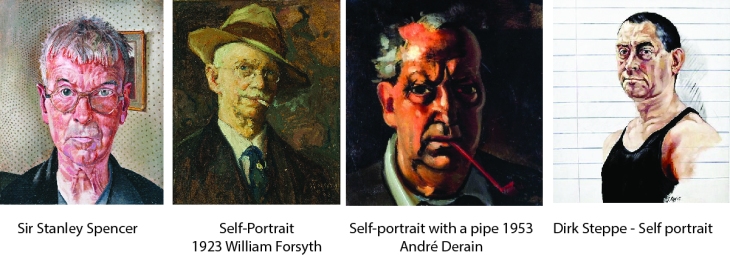
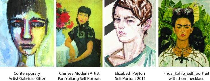
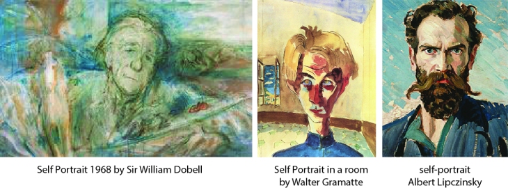
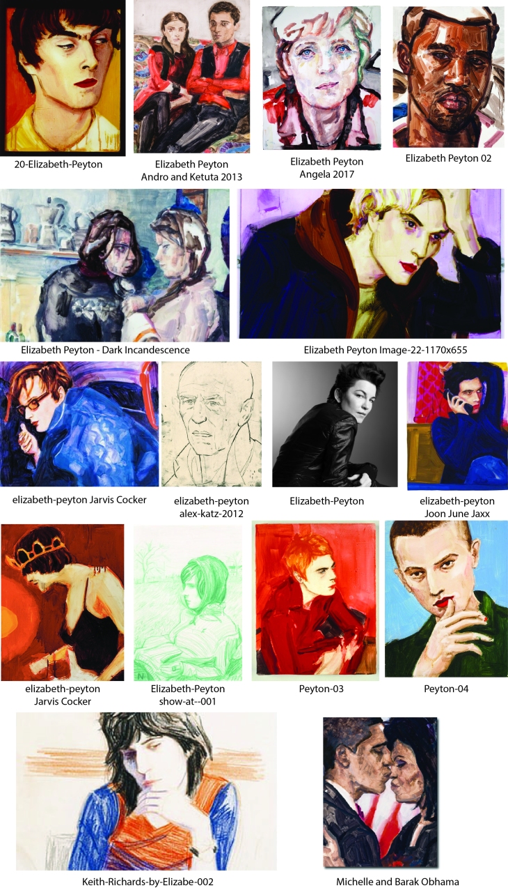
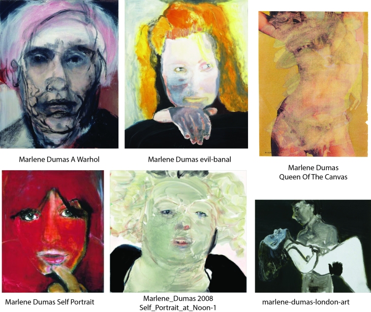 Marlene Dumas (b1953) has been called ‘the world’s most interesting figure painter’. Her practice centres around the human figure and examples of her work can be found in museums around the world. Like Elizabeth Peyton she draws on collected images and popular culture, her style is bold and painterly in a really interesting way, she captures a character with unconventional shading and line.