Part 4; The figure and the head – Life Drawing classes 12

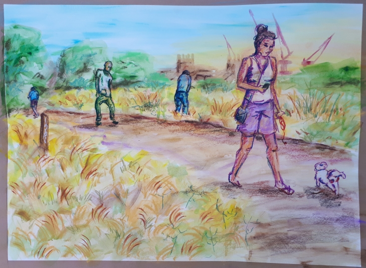
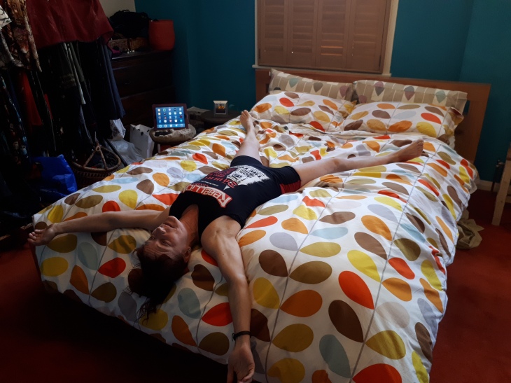
Holloway Arts Center Life Drawing Classes – 5 September 2018

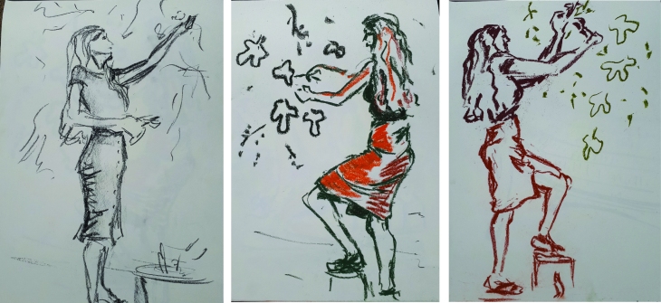
I have been working for the last few weeks in wax crayons, candle wax and poster paints so I decided to apply the same technique to this session of Life drawing.

All these examples are timed as to the length of the pose. In all cases I added the background, the paint and the heavy black lines later at home.

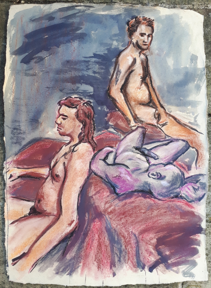
The models are Jose and Cordi

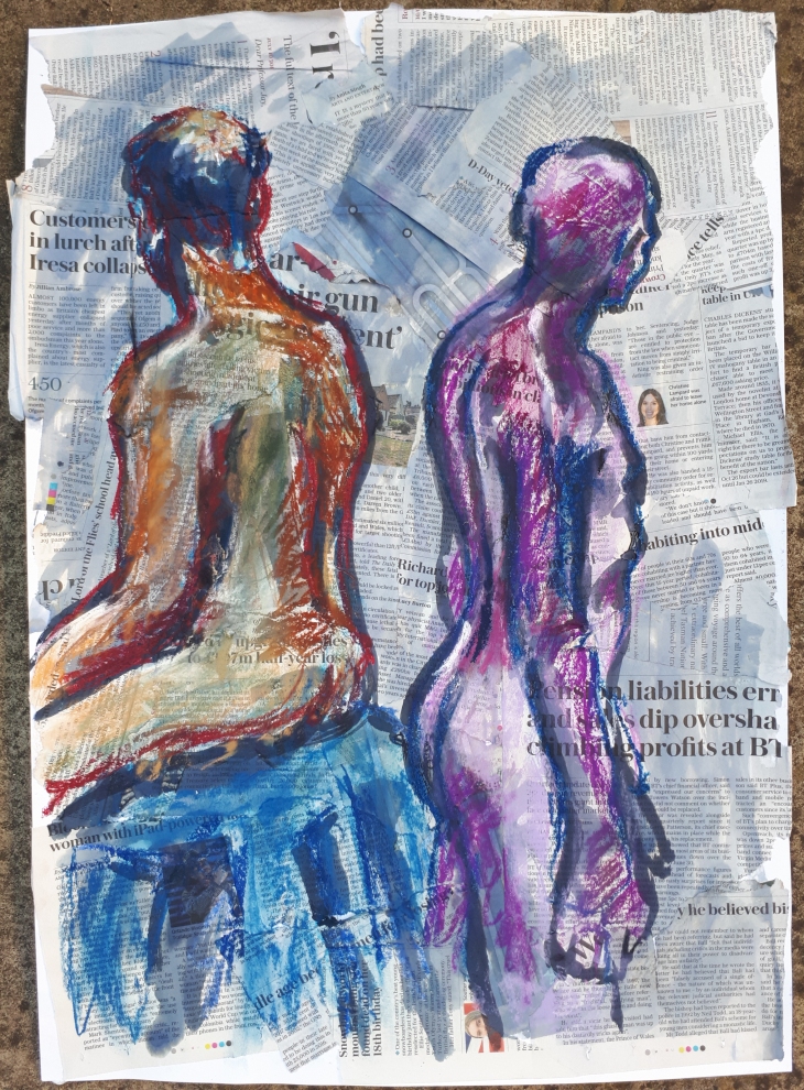
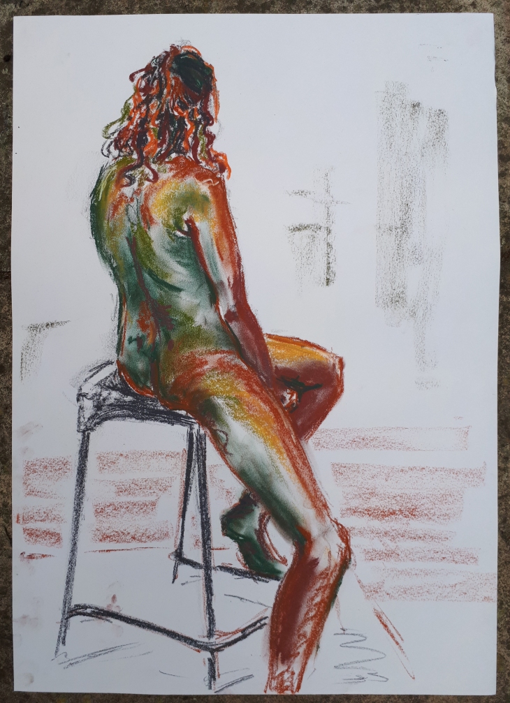
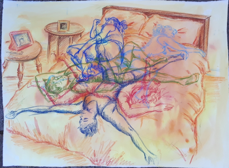
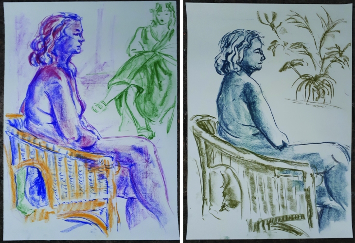
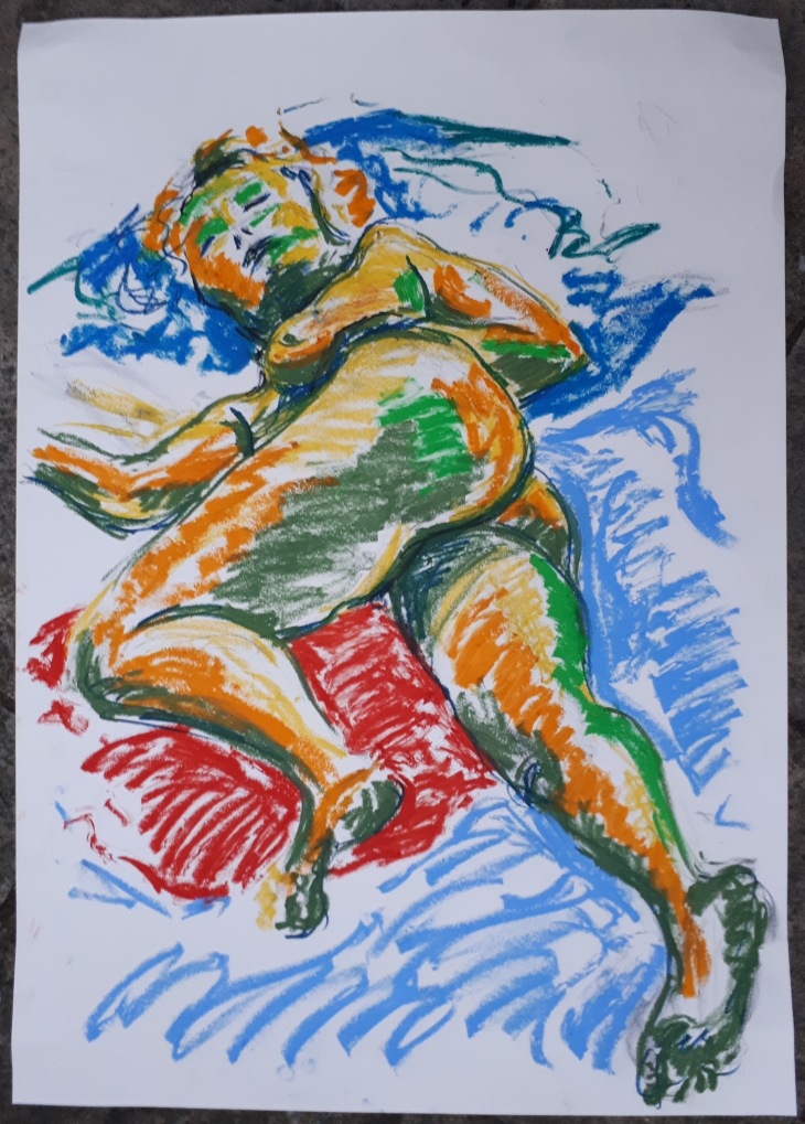
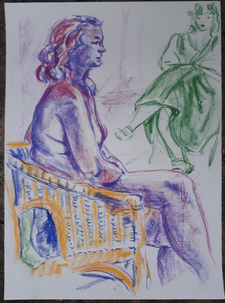
Sketch 6 – 1 hour pose

Sketch 76_20180906

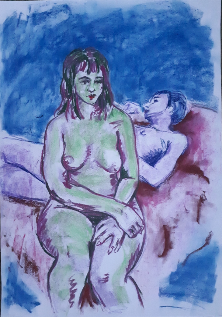
Having drawn both models throughout the hour long pose firstly in light orange wax crayon to rough it out then refining in steadily darker tones of different colours I had the composition completely drawn up by the end of the pose. I added the background as a sort of city-scape inspired by the patterns that I had been drawing while studying the work of Joan Wisdom. I wanted to reflect a 1960’s feel to the shapes, and by leaving the background line in wax crayon and the line defining the figures in darker oil pastel, I think the two planes differentiate well. I like the fact the the two models are passively interacting as they gaze across a landscape as if in a high-rise building.

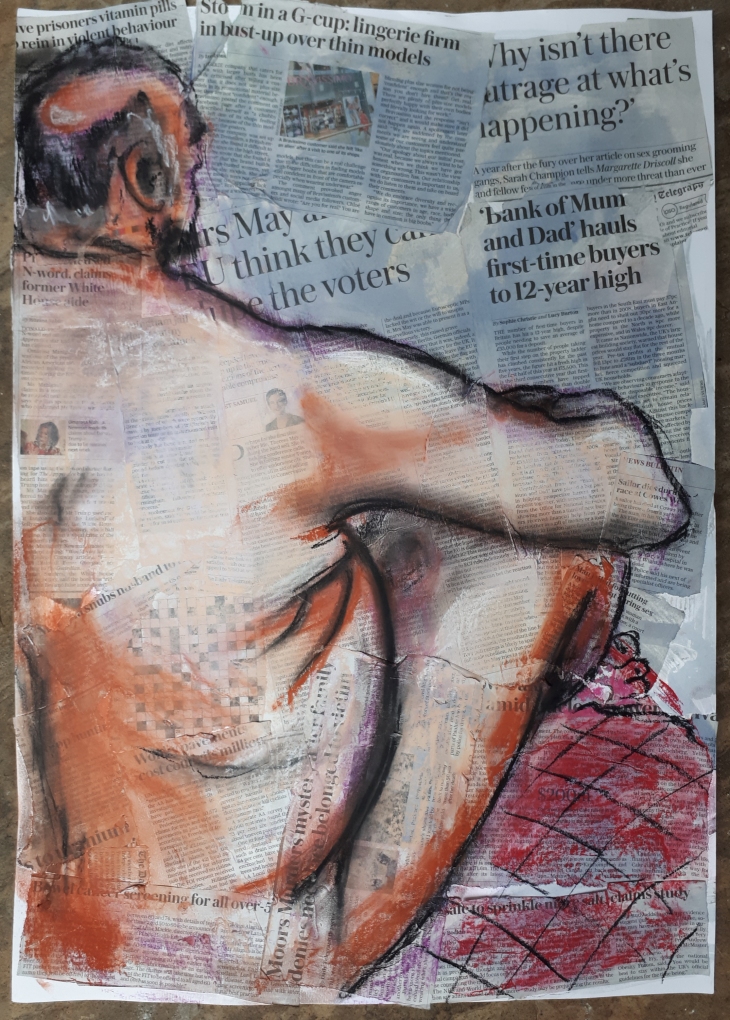
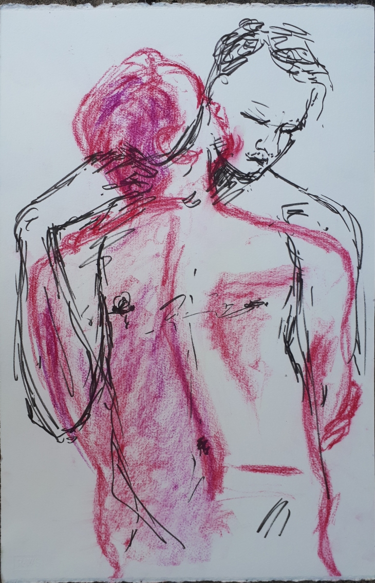
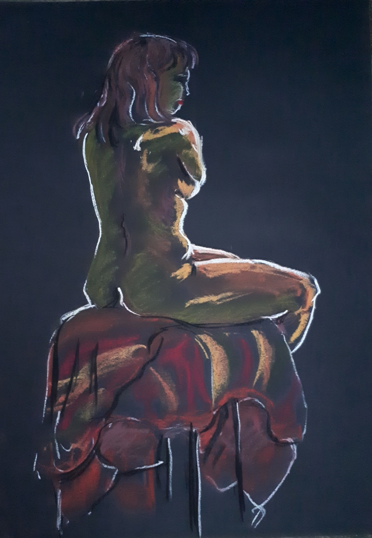
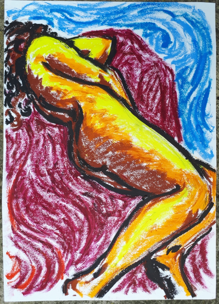
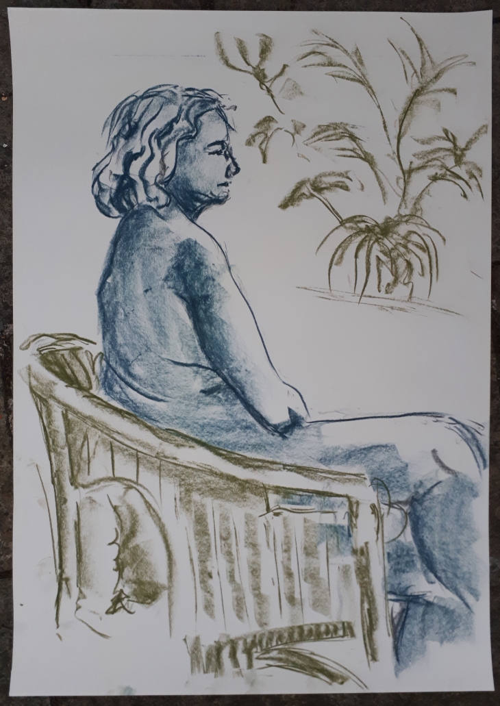
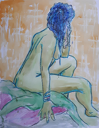
Sketch 5 – 20 min pose

Sketch 75_20180906_web

Here I just wanted to accentuate the figure by highlighting the background. The texture is created with a wax candle to apply some resist to the paint, I think this simple technique really accentuates the figure.

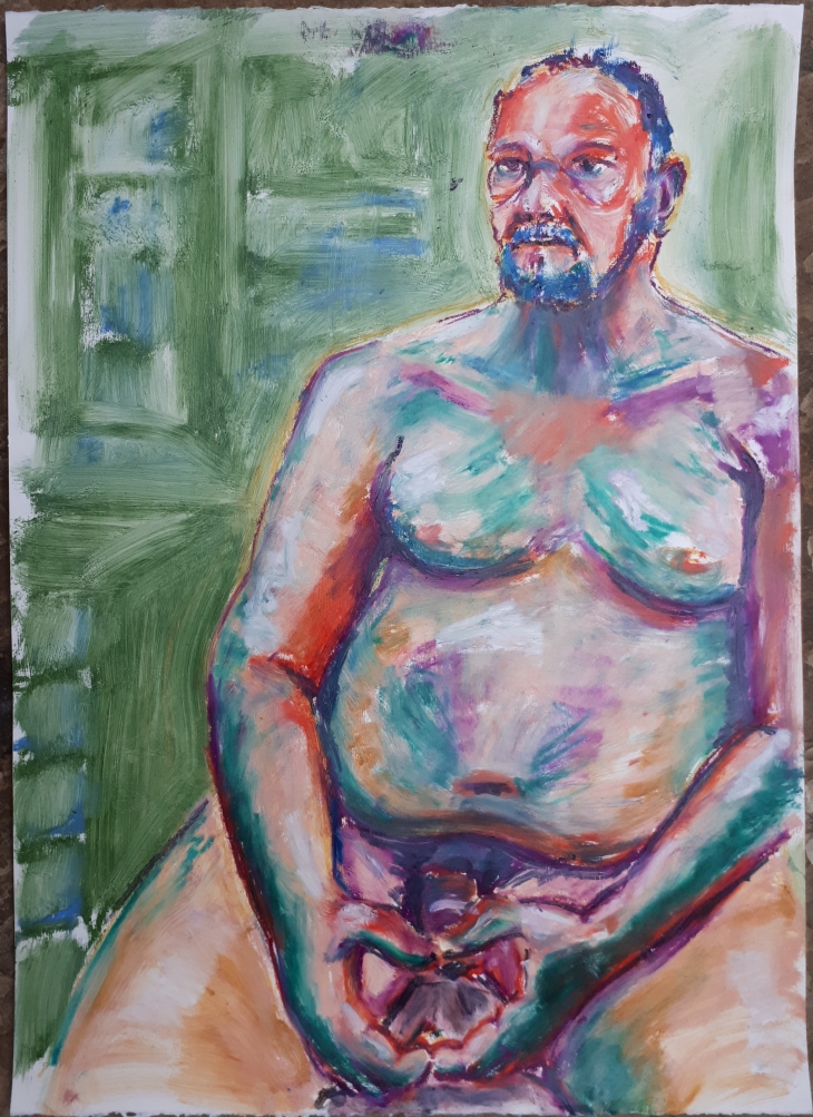
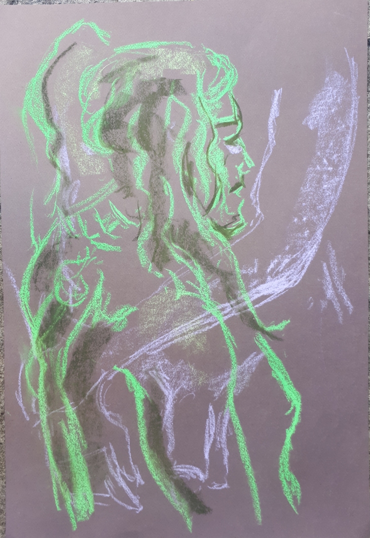
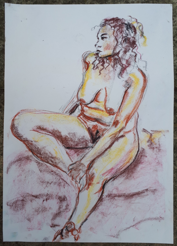
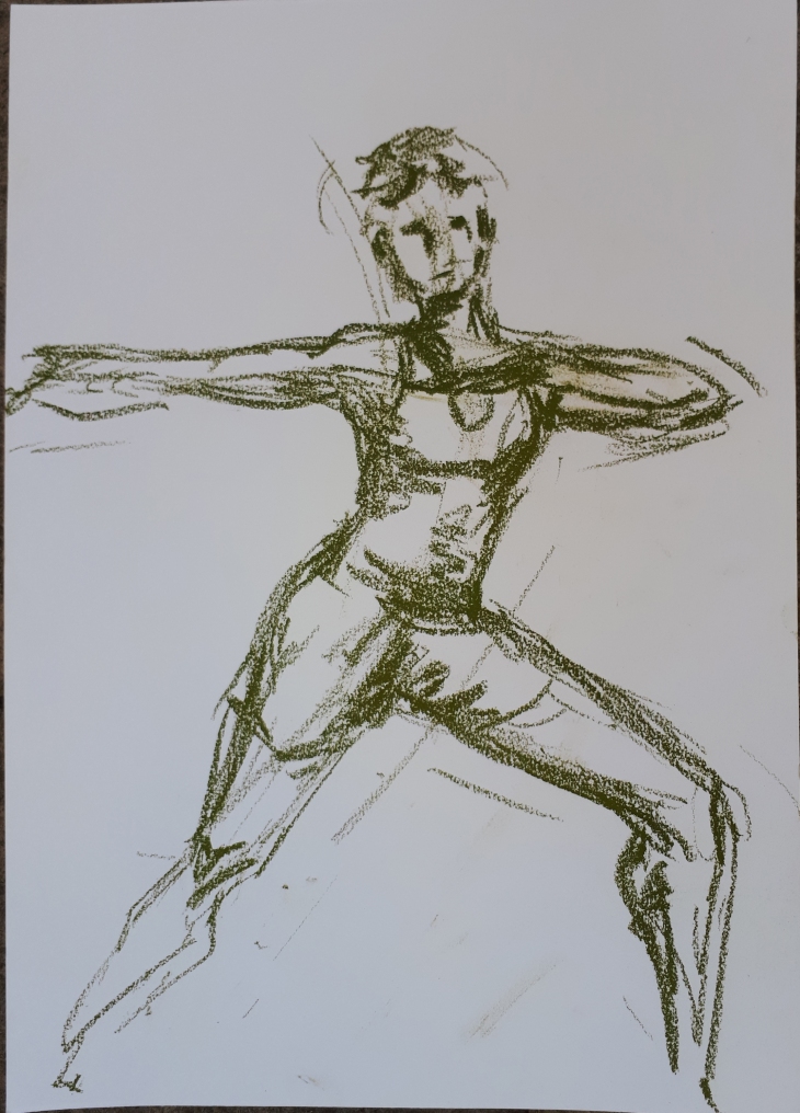
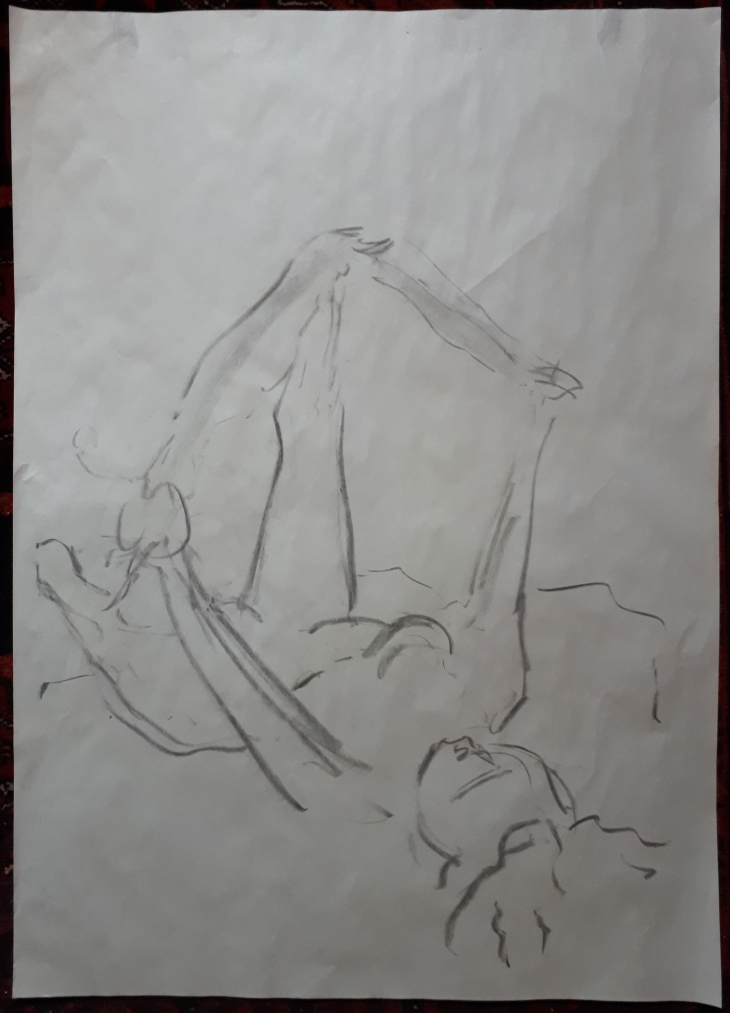
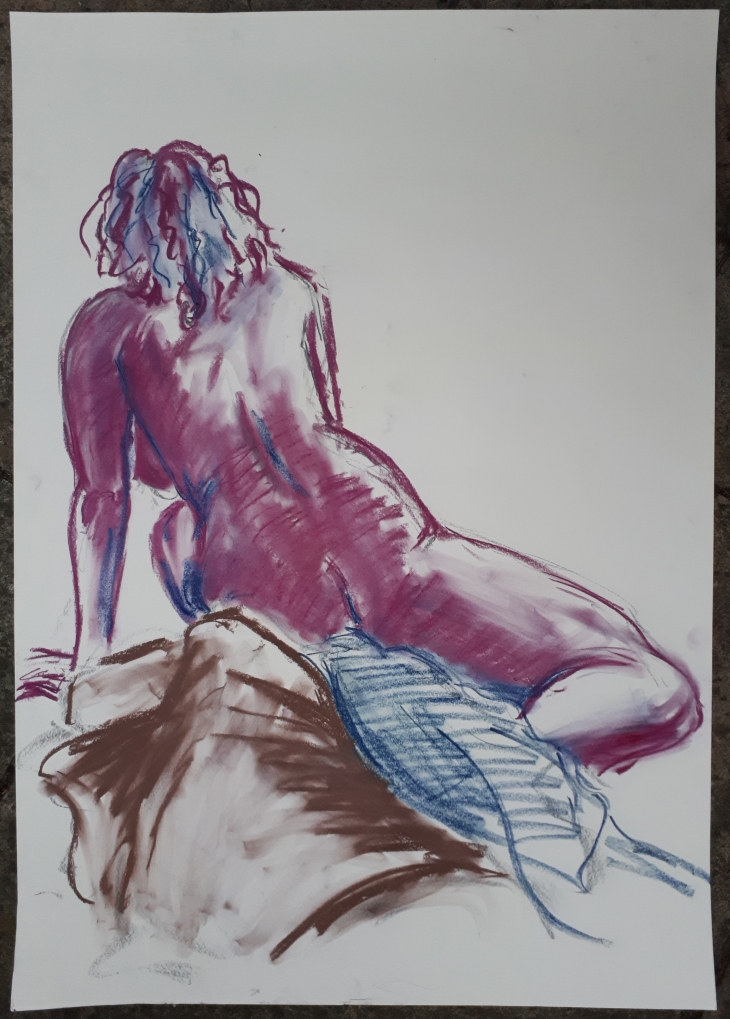
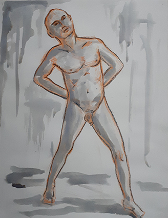
Sketch 4 – 20 min pose

Sketch 74_20180906_web

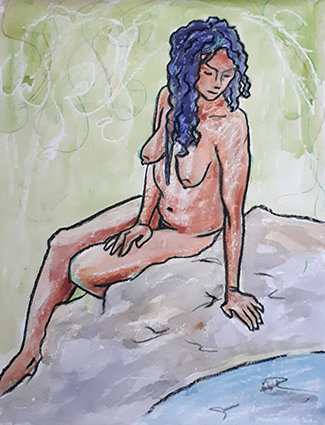
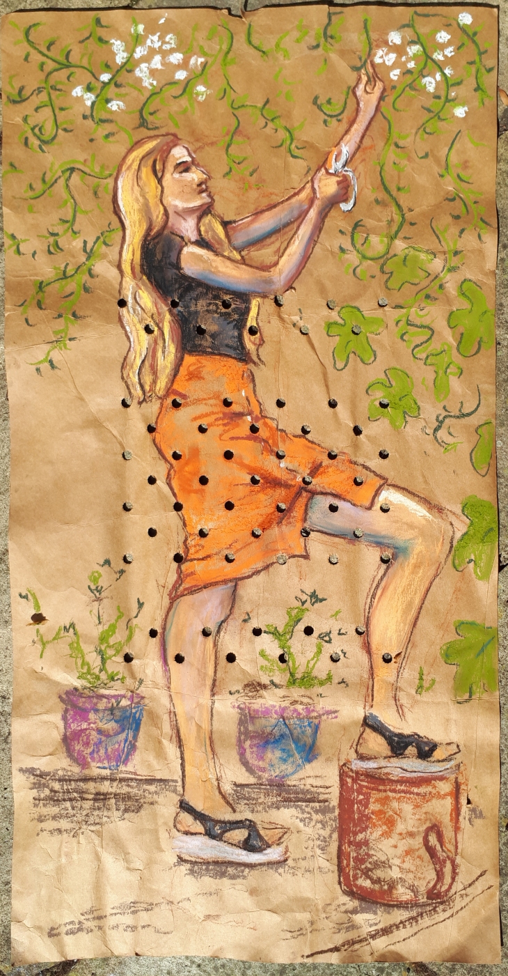
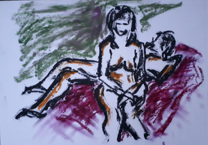
With this pose the model had a lot of weight on her wrist and she did really well to hold the pose for so long. The lean of her body inferred that she was looking over an edge at something, so I put her in a slightly romantic position as if she were gazing into a pool of water. I think is quite interesting to re-visit the drawing later and add a few lines that change the environment in which the model is situated.

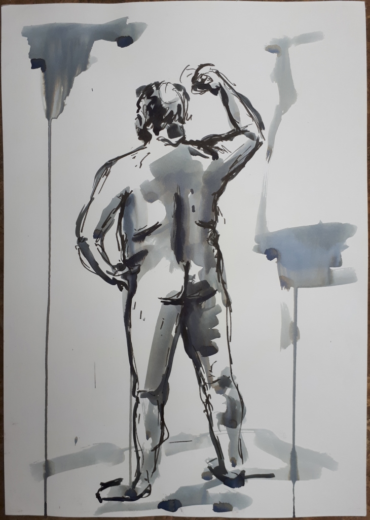
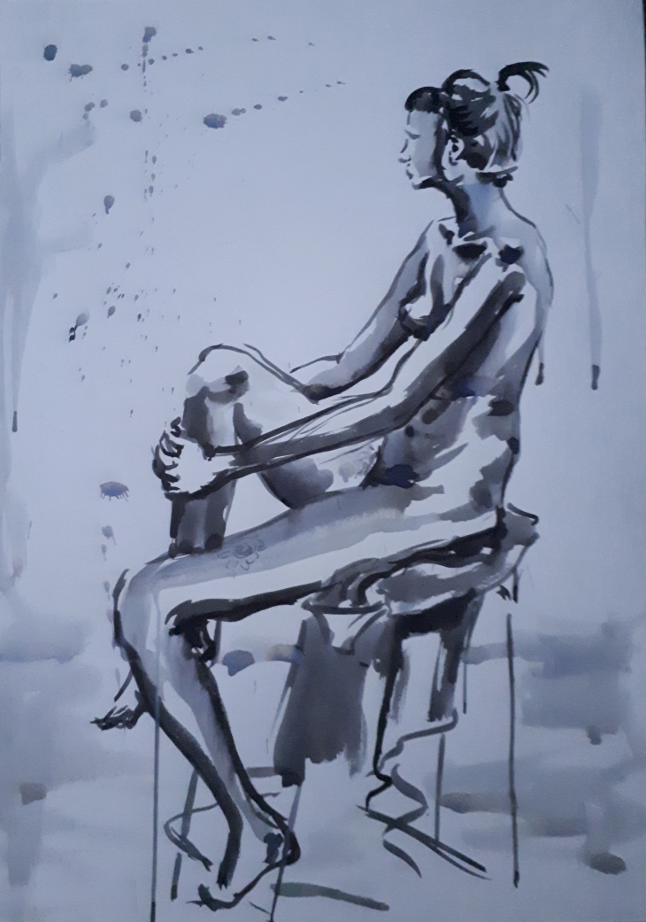
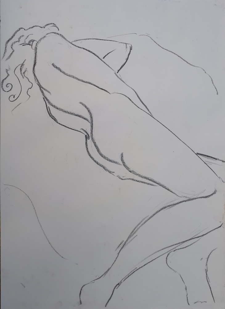
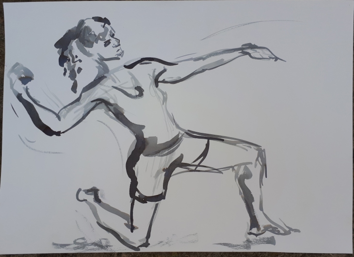
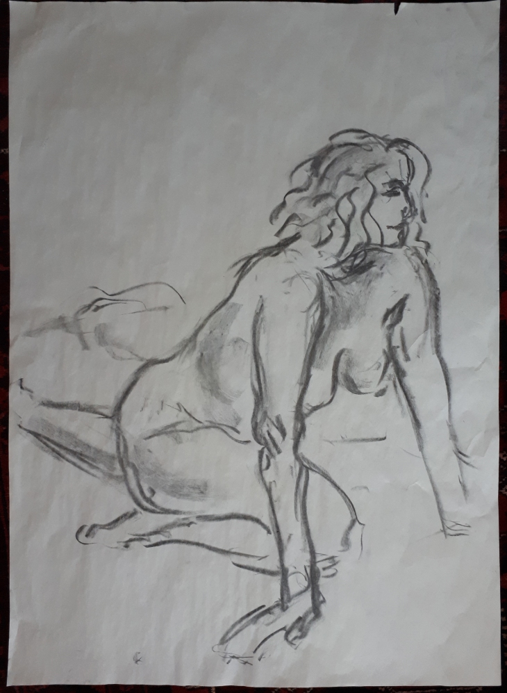
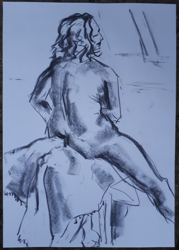
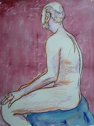
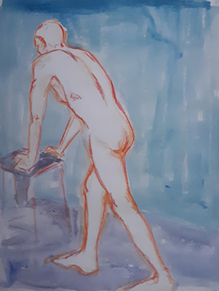
Sketch 3 – 10 min pose

Sketch 73_20180906_web

This was a strong pose from the model hat I wanted to capture as if a statue. The head is a bi big, but I like the monotone quality of the Quink ink wash that I added at home with the black wax crayon line.

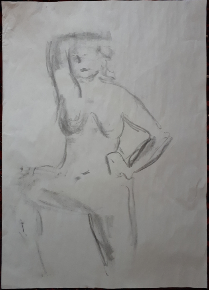
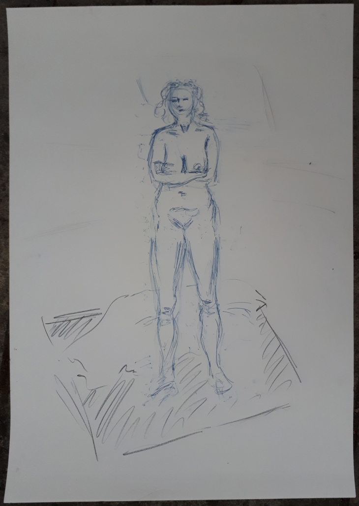
Sketch 2 – 10 min pose

Sketch 72_20180906_web

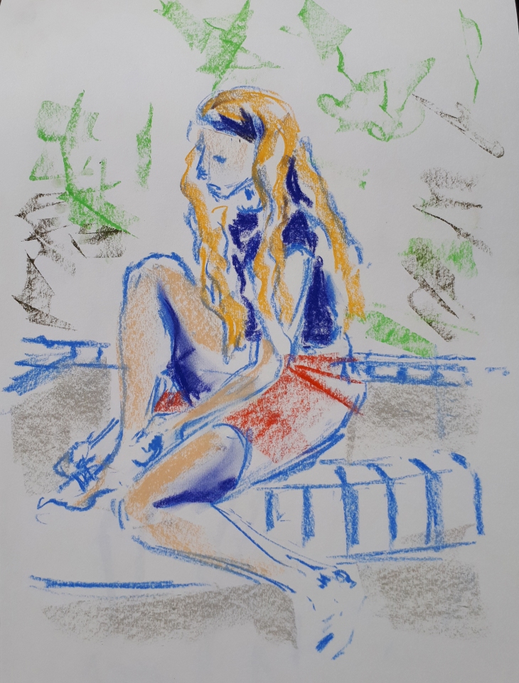
Roughing out this pose in blue gave her a different feel, I added the black line in and the paint wash at home.

Sketch 1 – 7 min pose

Sketch 71_20180906_web

I think adding a wash to the life drawing at home really gives the sketch a new dimension that I think enhances the figure well. It is quite liberating to sketch in wax crayon. They are fairly unforgiving as mistakes show, but by using lighter colours to begin with and defining with successive darker colours is a good manageable way to approach the quick poses.

Part 4; The figure and the head – Life Drawing classes 11

Holloway Arts Center Life Drawing Classes – 15 August 2018

Sketch 5 – 1 hour

Sketch 70_20180816

This hour long pose was done on A1 watercolour paper treated with gesso using oil sticks and white spirit. I want to understand how these oil sticks work a bit more so I chose to use them for the longest pose of the evening. The background I washed with quite a lot of spirit first as I wanted a different texture than the figure. I also learned from last week that it is easier to do the background first than at the end. I had bought some additional colours in the week and made a colour chart so that I could identify the colour that I wanted to use and see what it looked like when washed with spirit, the true brightness of the colour comes out when you wash them. I was really pleased with the way that the head worked out, Stephen, the model’s complexion was much redder in the face than the body and he wore a lot of character in his face that I wanted to try and capture. I think I got the proportions correct, but I still need to get used to my oil sticks and the way that I make my marks and the amount of spirit that I use to blend the colours before I can say that I am happy with the way that the main figure  looks. I also considered my composition quite carefully, I wanted the head to be the primary focus and the hands the secondary focus in terms of detail and to make both elements sit happily on the page I did not draw the model in the centre of the page, I find off setting the figure makes for a more interesting frame.

Sketch 4 – 20mins

Sketch 69_20180816

I had prepared a sheet of A2 cartridge with some collaged news stories from 11th August Saturday Telegraph newspaper. I roughed out the figure in Conte stick, then added some tone using watered down Quink ink. I then worked in pastel on top and added the smudged black line in the final couple of minutes. I have got the proportions of the head wrong, I wanted my composition to include the base of the seated figure rather than his bum falling off the page. The consequence of this is that the bulk of the body is too big and it feels a little unfinished although I do like the feel that the mass of the body is trying to fit into the page and there is somewhat of a fish eye perspective going on with the way that I was viewing the figure as I was quite close to the model. I think that it is interesting that my frequent glancing at the model has caused me to draw what I saw most of each time that I looked, rather than being proportionally correct. I think ideally this style technique needs a 30-40 minute pose, 20 mins is a bit quick!

Sketch 3 – 20 mins

Sketch 68_20180816

This natural Khadi paper is just smaller than A1. I drew the figures in Quink ink directly on to the paper with a brush having used a pen to key a few points of the composition out first. The Khadi paper was quite hard to work on; it soaked the watered down ink up really quickly so it sucked the colour densely. It was hard to know how dark the ink mix that I was using would come out, I tried to do the lightest mix first to indicate the tonal areas then gradually work more and more towards using neat ink for the darkest areas. I like the yellow ochre halo that edges the ink marks, butit was really hard to control and be delicate. It was also slow to even draw out as liquid was sucked out of the brush the moment that it made contact with the paper and I fell I struggle do get it complete enough in the 20 mins that the pose was held for. I am happy with the composition. I liked the way girls hair was in ponytails that reflected each other and the off-set mirroring of their bodies.

Sketch 2 – 10 mins

Sketch 67_20180816

This sketch is done with Quink ink ans Faber Castelle PITT brish pen. I like this technique for quick sketches and look forward to using it again in the future. Adding the drips and being really quick and liberal with the brush and liquid adds an additional element of interest to the whole composition and where the figure stands in space.

Sketch 1 – 5 mins

Sketch 66_20180816

It always takes me ages to set up so I miss the first warm up drawings. I did this quick sketch in my A3 sketchbook in pen and added the pastel colour later, although it was a 5 min pose, however I probably only got to draw for about half of it! It’s not a very good drawing, the proportions are a little stiff and off!

I think these classes are really giving me an opportunity to not only experiment, but to develop  some different styles, I have found this really useful to practice the same style each week and apply lessons from it the next time I use it.

Part 4; The figure and the head – Life Drawing classes 9

Holloway Arts Center Life Drawing Classes – 01 August 2018

I went into this class with some per-prepared paper and some different types of paper.

Sketch 4 – 1 hour

Sketch 59_20180802

This is my final sketch of the session on A1 brown rag paper that has flecks in it. The pastel sat on top of it and I had to work it in quite vigorously. I also used Conte stick to block out my composition, worked over it with pastel and then painted Quink ink on with a brush to exaggerate the tonal aread and define the form better. The ink was resisted by the pastel so was quite hard to get the coverage that I was after. I inked up the background, which I felt improved when I went over it with some looser strokes. I worked backwards and forwards with the ink and pastel for some time and then finished by adding some oil pastel to help with the definition. It was the first time that I had tried drawing three figures in one piece, this was challenging, but an interesting challenge.

Sketch 3 – 30 mins

Sketch 58_20180802

For this piece I used the pre-prepared newspaper collaged paper, all articles from 28th July Saturday Telegraph edition. I blocked out the composition in Conte stick, then added washes of Quink ink before adding pastel over the top. It came together more when I added the lighter tones and highlights. I like this technique, especially the layering and textures, and will try it again in future sessions.

Sketch 2 – 2 x 5 min poses

Sketch 57_20180802

When I went into the class I had a mind to try and do some close-up drawings. The first sketch was done with Faber Castelle PITT Brush pen, the second was with Conte stick. I didn’t intend to make it look like the two figures were embracing each other, as it is the same model, but I like it! This drawing is just a bit bigger than A3 watercolour paper.

Sketch 1 – 1 x 2 min and 1 x 5 min pose

Sketch 56_20180802

This first warm-up sketch I wanted to do some close-up studies of different parts of the body. It is done in pastel on pastel paper that is just smaller than A2. The juxta position of the two compositions is quite interesting.

Project 5: Exercise 2 – Groups of figures

Part 4: Project 5: The moving figure, Exercise 2; Groups of figures.

Parkland Walk

Parkland Walk Comp

I wanted to give an impression of what the path was like over a period of time so I decided on three snapshots of the time that I sat there. I wanted to create a feel of a hot sunny hazy day, so the colours of the background are bright and sun-bleached, although the last one does have evidence of longer shadows and sunset.

Parkland walk sketch 1

20180708_183844

This was the sketch I did in pencil for the previous exercise to size up the figures and sketch the composition.

Parkland walk sketch 2

20180708_183907

I did this A4 pastel sketch in situ, I wanted to see what the figures looked like if I drew the characters over the top of one another in oil pastel over a soft pastel background. It does give the impression of a busy path at a certain time of day. I used a variety of colours to draw the people, this reflected the colourful clothing of the public and the bright harsh sunshine of the day.

Parkland walk sketch 3

20180708_183957

Next I tried a version in very scribbly pen, I w2anted to experiment with the layering of the people on top of one another. I discovered that I still needed to have a strong element of placing the individual people in the composition as well as controlling how much of the background figures you could see through the foreground figures. By blocking in the foreground figure you really bring them to attention in the composition, and by working over some figures you can build a greater contrast between two overlapping figures a better differentiation can be observed.

Parkland walk 5pm

Parkland Walk 5 pm

This drawing is A2 and done on Fabriano 100% cotton 140lb  watercolour paper. It has a fine tooth to it and holds the soft pastel really well. I stretched the paper on a board and painted the background in a really light acrylic wash. I wanted to try and make it feel hot and bleached out in bright sunshine. For this first sketch I wanted to show how the people were not in a hurry, they were happy to sit around in the grass and stop to chat a while. It was fairly busy, England had just beaten Sweden 2-0 and there was happiness in the air! I also liked the way the dogs ran around and you had to guess who the owner was! The cranes are a feature in the scene, so I wanted to include the characters pointing at them, all of the characters are based on the people I witnessed on the day.

Parkland walk 6:30pm

Parkland Walk 6pm

I guess it was just before dinner time that there was a slight increase in the busyness of the human traffic. I wanted to overlay the figures in places an not in others so the viewer got a sense of time passing. I firstly drew all my figures in in a hard chalk pencil. I then blocked in the clothing using a hard soft pastel. It was important to still see some of the background through the characters to imply transiency and also enabled me to see through some of the foreground characters, some more than others to keep your eye moving around the page. I then drew over them in oil pastel , in differing colours according to the colour that they exuded and how much darker they are in the foreground than in the distance.

Parkland walk 8pm

Parkland Walk 8 pm

In order to appreciate the passage of time I felt important to describe the thinning out of people as it got later, The drunken guy was a real epitome of an evening stroll. The guy taking a leak and the oblivious girl on her phone walking her dog, and a lone jogger who has waited for it to cool down before going for a run. The hint of a sunset and longer dark shadows on the ground. I didn’t put any ghost line figures in this scene is because I wanted to show that emptiness in comparison to earlier.

This project came together for me when I decided to do three versions rather than trying to get all the characters overlaid on top of each other in one scene. I think by spreading it out over three images it looks slower paced and more peaceful. I also wanted to try and be true to some of the characters and capture them in their mid flow of sentence or thought process. I also am quite pleased that I have replicated what was in my head as an idea of execution style, and created a busy path on a hot summers day, I am happy with my choice of medium. I also wanted to have a go at bringing into my work some ideas that I had gained from looking at other artists.

Reference picture for background

IMG_20180707_195938

Project 4; Exercise 2 – Three figure drawings

Part 4: Project 4 – Structure, Exercise 2 – Three figure drawings

Using different tools, materials and supports, work on three drawings of your model; 1. Standing, 2. Sitting, 3. Lounging.

Make several 2 min sketches in your sketchbook before moving onto larger sheets. Spend between half to one hour on each of the three drawings (A2 or A1 in size).

Three figure drawings

Fina comp 2

For this exercise my model had about a 4 hour slot that she could model for me. For the first standing pose I did a few really quick 2 minute sketches in Conte stick and pastel in my A3 sketchbook to try and determine which shapes and position worked well. I sat on the ground and looked up at he. I liked the way the skirt pulled when she lifted a leg and thee delicate way she reached for the creeper to prune it, elongating the figure as she did so.

Standing figure 2 minute sketches

Fina comp

The first sketch has a slightly relaxed posture that I think I have missed in my final piece, I chose to draw her with both her arms raised as I liked the shapes that her arms made. As this was quite a difficult position for my model to hold I had to do the final piece quite quickly.

Pose 1 – Standing figure

20180717_101659

This drawing is done on 18 x 35 inch brown fruit packing paper. I had to wet it to stretch it out and let it dry before I could work on it. I think my sketches had a little more dynamism than my final piece and her raised leg may be a little too long in the thigh. I wanted to work on this elongated paper as I felt it suited the pose, and the brown paper gives some tonal value to the image. I also really like the holes, I think they add a different dimension and interest to final composition. I chose to work in pastel as it would sit well on the brown paper and retain it’s bright colours. I did draw some of the background in after my model had come out of position and chose to indicate the foliage in a slightly designed fashion. I also decided to introduce an element of story into the composition and a prop in the pruners to tell the story of her pruning the garden. There is an element of foreshortening as I am on the ground looking up at her. On reflection I think I could have exaggerated this more.

Seated figure 2 minute sketch

20180717_104749

Aware hat we were on a tight time scale I only did one sketch of the second seated position. In this sketch my model is putting a plaster on her blistered foot while sitting on the raised part of the wall. This sketch is done in the A3 sketchbook and is done with conte sticks. I quite like the sad forlorn look she has as she tends her wound.

20180717_101941

For this sketch I prepared a sheet of royal Watercolour Society 51 x 65 cm paper


Part 4; The figure and the head – Life Drawing classes 7

Holloway Arts Center Life Drawing Classes – 11th July 2018

The Football was on, but I’d rather go to life drawing classes!! I am rushed to get to the class on Wednesdays as I work and have to arrive late, this means no time for warm-up.

Sketch 1 – 20 mins

Sketch 48_20180711

A2 on black paper with soft pastel, I started with a white line and worked up the colour after. This is quite a warm technique and I really like working on black!

Sketch 2 – 20 mins

Sketch 49_20180711

This is my favourite sketch of the evening, done on A2 cartridge in Quink ink, I think it suits the elegant fragility of the model and was interesting to draw directly in ink and brush on the paper without mapping out in another medium. The drips and loose marks make for a really interesting study.

Sketch 3 – 50 mins

Sketch 50_20180711

This was an hour pose with a break. I drew on A1 cartridge in soft pastel. I had quite a complicated view of the pose and it took a while to map out. This was the first time that I had done a composition with two models in it, this was a challenge to get them both comfortably on the page, they are a little low, but I am glad I tackled the background as I think it makes the composition more complete. I drew the main figure in first, then the background figure. The tone I used on the background figure made it jump forward too much, so I had to work on the foreground figure more. I added the bright green to really bring her forward, which I think succeeded! The odd colour combinations add another dimension to the drawing that makes it more interesting to me. I didn’t want to over work it, so I decided to do one final quick sketch.

Sketch 4 – 7 mins

Sketch 51_20180711

I had very little time left on the pose and wanted to see how using the giant oil pastels worked when using them really quickly. It is not very successful, but worth the experiment. I want to use these classes to experiment with different mediums and different techniques, it is really useful to be doing these classes so regularly.

Project 3; Exercise 3 – Stance

Part 4: Project 3; form, Exercise 3 – Stance

Look for the line of stance or the center of gravity in a standing figure. Mark the central axis in your initial sketches of the standing figure and ask your model to change poses every 2-5 minutes.

Standing figure compilation

20180715_184944

My model was good enough to allow me to do enough different positioned to fill the page of an A1 sheet of cartridge. I wanted to use lots of different mediums in order to create a sense of layering and that some of the figures come more to the fore and others sink into the distance. I wrote the times on all of the ones that I remembered to time, all of them were under 5 mins though, and I tried to vary the size of the sketch so that they would sit in the spaces created by the existing drawings, and even if overlapping slightly, were clear in their composition. The central axis is visible as a guide in most of the sketches, and in some of them I managed to include some indication of the central axis. I used Conte stick, Conte pencil, Fine and Brush Faber Castelle PITT pens, Oil pastel, and charcoal. This was an interesting exercise in sizing, being consistent in my proportions and directing some interesting and challenging postures.

Photographic Reference

Val comp 2

Part 4; The figure and the head – Life Drawing classes 6

Holloway Arts Center Life Drawing Classes – 4th July 2018

Since my classes at the Royal Drawing School had finished and they will not be doing them there again, I decided to try a local class out. It was much cheaper just £6 plus paper, bring your own materials!

life drawing - yasmin comp

They only had A2 thin cartridge paper available to buy and I was a bit late arriving so I missed the first pose while I was setting up. All the drawings are on theA2 Cartridge.

Sketch 1 – 5 mins

Sketch 41_20180705

This sketch was done in Conte stick and is basically my warm-up for the evening – and I still drew her too big to fit properly on the page!

Sketch 2 – 5 mins

Sketch 42_20180705

Here in coloured Conte I quite like some of qualities of this drawing, except the face!

Sketch 3 – 20 mins

Sketch 43_20180705

Here I wanted to try out my soft pastels, using the colour as tone and ensuring I included the chair and some shadow so as to give the sketch some place in space, I am quite happy with this one for a 20 min sketch.

Sketch 4 – 15 mins

Sketch 44_20180705

This sketch was not so successful, I tried to get the foot in to exaggerate the foreshortening, but it still ended up off the page!It is done in Conte sticks, I tried to use interesting colour combinations, I think this is something I could work on in future drawings.

Sketch 5 – 30 mins

Sketch 45_20180705

This was part of an hour long pose, it is done in coloured Charcoal blocks and conte stick. I wanted to do a styalized drawing that was bold and reflected the simple bold lines of the model’s back. I really liked the lines in this pose and the shapes that the body made. I didn’t do the drawing any favours when I bolded up the lines around the base of the back and the bottom and the small black lines in the purple didn’t help, so I decidedto start again.

Sketch 6  – 5 mins

Sketch 46_20180705

I did this sketch really quickly in conte stick in order to give me an outline in case I fancied coming back to it later to play around with some block colour. Someone mentioned it looked quite Matisse – like in it’s simplicity.

Sketch 7 – 25 mins

Sketch 47_20180705

For this final drawing I used the big fat oil sticks. I worked quite quickly and started with the lightest colours and slowly worked darker. I wanted to create a design element to the background to reflect the simple flowing bold lines of the body. I like that the background is quite full, and think that I have something that is quite strong that can be improved upon with more practice with this medium.


Project 3; Exercise 4 – Energy

Part 4: Project 3; form, Exercise 4 – Energy

Ask your model to adopt a ‘dynamic’ position for approx 5 min poses. Work on A3 sheets of paper and use broad sweeping marks  to quickly sketch the figure.

I did a couple of A3 sketches to try and depict energy, I had had an idea the other night when I was trying to sleep that I wanted to do a sketch depicted that time when it is too hot and you are thrashing around on top of the covers, sticky and trying to get comfortable and cool enough to sleep.

‘Can’t Sleep’

20180715_185052

This drawing was done on 22 x 30 Inch Saunders Waterford hot press watercolour paper in Stabilo Carbothello chalk pencils. I had prepared the sheet by wetting it with water then adding some coloured water based inks to give a burning, sunny yellow feel to the drawing. Drawing each position in a different colour defined each figure better and also gave a sense of time as some were more prominent. I didn’t spend too long on each drawing, maybe about 10 mins each. I appreciate that I have gone a bit off brief here, but I wanted to interpret the brief’s goals and channel it into a more finished piece.

5 Min Sketches

20180715_185022

This first sketch was done in soft pastel on A3 cartridge in 5 minutes. There is some strength and energy in it and a sense of movement with the extraneous lines. It’ not as energetic as I would have liked it and the leading leg is a little long.

20180715_185038

For this second sketch I used a brush and Quink ink watered down to varying degrees. I think the differing thicknesses of line give the sketch an energetic sense, but for me it still lacks some tension in the stance that I was trying to achieve.

Photographic reference

20180715_182112

Part 4; The figure and the head – Life Drawing classes 5

Royal Drawing School Life Drawing Class 29 June 2018

This was the final class for this short course, I am quite sad about this as I have been really enjoying them and found them to be really helpful,  very motivational and a chance to not only draw the nude, but be creative, try new mediums and practice my observational skills in a time controlled environment.

Sketches 9 & 10

life drawing - stephanie comp

We started the session as usual with some 2 minute warm-up sketches. I have found these really useful as they really do tune you into drawing at the beginning of the session.

Sketch 1 – 2mins

Sketch 31_20180701

This was the first 2 min sketch on A1 Newsprint using charcoal, I am happy with the proportions, 2 mins passes really quickly!

Sketch 2 – 2mins

Sketch 32_20180701

This second 2 min sketch on A1 Newsprint using charcoal, was a more challenging position and lost some of my 2 mins taping up my paper!, The lines are more simplistic and I wanted to make sure that the fabric that she was holding was defined enough to make out what it was. The foreshortening of the head worked well here.

Sketch 3 – 2mins

Sketch 33_20180701

Here again I lost some of my 2 mins taping up my A1 newsprint so I decided to try and produce a more tonal drawing with the side of the charcoal, I don’t think it worked as a whole body, but there are elements of he drawing that work better around the head and upper body.

Sketch 4 – 4 mins

Sketch 34_20180701

Again on A1 newsprint this sketch in charcoal over 4 mins was I think more successful, it is quite a strong pose and I think that is captured in the drawing. I have still had a problem getting the whole figure on the page, but I actually prefer drawing in this bolder slightly magnified fashion.

Sketch 5 – 10 Mins

Sketch 35_20180629

For this first 10 min sketch on A cartridge using charcoal It tried a slightly different line, combining some very straight mark making with some bold tonal work. The charcoal has much more bite when used on the slightly textured cartridge. I was also conscious of adding a few marks to delineate the background to give the model some context.

Sketch 6 – 10 mins

Sketch 36_20180629

This sketch on A1 cartridge was done directly onto blue carbon copy paper where it is hard to see what line you have drawn. It was an interesting and pretty unsuccessful attempt, the legs are too long, using two sheets of carbon paper to get the full length of the body in was probably the cause of the elongation of the body. I was up for trying something different, bit is a technique that may work in combination with other mediums of techniques, but it didn’t work here!!!

Sketch 7 – 10 mins

Sketch 37_20180629

On A1 Cartridge using soft pastel I got my confidence back a little with this sketch, I like the use of the blue to accentuate the darkest tonal areas that are balanced with the blue and brown of the fabric that she sits on. Smudging the pastel really helped create some volume and working a lot of shading also helped volumise the body.

Sketch 8 – 30 mins

Sketch 38_20180629

On A1 cartridge I wanted to use some of the different media that I had bought with me for the longer pose, it is a very multicoloured drawing, there is something about it that I am not comfortable with – Is the head too big? Is the choice of colour too much? Maybe both! I had spent too long getting my composition right to have enough time to work the tonal aspect of the drawing to a level that I was comfortable with. I want to work with this medium some more, smudging it with spirit and scratching into it, but I will probably have to choose a differently prepared surface to work on so that the spirit does not affect the paper in a negative way.

Sketch 9 – 30 mins

Sketch 39_20180629

Since I had felt that the oil pastels were not working so well for me today, I turned back to me coloured Conte sticks on this 22×30 inch watercolour paper. This was a 45 min pose, however I decided to stop at this point in order to have another go at this composition in another medium. It wasn’t feeling like a hugely strong piece and I didn’t want to ‘flog a dead horse!! I wanted to put the model in the context of the drawing class, so included another of the artists who was sketching in their sketch book in the composition as well, I quite like having both the figures in the composition, it does add an additional element of interest.

Sketch 10 – 15 mins

Sketch 40_20180629

This final sketch of the day was done on A1 Cartridge with graphite blocks. I was interested in the fact that the chair was coming apart a bit and you could see bits of the model’s leg through it and bits of the wicker weave were coming undone! The addition of the plants in the background also round the composition off a bit. I am happier with the figure in this final sketch and am glad that I chose to do this second sketch of the final pose of the course.

This has been a hugely worthwhile exercise to do this additional course and I am looking forward to applying some of what I have learned in my future exercises of part 4 of Drawing skills 1.